Data at Depth

Data at Depth

Share this post

Data at Depth
Data at Depth
Waffle Charts With Python Plotly: Simple Election Results That Will Make You Sing.

Waffle Charts With Python Plotly: Simple Election Results That Will Make You Sing.

Simple Python Plotly code to effectively visualize the 2025 Canadian election results

John Loewen's avatar
John Loewen
May 14, 2025
∙ Paid
4

Share this post

Data at Depth
Data at Depth
Waffle Charts With Python Plotly: Simple Election Results That Will Make You Sing.
Share

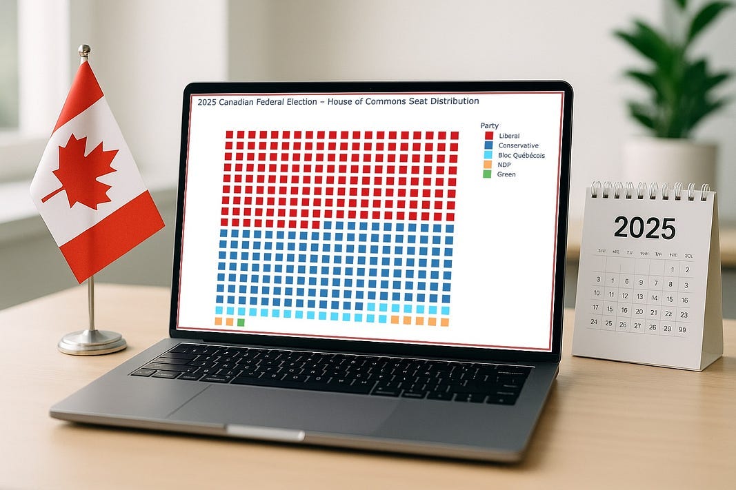
Often simple data set visuals are over-designed . The best way to show simple data is as individual units.

For example, to visualize election results, we can show every seat as a unit, making political party proportions immediately visible.

Data at Depth is a reader-supported publication. To receive new posts and support my work, consider becoming a free…

Keep reading with a 7-day free trial

Subscribe to Data at Depth to keep reading this post and get 7 days of free access to the full post archives.

Already a paid subscriber? Sign in
© 2025 John Loewen
Privacy ∙ Terms ∙ Collection notice
Start writingGet the app
Substack is the home for great culture

Share