Useful Python Data Storytelling: State by State Results on 50 Years Of U.S. Education
A mapping how-to on education trends with Python Folium, Plotly, and Dash libraries
Data visualization skills are essential for the modern data scientist — and the skill to create maps is a terrific tool to have in your visualization toolbox.
In this step-by-step article, let me show you how to create interactive choropleth maps to visualize educational attainment in the United States by decade.
Let’s get rolling!
First, The Dataset
For this tutorial, we’ll be using data from the American Community Survey conducted by the United States Census Bureau:
We’ve simplified the data to include state names, their 2-letter codes, and the percentage of adults with a Bachelor’s degree or higher for the range of years 1970–2020.
Our dataset is a CSV file named education_by_state.csv
, encapsulating data for each U.S. state, including the District of Columbia. Here's a preview of the first 10 rows of our CSV file:
You can see that we have State, 2-letter abbreviation which greatly simplifies the mapping process for the Python Plotly library.
Also notice that the education by state is presented in 10-year increments. Each year has a percent value for a particular state.
Great, now let’s get coding!
Creating a Heat Map for the US
For this first exercise, we want to create a heat map.
Specifically we will create what is called a choropleth map showing the education levels for each state.
A choropleth map is a type of heat map that uses varying shades or colors within predefined geographic regions (such as countries or states) to represent the intensity or value of a particular variable.
To start, we first access our data set and load it into a data frame, which will be used by Plotly to draw the actual choropleth map.
Step 1. Accessing the File, Creating the Data Frame
Let’s import this data into a pandas DataFrame and convert the ‘2020’ column into a numerical format:
import pandas as pd
import plotly.express as px
import folium
edu_df = pd.read_csv('education_by_state.csv')
edu_df['2020'] = edu_df['2020'].str.rstrip('%').astype('float') / 100.0
In this code snippet, we read the CSV file using pandas’ read_csv()
function.
Next, we strip the '%' character from the '2020' column and convert these percentage strings into floating-point numbers, making them numeric and easier to visualize.
Step 2. Creating Our First Choropleth Map
For our first map, we will use the Folium library to create a heat map (choropleth map) that effectively demonstrates the percentage of adults with a Bachelor’s degree or higher in each state.
As folium creates static maps, we need to choose a specific year to display the appropriate map. Let’s use the year 2020:
usa_map = folium.Map(location=[37.8, -96], zoom_start=4)
folium.Choropleth(
geo_data='https://raw.githubusercontent.com/python-visualization/folium/master/examples/data/us-states.json',
data=edu_df,
columns=['State', '2020'],
key_on='feature.properties.name',
fill_color='YlGn',
fill_opacity=0.7,
line_opacity=0.2,
legend_name='Percentage of Adults with a Bachelor\'s Degree or Higher (2020)'
).add_to(usa_map)
usa_map
This code starts by creating a base Folium Map of the United States. Then, adds a Choropleth layer to the map using our education data.
The colors in the resulting map represent the percentages of adults with a Bachelor’s degree or higher in each state, providing a visual summary of the state of education in the U.S.
Very easy, very nice looking. Great work.
Creating the US Heat Map with Plotly
Now let’s also create a choropleth map using Plotly for the same data:
fig = px.choropleth(edu_df,
locations='State',
locationmode="USA-states",
color='2020',
hover_name='State',
color_continuous_scale=["red", "blue"],
title='Percentage of Adults with a Bachelor\'s Degree or Higher (2020)',
scope='usa')
fig.show()
In this code, we use the choropleth
function in Plotly Express to create a choropleth map, similar to what we achieved with Folium.
The locations
parameter is set to our '2-letter' column, while the color
parameter is set to '2020'.
locationmode
is set to 'USA-states' to denote that our locations are U.S. state names.
We set the scope
parameter to 'usa' to specify that we want a map of the United States.
The color_continuous_scale
parameter is used to set the color scale of our choropleth map.
And the beautiful result:
The resulting map, like our Folium map, represents the percentages of adults with a Bachelor’s degree or higher in each state.
Much more Plain-Jane, but it certainly shows the disparities quite clearly.
Great job on this one.
Adding Interactivity with Plotly Dash
OK, now this step is where Plotly really outshines Folium.
It is much easier to integrate the Plotly map we just created into a dashboard and to display results results for multiple years than it is to do the same task with the folium library.
First we need to make sure we have all the necessary libraries, and we need to load and filter our data:
import dash
from dash import dcc
from dash import html
from dash.dependencies import Input, Output
import plotly.express as px
import pandas as pd
# Load the dataset
edu_df = pd.read_csv('education_by_state.csv')
# Convert percentage strings to float for hardcoded years
for year in ['1970', '1980', '1990', '2000', '2010', '2020']:
edu_df[year] = edu_df[year].str.rstrip('%').astype(float)
You can see that the dash library is new — and we need dcc to create the interactivity (ie. the slider) and html for the layout.
For the next step of code, we need to initialize the Dash app and define the App Layout:
# Initialize the Dash app
app = dash.Dash(__name__)
# Define layout
app.layout = html.Div([
html.H1("US Education Levels by State"),
dcc.Slider(
id='year-slider',
min=1970,
max=2020,
step=10,
marks={year: str(year) for year in range(1970, 2030, 10)},
value=2020
),
dcc.Graph(id='choropleth'),
])
Dash is initialized with dash.Dash(__name__)
For the layout, we have a title (“US Education Levels by State”), a slider for selecting the year, and a Graph component where the choropleth map will be rendered.
dcc.Slider
creates a slider with a uniqueid
(year-slider). Themin
andmax
properties set the bounds of the slider. Thestep
property indicates the increment between selectable values. Themarks
property creates labeled points along the slider. Thevalue
property sets the initial value of the slider.
Next we define a Callback Function for the slider:
# Define callback
@app.callback(
Output('choropleth', 'figure'),
[Input('year-slider', 'value')]
)
This code uses Dash’s callback decorator (@app.callback
) to specify the function that will update the figure. This function takes the slider's value as input and returns a Plotly figure.
Then we need to update the figure (each time the slider is moved):
def update_figure(selected_year):
year_col = str(selected_year)
fig = px.choropleth(
edu_df,
locations='2-letter',
locationmode='USA-states',
color=year_col,
hover_name='State',
color_continuous_scale=["red", "blue"],
range_color=[0, 65],
scope='usa',
labels={year_col: 'Percent (%)'},
title=f"Percentage of Adults with a Bachelor's Degree or Higher ({selected_year})"
)
return fig
px.choropleth
creates the choropleth map. It takes a data frame, column names or column references for different parameters, and other visual properties.
locations
specifies the column with the geographical codes, locationmode
specifies the type of locations used, color
determines the column used for color coding, hover_name
gives the column used for hover data, color_continuous_scale
specifies the colors to use for the color scale, range_color
sets the range of the color scale, scope
sets the geographical scope of the map, and labels
allows us to rename the color scale legend.
And lastly, we need to run the dash application:
# Run the app
if __name__ == '__main__':
app.run_server(debug=True)
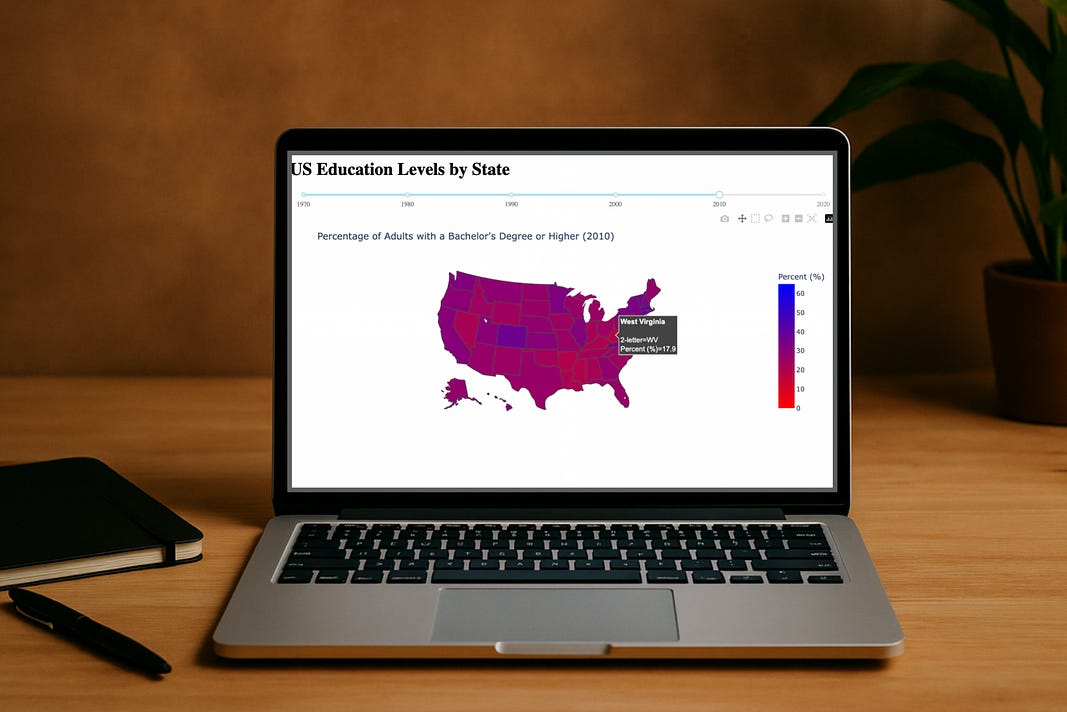
The application will run in your browser at the default port of 8050 (so you can type “localhost:8050” in as the URL and see the result from our carefully put-together code:
Wow, fantastic!
Right under the title, you can see the slider — you can click on the year value to see the percentages for each state for that year. A
And just to make it even a bit more cool — you can mouse-over each state to find the actual percentage value:
Super awesome, super slick!
Nice work!
In Summary…
With the help of the Folium and Plotly libraries in Python, we have been able to take a dataset on US education levels by state and to provide an interactive medium for our audience to explore.
We started from low interaction as a folium map, then to a Plotly map, and right into an interactive Dash application complete with a slider (by year) and hover data by state.
These choropleth maps bring to light the educational attainment across the U.S across 60 years of time.
For example, we can easily see the disparity between two neighouring states — West Virginia at 17.9% of the population with a tertiary degree compared to Virginia at double the rate, 36.8%.
Load up the code, give these choropleth maps a try. And if you have any issues…
…all of the code can be found on my GitHub: HERE