
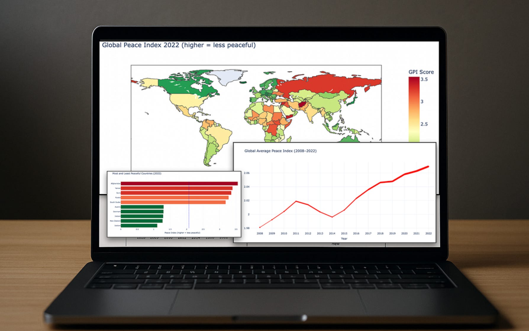
Data scientists often use color to highlight important points in their data visual charts.
One extremely effective trick is the “red effect” — the fact that our brains link red to danger and/or aggression.
With data visual…

Data scientists often use color to highlight important points in their data visual charts.
One extremely effective trick is the “red effect” — the fact that our brains link red to danger and/or aggression.
With data visual…
