
Pragmatic Python Dashboards: Comparing 5 Frameworks For Interactive Mapping
An practical interactive tutorial comparing Streamlit, Dash, Shiny, Voila, and Panel

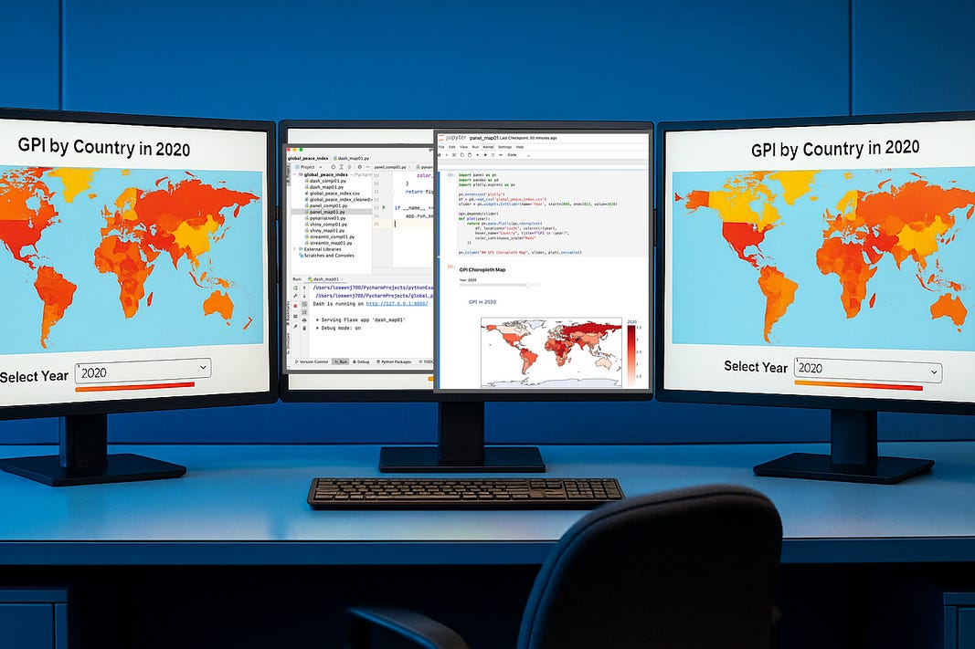
Working with global and regional datasets often means building maps combined with multi-year interactive features, like sliders.
Let’s compare five Python dashboard frameworks — Streamlit, Dash, Shiny for Python, Voila, and Panel — by demonstrating how to implement the same Plotly choropleth map and slider example in each.
