Optimal Python Results: Why Dash Is Better Than Streamlit For Async Mapping
An interactive Python tutorial with the Canada large forest fire data set
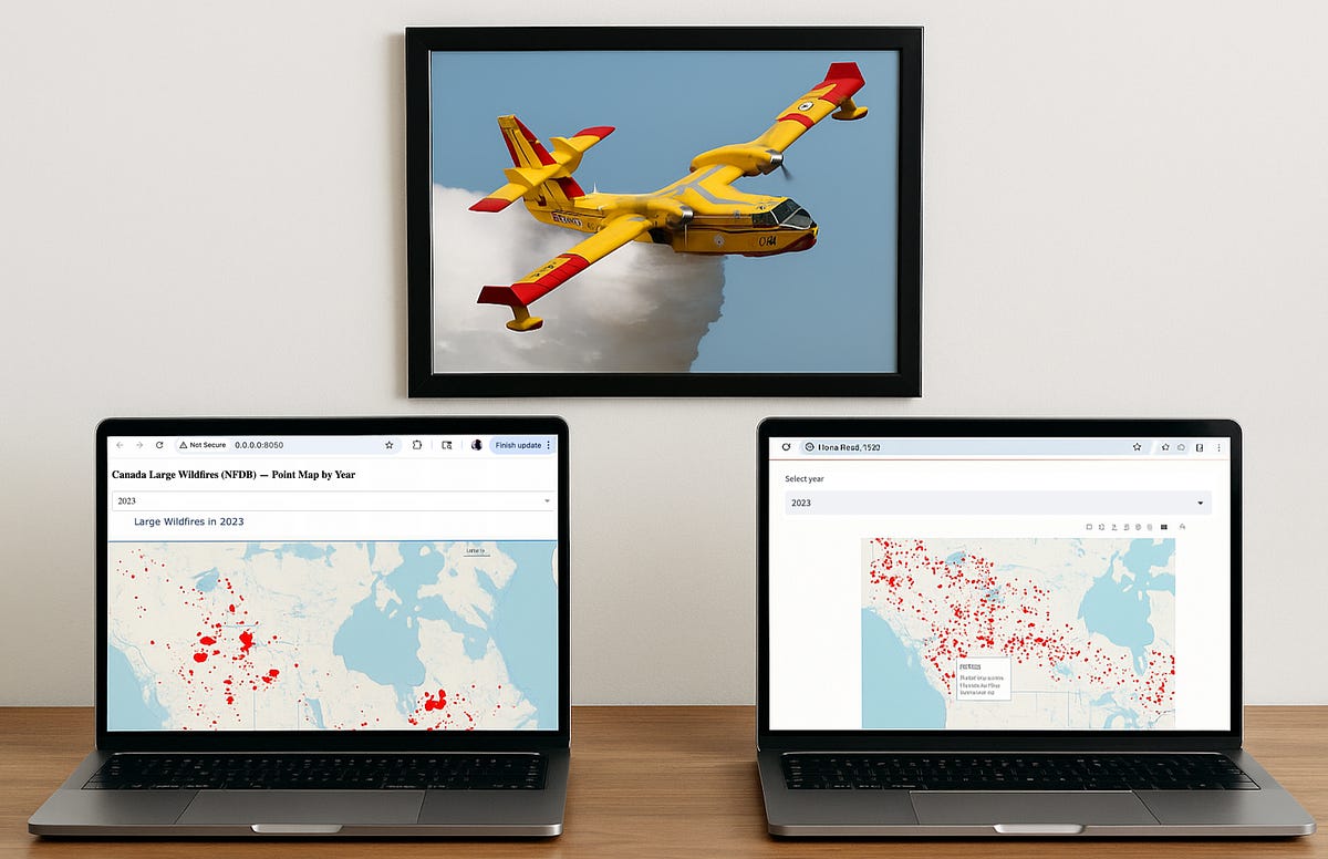
Interactive geographic maps often require filtering large datasets on demand.
Visualizing thousands of geospatial points in a web app is no small feat.
As an example, today I want to map all historical fires in Canada using the government of Canada’s publicly accessible dataset (from HERE). If you download the full text file (NFDB_fires.csv), the dataset is just over 80mb in size.
Two popular Python frameworks that can be used for displaying this type of data are Plotly Dash and Streamlit. Both can create a map with these points, but their approaches to interactivity are fundamentally different.
Due to these 2 different approaches, one model starts to work much better as the dataset size increases.
Which one? Let’s use each library to create a simple dashboard that maps historical data by year, and let me show you how both Dash and Streamlit handle updating the data.
Building the Wildfire Map App in Dash
The Dash implementation of our wildfire map loads the dataset once and uses UI callbacks to handle interactions.
Our basic Plotly Dash code for creating a map:
import dash
from dash import dcc, html
import plotly.express as px
import pandas as pd
# Load and preprocess the data
df = pd.read_csv(”NFDB_fires.csv”)
df = df[df[”YEAR”] != -999] # remove invalid year entries
df = df[(df[”LATITUDE”] != 0) & (df[”LONGITUDE”] != 0)] # drop placeholder coords (0,0)
years = sorted(df[”YEAR”].unique()) # list of available years for filtering
# Define the Dash app layout with a dropdown and map graph
app = dash.Dash(__name__)
app.layout = html.Div([
dcc.Dropdown(id=”year-dropdown”, options=[{”label”: y, “value”: y} for y in years],
value=2023, clearable=False),
dcc.Graph(id=”fire-map”)
])
# Callback: Update map figure when the selected year changes
@app.callback(
dash.dependencies.Output(”fire-map”, “figure”),
[dash.dependencies.Input(”year-dropdown”, “value”)]
)
def update_map(selected_year):
filtered = df[df[”YEAR”] == selected_year]
fig = px.scatter_mapbox(filtered, lat=”LATITUDE”, lon=”LONGITUDE”,
hover_name=”FIRENAME”,
hover_data={”SIZE_HA”: True, “CAUSE”: True, “YEAR”: False},
color_discrete_sequence=[”red”], zoom=3)
fig.update_layout(mapbox_style=”open-street-map”)
return fig
if __name__ == “__main__”:
app.run_server()In this Dash app, the data is read and cleaned just once (at startup).
We drop invalid year entries and obvious bogus coordinates (some entries had latitude/longitude of 0,0 – an out-of-bounds placeholder).
The layout defines a dropdown menu for year selection and a Mapbox-powered scatter plot (points on a map).
Dash’s callback ties them together: when the user picks a year from the dropdown, the update_map function filters the preloaded DataFrame to that year and creates a new scatter map figure.
The fire points are plotted with Plotly’s scatter_mapbox, and each marker’s hover tooltip shows the fire’s name, size (in hectares), and cause code.
Notably, the Dash callback only updates the map component.
The rest of the page (the dropdown and any other content) stays as-is. This is a definite advantage over the Streamlit model. The app does not reload the entire script or data on each interaction — it doesn’t need to, because Dash keeps the app state in memory and only renders the changed output.
Our map displays in our default browser:
Awesome. Specifically:
User selects a year. For example, choosing 2017 from the dropdown (which has all years from 1946 to 2023) will trigger an event.
Dash triggers the callback. The app’s back-end receives the selected year and runs the
update_mapfunction which generates a Plotly map figure with those points.Partial page update. Dash sends the new figure back to the front-end, updating only the
fire-mapcomponent. The page does not refresh or reload — only the map is replaced with the new one.Interactive output. The user immediately sees the updated map with all 2017 fires plotted.
This responsive behavior is possible because Dash follows an async update model with granular callbacks. Only the necessary components update on a given interaction.
With the above example, only the dcc.Graph output updates; the rest of the page doesn’t re-execute.
The app doesn’t block the user interface or restart other parts of the app when one filter changes. Dash’s model involves the browser making an AJAX call (asynchronous JavaScript).
The data was loaded into memory just once. By maintaining state and only updating what’s changed, Dash provides snappy performance, even as the number of points grows.
Streamlit’s Rerun Model
How does the same app behave in Streamlit?
Streamlit uses a linear script rerun model for interactivity. Using the same dataset and the same dashboard structure, the Streamlit code:
# app.py — Streamlit equivalent of the Dash app
import streamlit as st
import pandas as pd
import plotly.express as px
@st.cache_data
def load_data():
df = pd.read_csv(”NFDB_fires.csv”)
df = df[df[”YEAR”] != -999]
df = df[(df[”LATITUDE”] != 0) & (df[”LONGITUDE”] != 0)]
years = sorted(df[”YEAR”].unique())
return df, years
df, years = load_data()
default_year = 2023 if 2023 in years else max(years)
st.title(”NFDB Large Fires Map”)
year = st.selectbox(”Select year”, years, index=years.index(default_year))
filtered = df[df[”YEAR”] == year]
fig = px.scatter_mapbox(
filtered,
lat=”LATITUDE”,
lon=”LONGITUDE”,
hover_name=”FIRENAME”,
hover_data={”SIZE_HA”: True, “CAUSE”: True, “YEAR”: False},
color_discrete_sequence=[”red”],
zoom=3,
height=600,
)
fig.update_layout(mapbox_style=”open-street-map”, margin=dict(l=0, r=0, t=40, b=0))
st.plotly_chart(fig, use_container_width=True)We use st.selectbox for the year and a plotting call for the map.On each change of the selection, Streamlit re-executes the entire script from the top. In practice, this means every time the user picks a new year:
The script runs again, potentially re-reading or reprocessing the data (unless you explicitly cache it).
The filter is applied and a new map is drawn by reconstructing the plot from scratch in the script.
The whole interface is essentially rebuilt. Streamlit tries to preserve widget states, but it still refreshes all outputs.
There is an inherent overhead to rerunning the full app logic on each interaction.
To run this code, we can use the built-in terminal app in PyCharm (or we can run it from a command/terminal prompt):
The code seems to produce our dashboard very nicely:
However this Streamlit app does not have discrete callbacks for each component — instead, it reacts by re-running your code.
As the Streamlit docs/community often point out, “re-running top-to-bottom is the core of the Streamlit execution model”.
For a large dataset, that means repeatedly doing the same expensive operations. You can mitigate some of this by using @st.cache_data to load the CSV once and cache it, but the filtering and plotting will still repeat each time.
As the dataset size increases, you may start to see something like this:
The data loads start to be less “snappy” and we have visible delays.
You can cache the data load, but every year selection still requires a rebuild of the Plotly figure. The user interface may appear to “flash” as it updates, because Streamlit effectively replaces the old output with the new one on rerun.
By contrast, Dash’s update is more surgical — only the map’s data is swapped, without disturbing the rest of the page.
This means better performance at scale.
In Summary…
For this use case — an interactive map with a large dataset — Dash provides a more scalable solution.
The callback-based architecture means the app handles incremental changes efficiently, rather than restarting on every input.
Streamlit’s strengths lie in its simplicity and easy setup. It’s great for prototyping and development.
However, when building large geospatial data applications that demand quick asynchronous interactions, Dash excels.
In this wildfire mapping example, Dash’s callback model allowed year-based filtering without reloading the entire app on each change.
The result is that as the dataset increases in size, the degredation in performance will be much less with the Dash interactive web map rather than a Streamlit script running in a loop.
This makes Dash a better fit for “async data” apps and choropleth dashboards that must stay responsive under heavy filtering.


Thanks for this, John. I really enjoy these comparisons and improving my understanding of how different libraries handle ostensibly the same assignment.