


How To Put Together A Simple Flask Dashboard With Python Folium
Providing a platform for data storytelling global access to safe drinking water

Access to safe drinking water remains a critical global issue. While progress has been made in expanding access to improved water sources, large gaps remain — especially between rural and urban populations.
As a data scientist, I have been experimenting extensively on how we can explore and communicate humanitarian issues through interactive dashboards.
Recently, I put together a dashboard to display a global choropleth map showing water access rates by country, using real data from the UN Joint Monitoring Programme (JMP) dataset.
Let me step through and show you how I put together this simple web-based data visualization dashboard using Flask and Folium in Python.
The Dataset
The dataset used in this project is the JMP’s 2023 global household water access data. This dataset can be downloaded from HERE.
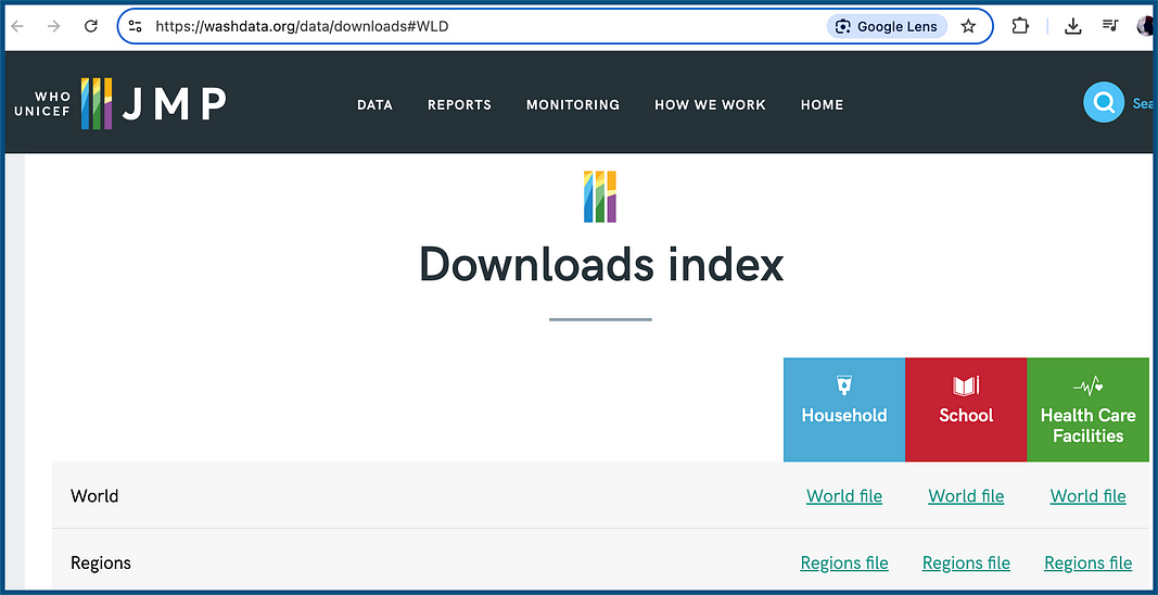
For this example, I downloaded the World file dataset for “Household”. Now this is a pretty big file. I have simplified it and saved it on my GitHub as global_water_access.xlsx. You can find it (and all other files) HERE.
This Excel file contains detailed country-level data for the year 2022. We’ll focus on two key indicators:
wat_basal_t — The percentage of the population with access to at least basic water services.
wat_imp_prem_t — The percentage of the population with access to improved water services located on premises.
Both indicators give us hard numbers on actual water access across countries, and together they highlight the gap between having nearby water versus water that is accessible directly at home.
Our Initial Flask Project Setup
First, we’ll set up the project structure and install the required Python libraries.
For this project I have set up the folder structure like so:
project_folder/
├── app.py
├── global_water_access.xlsx
├── world-countries.geojson
└── templates/
    └── index.html
NOTE: all the working files in this project are available on my Github HERE
Next, you need to make sure you have all of the libraries for this project installed:
pip install flask pandas folium openpyxlAlright, now we’re ready to start coding! Let’s start with setting up the data.
Data Preparation
In the Flask app, we’ll load and filter the dataset at application startup.
The goal is to extract only the relevant fields for the year 2022 and remove any rows with missing values.
import pandas as pd
data = pd.read_excel('global_water_access.xlsx', sheet_name='wat', engine='openpyxl')
data = data[data['year'] == 2022]
data = data[['iso3', 'name', 'wat_basal_t', 'wat_imp_prem_t']].dropna(subset=['wat_basal_t', 'wat_imp_prem_t'])
This code reads the Excel file, filters the data to include only rows from 2022, selects the ISO3 country code, country name, and two key indicators, and removes any rows that lack values for either metric.
Now let’s put the Flask Application toegether.
Building the Flask App
First, let’s set up the core of our Flask application.
The code below defines a single route ("/") and loads the Folium map based on a selected metric (either basic or improved).
from flask import Flask, render_template, request
import pandas as pd
import folium

app = Flask(__name__)
# Load data at startup
data = pd.read_excel('global_water_access.xlsx', sheet_name='wat', engine='openpyxl')
data = data[data['year'] == 2022]
data = data[['iso3', 'name', 'wat_basal_t', 'wat_imp_prem_t']].dropna(subset=['wat_basal_t', 'wat_imp_prem_t'])
@app.route("/", methods=["GET"])
def index():
    # Determine which metric to display based on query parameter (default to 'basic')
    metric = request.args.get('metric', 'basic')
    if metric == 'improved':
        value_col = 'wat_imp_prem_t'
        legend_title = 'Improved water access (% of population)'
    else:
        value_col = 'wat_basal_t'
        legend_title = 'Basic water access (% of population)'
        metric = 'basic'  # normalize any other value
    # Create the Folium map centered at an appropriate location
    m = folium.Map(location=[20, 0], zoom_start=2)
    # Add the choropleth layer
    # Create Choropleth layer
    choropleth = folium.Choropleth(
        geo_data="world-countries.geojson",
        name="choropleth",
        data=data,
        columns=["iso3", value_col],
        key_on="feature.id",  # Use 'feature.id' because that's how ISO3 is stored
        fill_color="YlGnBu",
        fill_opacity=0.7,
        line_opacity=0.2,
        nan_fill_color="lightgray",
        nan_fill_opacity=0.4,
        legend_name=legend_title
    ).add_to(m)

    # Add GeoJson overlay with tooltip
    folium.GeoJson(
        "world-countries.geojson",
        name="Labels",
        tooltip=folium.GeoJsonTooltip(
            fields=["name"],
            aliases=["Country:"],
            sticky=False
        )
    ).add_to(m)
    # Render map HTML in template
    map_html = m._repr_html_()  # Get the HTML representation of the map
    return render_template("index.html", map=map_html, metric=metric)
if __name__ == "__main__":
    app.run(debug=True)
This Flask app:
Loads the dataset once on startup.
Responds to a query parameter
?metric=basicor?metric=improved.Creates a Folium map centered on [20, 0] (roughly the center of the world).
Adds a colored choropleth based on the selected metric.
Attaches hoverable country name tooltips using an additional GeoJSON layer.
Embeds the map HTML using
m._repr_html_()into the Flask-rendered template.
Now in order to get a global map working with Folium, we need to provide the chloropleth map function with the coordinates for each country border. We do this using a geoJSON file (world-countries.geojson). There are many places we can download this file from. I have included the file on my GitHub (HERE) for you to use.
Great! Now that we have the code to actually create the map , let’s go ahead and create the HTML template to display it!
Creating the Interactive Folium Map in HTML
To render the map with proper layout and interactivity, we use an HTML template stored in templates/index.html.
We can include HTML layout styling and then embed the Folium map to render at the correct size:
<!DOCTYPE html>
<html lang="en">
<head>
  <meta charset="UTF-8">
  <title>Global Water Access Dashboard</title>
  <style>
    #map-wrapper {
      width: 80%;
      height: 600px;
      margin: 0 auto;
    }
    html, body {
      overflow-x: hidden;
    }
  </style>
</head>
<body>
  <h3 style="text-align:center;">Global Water Access Dashboard</h3>

<form method="get" style="text-align:center; margin-bottom:20px;">
    <label for="metric">Choose metric:</label>
    <select name="metric" id="metric" onchange="this.form.submit()">
      <option value="basic" {% if metric == 'basic' %}selected{% endif %}>Basic Water Access</option>
      <option value="improved" {% if metric == 'improved' %}selected{% endif %}>Improved On-Premises Water</option>
    </select>
  </form>
  <div id="map-wrapper">
    {{ map|safe }}
  </div>
  <script>
    // Force map height after folium injects its junk
    window.onload = function () {
      const mapDiv = document.getElementById('map');
      if (mapDiv) {
        mapDiv.style.width = '100%';
        mapDiv.style.height = '600px';
      }
    };
  </script>
</body>
</html>
What’s happening with this HTML code:
#map-wrapper: Sets a fixed width (80% of the page) and height (600px), and centers the map horizontally.<form>: Allows the user to select the water access metric from a dropdown; reloads the page with the new selection.{{ map|safe }}: Injects the Folium-generated HTML directly.The JavaScript in
window.onload: Manually overrides Folium’s default injected styles to constrain the map size properly.
Now that is all of the files and code we need!
Now we’re ready to run the application. For my working application, I am using the PyCharm editor. Here is a screenshot of my project:

Now to run my application, I only need to start the .py file (click the green “Play” button) and the Flask application runs in my default browser.

Once we run the application, the HTML page will be displayed in your default browser at port 5000.
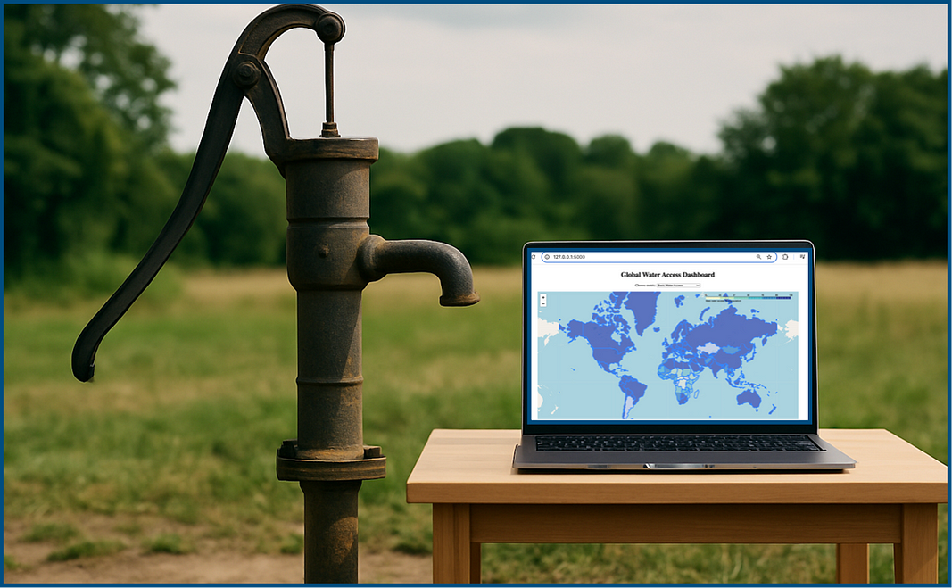
And the web page is loaded, presto:

The interactivity comes from two key components:
The dropdown menu which allows users to switch between viewing basic access (
wat_basal_t) and improved on-premises access (wat_imp_prem_t).The hover tooltips, which display country names when the user hovers over regions of the map.
The dropdown triggers a page reload with the appropriate metric, and the choropleth is updated accordingly before being rendered.
And there you have it! A simple working dashboard using Flask and Python folium.
Nice work!
In Summary…
To create an interactive data dashboard using Flask and Folium, we need to understand how to combine our Python code with an HTML template.
By combining a simple web framework (Flask), interactive maps (Folium), and tabular data (Pandas), we can create a powerful data visualization tool.
The approach used here is modular, easy to extend, and deployable anywhere Flask apps are supported.
For example, this dashboard could be enhanced further with additional visualizations (ie line/bar charts to show changes over time), region filters, timeline animation, or deployed publicly using a platform like Heroku or Render.
Do you have any other suggestions? Let me know!
NOTE: All working code is located on my GitHub: HERE.