
How to Make and Modify Terrific Gauge Charts Using Python Plotly
Three practical data visualizations using the Global Giving dataset

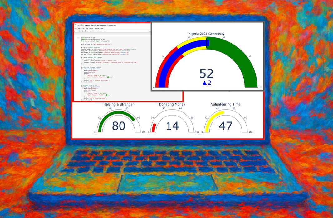
Gauge charts are terrific for visualizing a single value within a range at a glance.
Also known as dial or speedometer charts), gauge charts can be easily created using Python Plotly.
So let’s use a real dataset on global …
Keep reading with a 7-day free trial
Subscribe to Data at Depth to keep reading this post and get 7 days of free access to the full post archives.