


Here is What Makes Python Shiny Terrific for Data Visualization Dashboards
A how-to tutorial on creating a simple dashboard with the Shiny and Plotly libraries

The Python Shiny library is a terrific framework for building interactive web applications in Python.
Developed by RStudio (the same team behind the Shiny library for R) the Shiny Python library is a powerful tool data scientists and analysts who want to build slick interactive dashboards and applications without having extensive front-end development skills.
How easy is Python Shiny to use? Let’s start with a simple data set and take it for a test drive!
The Dataset
For this exercise, let’s use a super-simple dataset — the global happiness data that can be found HERE.
I downloaded the file, opened it and exported is as a CSV file I called WHR2024.csv.
NOTE: The files in this article are also available on my Github: HERE
The relevant fields for us in this CSV file are:
Country name — the name of each country that has a happiness value
year — the year of the recorded data
Life Ladder — the field that contains the actual happiness value (the larger the value, the happier the country).
With this dataset, we can use tools that give us a global representation of countries compared to each other, to perhaps see regional comparisons.
A great tool to start with is a choropleth map.
A choropleth map uses differences in shading or colour within predefined areas (ie countries) to indicate the average values of a particular quantity in that area.
For example, we can use a darker shade to indicate countries with higher happiness values.
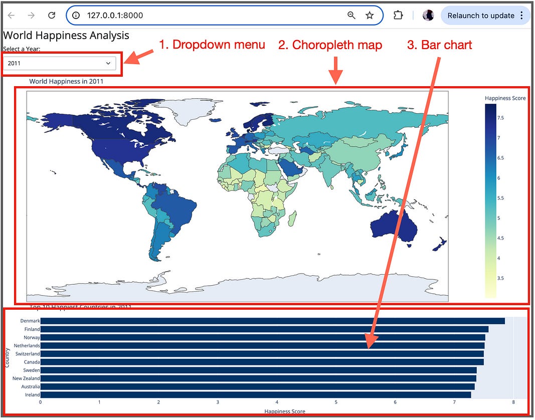
So let’s show whatPython Shiny can do by creating an interactive data visualization that has 2 components:
Dropdown menu — allows the user to select a year (this data set contains data from 2005–2022).
Global Choropleth map — displays the value for each country on a map of the world (for the chosen year).
Bar chart — showing top 10 countries for the chosen year.
And let’s go through this in a modular fashion, starting with loading all of the necessary libraries and our dataset.
Loading the Libraries and Dataset
We need three main libraries for this application to run successfully. Make sure you have installed each library before running the application (more on this in a later step).
import pandas as pd
import plotly.express as px
from shiny import App, render, ui, reactive

# Load the dataset with the correct delimiter
file_path = 'WHR2024.csv'  # Ensure this is the correct path to your CSV file
happiness_data = pd.read_csv(file_path, delimiter=',')
This segment imports necessary libraries and loads the World Happiness dataset (WHR2024.csv) using pandas. The dataset is a comma-delimited file and it must be placed in the same directory as our Python File (if you use this code snippet example).
Defining the User Interface (UI)
This is where we start to implement the Python Shiny library.
Now remember when we loaded the with our import statement, we included the ui library to help us with the web application interface. We can now use this library to set up our interface:
# Define the UI
app_ui = ui.page_fluid(
    ui.h3("World Happiness Analysis"),
    ui.input_select(
        "year", "Select a Year:",
        {str(year): str(year) for year in sorted(happiness_data['year'].unique())}
    ),
    ui.output_ui("happiness_map")
)
The app_ui variable defines the layout of the web application. It includes:
A header (
h3) for the application title.A dropdown menu (
input_select) that allows users to select a year from the dataset.A placeholder for the choropleth map (
output_ui).
From this small piece of code, you can get the feel for how we can easily add HTML elements to get the right look and feel. We can add any html element supported by the Python Shiny library.
For example, <div>, <span>, <p>, <ul>, etc. — all of the standard most commonly used HTML tags.
Now, let’s set up the server and the application.
Defining the Server Logic
Once we have the interface laid out, we can set up the server code:
# Define the server logic
def server(input, output, session):
    @reactive.Calc
    def filtered_data():
        return happiness_data[happiness_data['year'] == int(input.year())]
The server function defines the logic of the application. It contains a reactive calculation (filtered_data) that filters the dataset based on the selected year.
This allow the user to select a year to view the visualization results.
Perfect. Now we can start putting together our data visualizations.
Creating the Choropleth Map (using Plotly, yay!)
The focal point of this code segment is the happiness_map() function which renders the choropleth map using Plotly Express (px):
@output
    @render.ui
    def happiness_map():
        data = filtered_data()
        fig = px.choropleth(
            data,
            locations='Country name',  # Use country names for locations
            locationmode='country names',  # Specify that we're using country names
            color='Life Ladder',  # Use 'Life Ladder' for happiness values
            hover_name='Country name',  # Use 'Country name' for the hover information
            color_continuous_scale=px.colors.sequential.YlGnBu,
            labels={'Life Ladder': 'Life Ladder Score'},
            title=f'World Happiness in {input.year()}'
        )
        fig.update_layout(height=600, margin={"r":0,"t":40,"l":0,"b":0})
        fig_html = fig.to_html(full_html=False)
        return ui.HTML(fig_html)
The key properties (passed as parameters here) include:
locations: Uses country names for locations.locationmode: Specifies that we are using country names.color: Colors the map based on the 'Life Ladder' values.hover_name: Displays country names on hover.color_continuous_scale: Uses the 'YlGnBu' color scale.
The map is updated to fit within a specified height and margin (using the update_layout() function.

Now as the creation of each visualization is modular, if we want to add on other data visualizations (ie a bar chart), it is super-simple.
Let’s do it!
Creating a Dynamic Bar Chart
In addition to the choropleth map, we want to give users a quick, ranked snapshot of the top 10 happiest countries in any selected year. A horizontal bar chart is ideal for this — it’s compact, easily readable, and naturally emphasizes ranking:
@output
@render.ui
def top10_bar():
    data = filtered_data().sort_values(by='Ladder score', ascending=True).tail(10)
    fig = px.bar(
        data,
        x='Ladder score',
        y='Country name',
        orientation='h',
        title=f'Top 10 Happiest Countries in {input.year()}',
        labels={'Ladder score': 'Happiness Score', 'Country name': 'Country'},
        color_discrete_sequence=['#003366']
    )
    fig.update_layout(height=300, margin={"r":0,"t":40,"l":0,"b":0})
    return ui.HTML(fig.to_html(full_html=False))
The key parts of this code snippet:
The
filtered_data()function gives us only the records from the selected year. We sort by"Ladder score"and take the last 10 rows (the happiest countries) using.tail(10).plotly.express.bar()creates a horizontal bar chart withorientation='h'.The height is set to
300pixels for visual balance, and margins are minimized for a clean, tight layout.fig.to_html(full_html=False)converts the Plotly figure to HTML, andui.HTML(...)injects it into the Shiny UI.
The clean and clear results for our bar chart visualization:
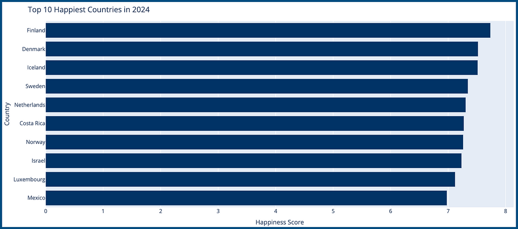
This chart adds clear, accessible ranking information to the dashboard — complementing the geographic choropleth with precise country-level comparisons.
Creating and Running the App
Lastly, we need to add in the code to run our application in a web browser:
# Create the app
app = App(app_ui, server)
if __name__ == '__main__':
    app.run()
This code ties together the UI and server components, making the application functional and ready to be displayed in a web browser.
And that’s all the code we need!
Now to run the application as a standalone application, you can run it from a terminal (or command) prompt. For this exercise, let’s use PyCharm’s built-in terminal prompt.
Personally, having very little experience with Shiny until today, the steps to getting it running in PyCharm were super straightforward.
First, I installed the library from my Preferences/Project/Python Interpreter:

Once installed, I was able to run the Python file as a Shiny application from the built-in Pycharm Terminal window (View/Tool Windows/Terminal):

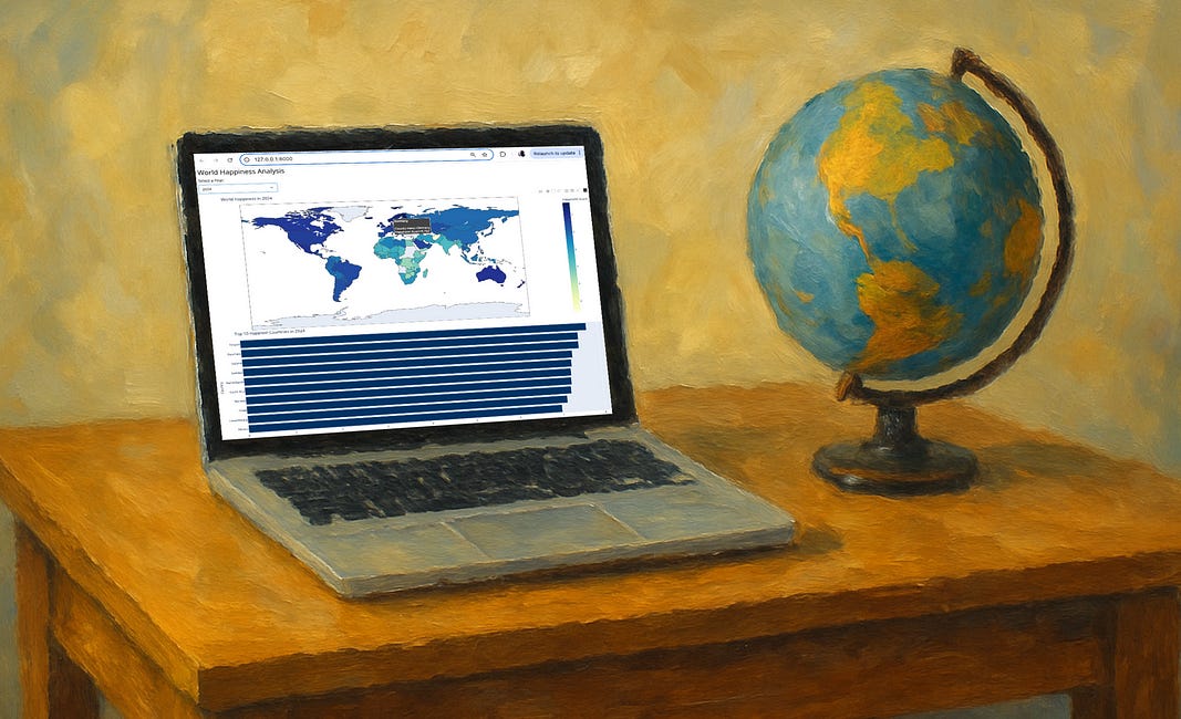
And our super slick visually appealing result (displayed in the default browser):
Very nice. Interactively, the user can select the year from the dropdown menu (2011–2024) and the map is automatically updated for that year. Sweet!
I hope you were able to get it up and running!
In Summary…
Python Shiny is a great library on a long list of useful data visualization tools for data scientists.
It allows for the creation of interactive and dynamic data visualizations with ease.
Shiny’s ability to easily render Plotly data visualizations certainly adds to its appeal.
One big advantage to Shiny over another similar and very popular framework, Streamlit, is that it is more efficient in that it only re-executes the parts of the code that need updating. Streamlit renders the entire application script when a user inputs something.
Conversely, Streamlit is easier for non-experienced UI developers to get up and running. I created the exact same application in both Streamlit and in Shiny.
The Streamlit app is 45 lines of code and the Shiny app is 65 lines of code. The visual results from these two libraries? Pretty much identical.
The full working code and dataset is available on my GitHub: HERE.