
Heat Map Data Visualization Using Python Plotly: A Hands-on Example
Combining multiple data sets for Plotly heat map creation

Combining multiple data sets for Plotly heat map creation
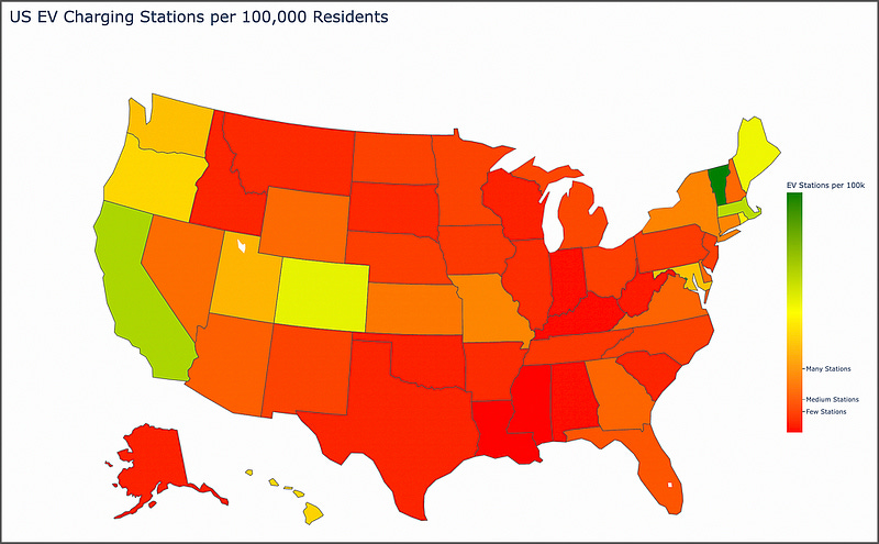
We can easily develop an interactive choropleth map (heat map) using Plotly, a useful and powerful Python data visualization library.
Curious to know which U.S. states are leading the charge in electric vehicle (EV) infrastruc…
Keep reading with a 7-day free trial
Subscribe to Data at Depth to keep reading this post and get 7 days of free access to the full post archives.