
Hands-On Tutorial: Dynamic Web Dashboard using Python Plotly Dash
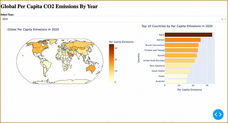
Visualizing Global Per Capita CO2 Emissions By Year

Visualizing Global Per Capita CO2 Emissions By Year
Data visualization techniques and tools are terrific for understanding and collecting insights from complex datasets.
Python’s plotly and dash libraries allow coders to build analytical web applications without needing to resort to JavaScript.
This step-by-step tutorial walks you through the steps for cre…
Keep reading with a 7-day free trial
Subscribe to Data at Depth to keep reading this post and get 7 days of free access to the full post archives.