
Data Storytelling Using Comparative Analysis: 3 Examples With Python Plotly
Analyzing UN global safety data with comparative charts and maps.


The value of data often lies in its comparability.
Professor Edward Tufte, a pioneer in data visualization, has spent his entire career distilling complex information into clear and practical visualizations.
In Tufte’s view, data rarely exists in a vacuum. It may make the most sense when contrasted with other data.
The world is boiling over with data, making it a tough process to transform this information into understandable data visualizations.
By making comparisons explicit, viewers can better see the differences and similarities among datasets.
So how can we be explicit? Using comparative analysis.
Using a UN global data set, let’s look at 3 examples on how to do this. And let’s use Python to put together: a comparative bar chart, line chart, and choropleth heat map.
The Data Set
For our examples let’s use the“Global Peace Index” (GPI) data downloaded from the visionofhumanity.org website (located HERE).
Once we download the file, we can open it up in Excel (or Numbers) and click on the “Overall Scores” tab. You should see this view:
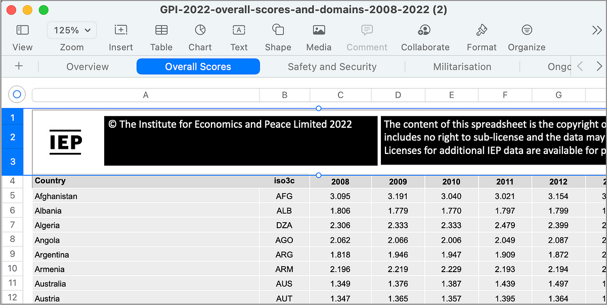
Next, you want to select and delete the first 3 rows (highlighted in the image above). Once these rows are removed, you can then Export this sheet as a CSV file called global_peace_index.csv.
Now we are ready to do some comparative analysis - let’s write some Python code!
Example 1: Comparative Bar Chart
Keep reading with a 7-day free trial
Subscribe to Data at Depth to keep reading this post and get 7 days of free access to the full post archives.