Data at Depth

Data at Depth

Share this post

Data at Depth
Data at Depth
Comparative Analysis in Data Visualization: 3 Hands-on Examples Using Python Plotly
Programming

Comparative Analysis in Data Visualization: 3 Hands-on Examples Using Python Plotly

The value of data often lies in its comparability — Prof. Edward Tufte

John Loewen's avatar
John Loewen
Jan 28, 2024
∙ Paid
4

Share this post

Data at Depth
Data at Depth
Comparative Analysis in Data Visualization: 3 Hands-on Examples Using Python Plotly
3
Share

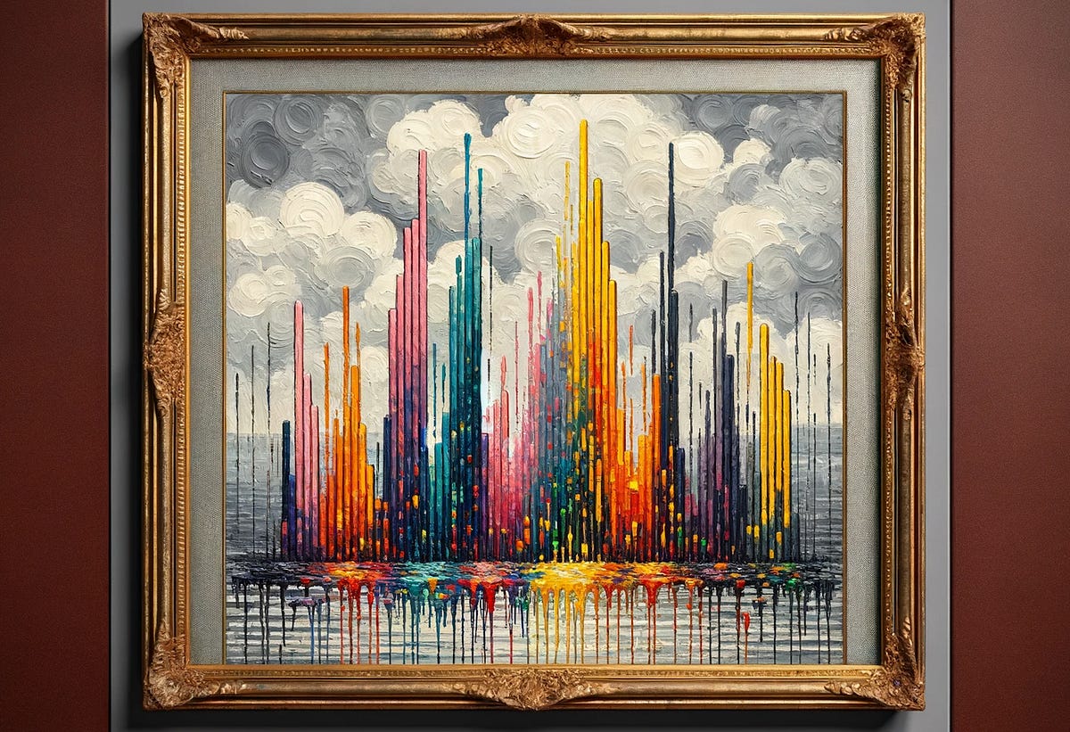
Dall-E image: Impressionist painting of a comparative bar chart in a golden gilded frame

The world is boiling over with data, making it a tough process to transform this information into understandable data visualizations.

Professor Edward Tufte, a pioneer in data visualization, has spent his entire career distilling complex information into clear, insigh…

Keep reading with a 7-day free trial

Subscribe to Data at Depth to keep reading this post and get 7 days of free access to the full post archives.

Already a paid subscriber? Sign in
© 2025 John Loewen
Privacy ∙ Terms ∙ Collection notice
Start writingGet the app
Substack is the home for great culture

Share