
Beautiful Sunburst Charts With Python Plotly: Visualizing UN Refugee Data
A fun and attractive data visualization method for multi-dimensional data.

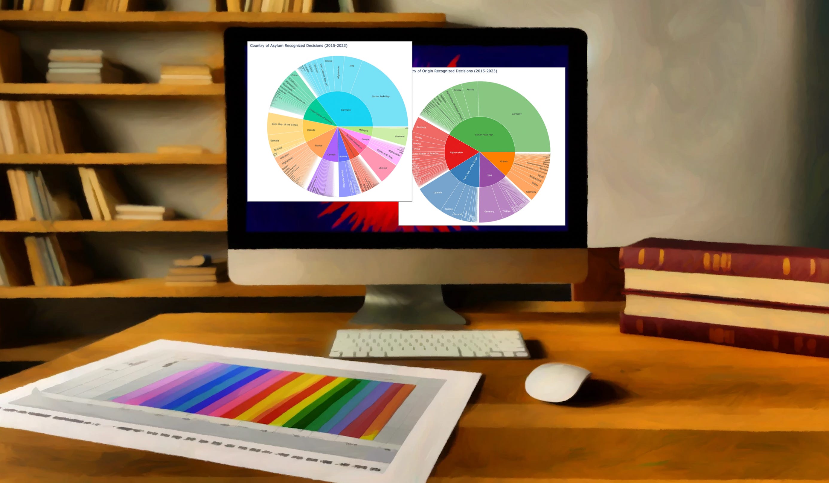
Sunburst charts are a beautiful way to represent data. Though perhaps not the most effective method for visualizing many forms of data, they are still very nice to look at.
Sunburst charts always catch my eye, and I am drawn towards them, curious about what data points they are representing.
