
Applying the Flexibility vs. Usability Design Principle For Better Data Visuals
A Python Streamlit how-to on balancing design simplicity and complexity

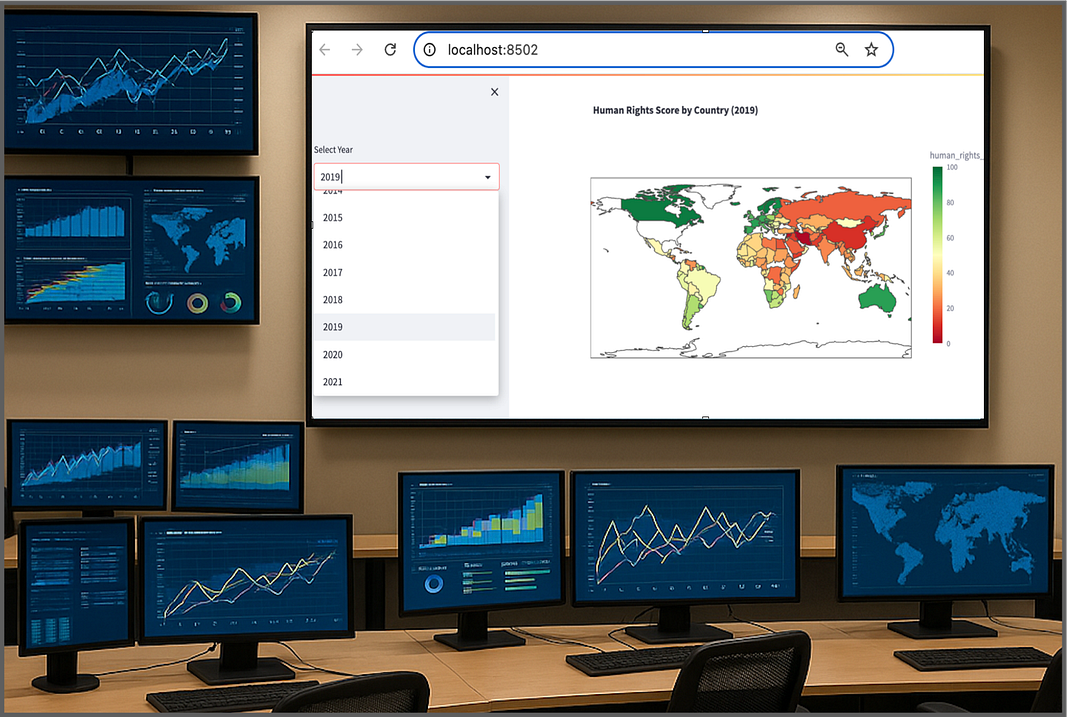
An important design decision in any data story is how flexible to make the visualization versus how usable or should be.
Add too many interactive features and you risk overwhelming or confusing your audience. Conversely, if you keep it too simple you may deprive higher level users the ability to explore.
Keep reading with a 7-day free trial
Subscribe to Data at Depth to keep reading this post and get 7 days of free access to the full post archives.