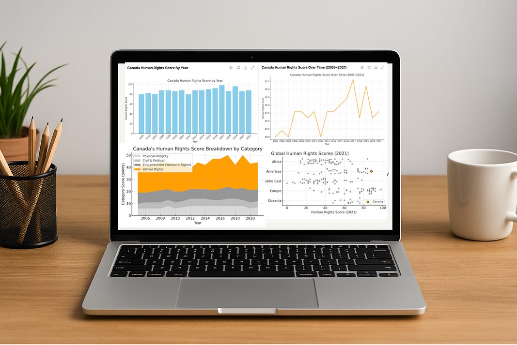
4 Simple Exploratory Visual Techniques In Python To Make Your Data Speak
Visualizing the Human Rights index with exploratory research methods
With data visualization and storytelling, there is great value in presenting clear and concise images to get your point across.
As Nathan Yau points out in his book Visualize This (2nd edition, 2024), if we were always looking for the most efficient and accurate way to present data, we would use bar charts most of the time.
Keep reading with a 7-day free trial
Subscribe to Data at Depth to keep reading this post and get 7 days of free access to the full post archives.


