4 Reasons Why Streamlit Is Better Than Dash (And One Reason Why It Is Not)
A how-to example to demonstrate each reason. The results may not be what you expect
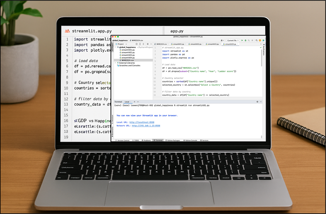
Streamlit and Dash are both popular Python frameworks for data visualization apps, but they cater to slightly different use cases.
Different, how? In general, Streamlit shines for quick, lightweight dashboards with minimal code, while Dash works better with more complex, production-ready applications.
Here are 4 clear reasons (with examples) why Streamlit is often easier and faster to use than Dash and one reason why it is not.
Each reason is illustrated with a specific example using the provided WHR2024 (World Happiness Report 2024) dataset (WHR2024.csv)
NOTE: The dataset and code examples are on my Github: HERE
Reason 1. Simplicity and Minimal Boilerplate
Streamlit apps are incredibly easy to write — you can go from zero to interactive chart in just a few lines of Python.
In Dash, you often need to set up callbacks and more boilerplate.
For example, to make a quick bar chart of the top 10 happiest countries in 2023, consider this Streamlit code snippet:
import streamlit as st
import pandas as pd
df = pd.read_csv("WHR2024.csv")
# Filter to only the year 2023
df_2023 = df[df["Year"] == 2023]
# Get top 10 countries by Ladder score
top10 = df_2023.sort_values("Ladder score", ascending=False).head(10)
st.title("Top 10 Happiest Countries (2023)")
st.bar_chart(top10.set_index("Country name")["Ladder score"])
This small Streamlit script loads the data, sorts by the “Ladder score” column (higher is happier), picks the top 10, and displays a bar chart:
Everything runs top-to-bottom without any extra setup.
Dash requires defining a layout and callbacks to do the same thing, which quickly becomes more verbose. The same code with Dash:
import dash
from dash import html, dcc
import pandas as pd
import plotly.express as px
# Load dataset, filter to only year 2023
df = pd.read_csv("WHR2024.csv")
df_2023 = df[df["Year"] == 2023]
# Get top 10 countries by Ladder score
top10 = df_2023.sort_values("Ladder score", ascending=False).head(10)
# Create the bar chart
fig = px.bar(
top10,
x="Country name",
y="Ladder score",
title="Top 10 Happiest Countries (2023)",
labels={"Country name": "Country", "Ladder score": "Happiness Score"}
)
# Initialize Dash app and layout
app = dash.Dash(__name__)
app.layout = html.Div([
html.H1("Top 10 Happiest Countries (2023)"),
dcc.Graph(figure=fig)
])
# Run server
if __name__ == "__main__":
app.run_server(debug=True)
As one comparison notes, “Streamlit is well suited for fast prototyping… real-time feedback when changing code allows for a fast turnaround” (firebolt.io).
With Streamlit, you literally save the file and run it — instant interactivity comes for free.
Reason 2. Instant Interactivity with Widgets
One of Streamlit’s best tricks is how effortlessly you can make your dashboard interactive.
For example, if we want to filter our dataset by year and see how happiness scores are distributed in that specific year, here’s the Streamlit code:
import streamlit as st
import pandas as pd
import plotly.express as px
df = pd.read_csv("WHR2024.csv")
region = st.selectbox("Select a Region:", df["Regional indicator"].unique())
filtered = df[df["Regional indicator"] == region]
fig = px.histogram(filtered, x="Ladder score", nbins=10, title=f"Happiness in {region}")
st.plotly_chart(fig)
In this code, the st.slider
widget lets users pick a year. As they drag it, the dataset is filtered live, and the histogram updates.
No callback functions. No app reboots.
Streamlit reruns the script, keeping your logic simple and clean. The result:
In Dash, this exact histogram would require a callback tied to a dropdown or slider, a separate function to filter the data, and more boilerplate code.
Streamlit lets you “think in Python” and still get an interactive dashboard.
Reason 3. Layout/UI Simplicity (Side-by-Side Comparisons)
Streamlit makes it stupidly easy to build side-by-side visualizations, great for comparison charts.
For example, if we want to compare how GDP and social support relate to happiness in the most recent year.
import streamlit as st
import pandas as pd
import plotly.express as px
df = pd.read_csv("WHR2024.csv")
col1, col2 = st.columns(2)
col1.header("GDP vs Happiness")
fig1 = px.scatter(df, x="Logged GDP per capita", y="Ladder score",
color="Regional indicator", title="GDP per Capita vs Happiness")
col1.plotly_chart(fig1, use_container_width=True)
col2.header("Generosity vs Happiness")
fig2 = px.scatter(df, x="Generosity", y="Ladder score",
color="Regional indicator", title="Generosity vs Happiness")
col2.plotly_chart(fig2, use_container_width=True)
In just a few lines, we created two columns, added headers, and placed two Plotly charts side by side. Streamlit handles the HTML/CSS under the hood, so you don’t need to write any HTML or CSS code.
The visual result:
In Dash, you’d typically use a HTML <div>
layout or a specialized grid system to achieve the same effect, which is more cumbersome. To handle the layout, the Dash code is:
app.layout = html.Div([
html.H1("Happiness Insights Dashboard"),
html.Div([
html.Div([
html.H3("GDP vs Happiness"),
dcc.Graph(figure=fig1)
], style={'width': '48%', 'display': 'inline-block'}),
html.Div([
html.H3("Generosity vs Happiness"),
dcc.Graph(figure=fig2)
], style={'width': '48%', 'display': 'inline-block', 'float': 'right'})
])
])
What was handled with 5 lines of streamlit code takes 15 lines of Dash code along with fiddling with width approximations, etc.
Very tedious.
Streamlit’s approach follows its mantra of “pure Python, without the need to learn a new language or framework” (From: docs.kanaries.net).
In other words, layout and styling feel like a natural extension of your Python script.
Reason 4. Rapid Development Cycle
Streamlit’s fast feedback loop is a huge advantage. Because it runs your Python script top-to-bottom on each change, you can just save your code and instantly see updates.
In practice, I often edit the script, watch the browser, and quickly iterate. For example, we can refine the chart above by adding a title or formatting it, and the change appears as soon as we save. We can start the application from the Terminal:
Once the application is running, we can modify code and save, and the running application is immediately updated in the browser. Pretty cool.
In Dash, you would need to refresh the server or deal with callbacks, which interrupts the flow. Streamlit even offers one-click deployment via Streamlit Cloud, making it easy to share your app after development
Overall, Streamlit’s quick edit–refresh cycle and simple “run as script” model help you prototype and experiment very fast.
If your goal is to build a small internal tool or a rapid demo (like exploring the World Happiness data), Streamlit clearly wins on development speed.
One Major Drawback of Streamlit — Lack of Control
Streamlit’s biggest strengths also expose its biggest weakness — there is a lack of fine-grained control (Callbacks vs. Full Rerun).
Streamlit’s simplicity comes from rerunning the entire script on every interaction. For simple apps this is fine, but it can be a major limitation when you want complex interdependencies or partial updates.
For example let’s say we want to create an app where:
The user selects a country from a dropdown.
The app automatically filters the available years for that country.
Then, it shows a line chart of that country’s happiness score over time.
Our visualization looks like so:
This kind of inter-widget dependency is trivial in Dash — callbacks are used to update the second widget based on the first.
So you’d have:
One dropdown for the country,
A callback to dynamically update the years in the second widget based on the selected country,
Another callback to generate the plot.
The callback code looks something like this:
# Update plot based on both widgets
@app.callback(
Output("line-plot", "figure"),
Input("country-dropdown", "value"),
Input("year-slider", "value")
Each input has a separate “handler” and only executes when the value of the input changes.
This separation allows Dash to keep the year slider state intact, only update what needs updating, and avoid re-executing the entire script.
But in Streamlit, since the entire script reruns top-to-bottom on each interaction, this requires a workaround using st.selectbox
with dynamic options — and the UX is more awkward.
In Summary…
For most all rapid prototyping and exploratory data visualization research, the drawback is minor compared to Streamlit’s benefits.
Conversely, it is important to know that Streamlit is less suitable for highly customized, production-scale dashboards, this is the domain where Dash shines.
The Bottom line: Streamlit can do multi-step interactions, but they get clumsy quickly. This example — which should be simple — becomes error-prone and annoying to maintain. That’s where Dash’s callback system and component separation are clearly superior.
And there you have it — hopefully this provides clarity on when to use each of these modern powerful frameworks.
NOTE: The dataset and code examples are on my Github: HERE