

What Exactly is Data Storytelling? Here Are Some of The Basics
What Exactly is Data Storytelling? Here Are Some of The Basics
How to turn your quantitative data into a qualitative narrative


Data storytelling provides calmness and clarity within the storm of complicated datasets.
Numbers alone do not generate interest and drive change — the story behind them does.
Data storytelling is the art behind the science — the art of making sense out of a deluge of data, shaping it into something that sticks.
OK, sounds great, but how the heck do we do this?
In three clear steps, we can:
Create (or find) a good data set
Visualize the data to find trends
Provide a narrative on these trends
Let’s look at these three fundamentals of data storytelling using some real-life examples.
1. Finding/Creating a Good Data Set
The accuracy and relevance of your data are the key starting points. Without solid data, the story falls apart.
The UN datasets provide a factual starting point — solid quantitative research that can be converted into qualitative projections. A useful dataset for learning is the newly updated dataset from the UN Department of Economic and Social Affairs website (HERE).
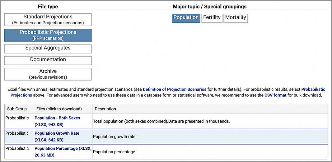
This UN dataset models projected population growth for the years 2022 to 2100.
It’s a spreadsheet of numbers, organized by country:
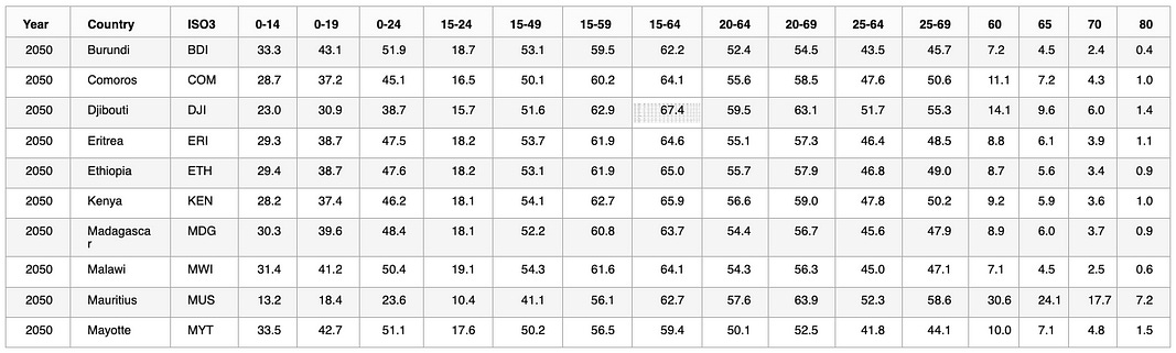
Yawn, pretty boring — and very tough to interpret. How do you make sense of these data points in a meaningful way ?
We can start by trying some different data visualizations.
2. Data Visualization to Find Trends
Data visuals are the key to finding trends within your data set.
Through charts and graphs, we can illustrate trends in the UN’s population projections, such as the gradual increase in median age.
And these days, there are some terrific tools for creating charts and graphs (with NO coding required) from our dataset. For example, Tableau, PowerBI, and Google Studio. Even GPT-4 can create on-the-fly data visualizations from a dataset. This is how I created the charts for this article.
Some of the gurus of data visualization (Nathan Yau, Edward Tufte, Alberto Cairo) recommend visualizing your data six ways from Sunday (a lot of different ways) to learn as much as possible.
So let’s follow their advice and create a few different visualizations from our data set.
Line chart — global projections
Let’s start off with a time-series line chart. Looking at the fields in our dataset, there are numeric projections for each year (in percent) for each age group.
One of the concerns expressed across many nations is the overall aging of the global population. Can we visualize this in a way that proves, or refutes, this hypothesis?
If we focus in on the 65+ age group, we can aggregate it across all countries for each year, and presto:
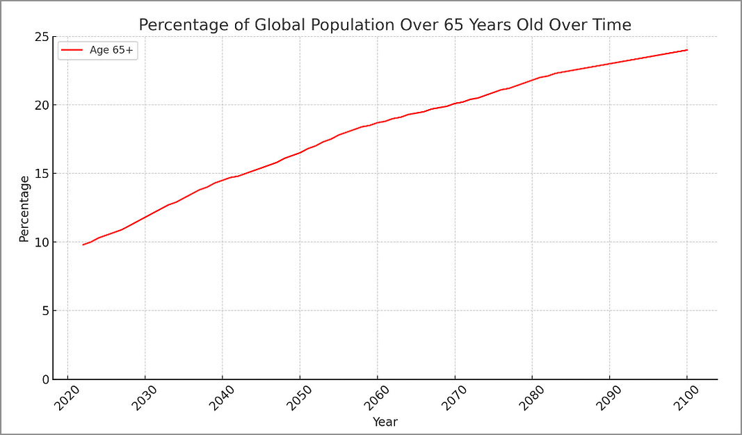
This particular data visualization indeed shows the upward projections on an aging population.
Grouped Bar Chart — projections for Canada
Now if we want to get a little more “granular” we can focus in on a particular country. A grouped bar chart is useful to show the different demographics in 2025 vs 2100 — for the country of Canada:
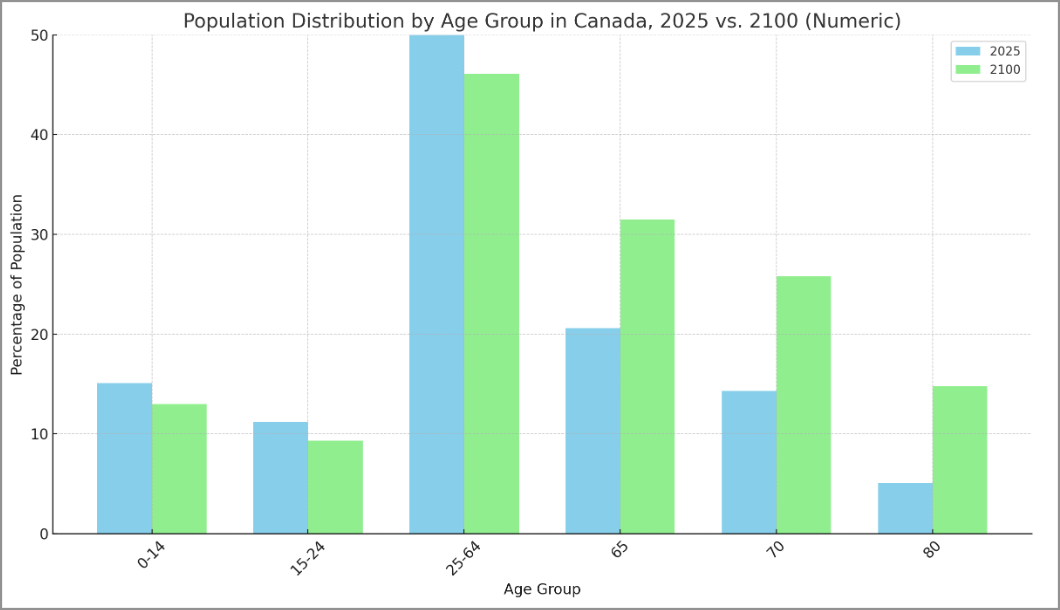
Here we can see a decline in the percentage of the population from 10–14, 15–24, and 25–64, and an increase in percentage of the population over 65, 70, and 80.
Pie Charts — a simpler view on Canada’s aging population
And lastly, for those who looove simplicity, how about a two-tone pie chart for comparison:
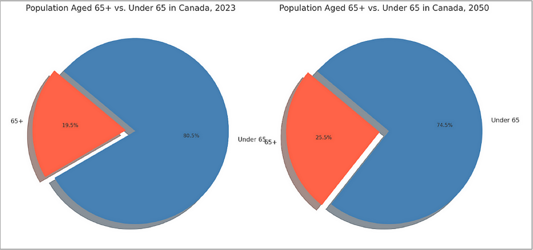
While I am not a lover of pie charts (nor is data storytelling guru Cole Nussbaumer-Knaflic, among others) some folks appreciate their simplicity.
Armed with these data visuals, we can more easily see trends in our data as up/down, more/less, higher/lower.
And we can start to weave our narrative around the ways in which our data is trending.
3. Adding in a Narrative
This is where we let fly with our qualitative analysis! We start putting words in the form of stories to our visualizations.
For example let’s shape out the narrative built around the UN’s projections highlights how an aging population will affect global economies and social structures.
We can focus on the implications of an aging population — what these changes mean for societies globally — specifically on the work force, health care, transportation, and pension systems.
The numbers are able to support the position that in Canada, for example, more money will need to be invested in health care, and there will be a significant decrease in the size of the workforce.
A simple but effective starting narrative for our pie charts:
The noticeable difference between the two charts highlights the demographic shift towards an older population over the next few decades
And we’re off and running!
In Summary…
By focusing on these three core components, we visualized the UN population projections to tell a story about global aging population projections in the next 50 years.
The narrative we created is grounded in data that is supplemented with data visualizations for clarity.
In three simple steps — data to visualization to narrative.
And that’s what the heck data storytelling is.
Thank you for reading.
If you’re interested in this topic…and want to learn more about data storytelling, check out my free 5-Day Email Course on Data Storytelling Fundamentals:

https://stats-and-stories.ck.page/datastorytelling
Let me know what you think! Any feedback/comments are very much appreciated!
Very interesting and above all very practical. Thanks for these insights! I look forward to applying them in my next presentations and/or issues here on Substack!