

Three Simple Multi-functioning Visuals That Will Make Your Data Dance
Three Simple Multi-functioning Visuals That Will Make Your Data Dance
Three under-utilized and lesser-known multi-functioning data plots (with examples)


Graphical elements on a chart can serve more than one purpose.
Multi-functionality in graphical elements allows for the efficient presentation of complex data within a limited space.
When designed with care, they can represent multiple dimensions of data simultaneously. - without overwhelming the viewer with numerous separate visualizations.
So let’s take a look at three examples of multifunctional graphing elements — the stem-and-leaf plot, the dot plot, and the heat map.
The Stem-and-Leaf Plot
A stem-and-leaf plot is used to display quantitative data where each data point is split into a “stem” (the leading digit or digits) and a “leaf” (the final digit), effectively showing the distribution of the data.
A stem-and-leaf plot organizes data to show its distribution and identify patterns by dividing each value into a stem and a leaf, useful for comparing groups or changes over time
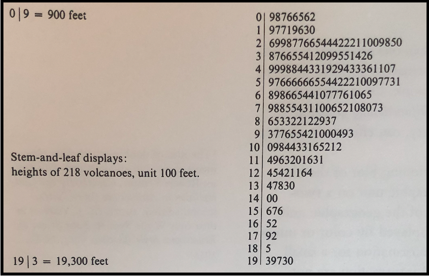
For example, a stem-and-leaf plot (from Tufte) that shows the distribution by height, for 218 volcanoes:
How many of you are able to immediately interpret the plot represented in the image?
Many of you may say “It’s just a bunch of random numbers!”. But the numbers are not random — they are representing a style of plot called the stem-and-leaf plot.
The numbers to the left of the solid line represent thousands (so from 0 up to 19,000).
Each number on the right hand side represents one volcano AND it represents a unit of 100 feet.
Dual-purpose! Cool! to clarify, if we focus in on the last 2 horizontal columns:
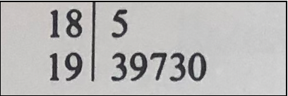
We first have one volcano that is 18,500 feet, then we have 5 volcanoes over 19,000 feet (19,300, 19,900, 19,700, 19,300, 19,000 respectively).
So we can say that the volcanoes are organized into “bins” Each bin represents a range — in this case 1000 feet per bin. So if a volcano is between 18000 feet and 19000 feet in height, we “throw it in the 18 bin”.
This style of visualization follows Tufte’s principle of creating graphical elements to provide multiple functions:
Mobilize every graphical element, perhaps several times over, to show the data
Let’s look at a more modern example.
For most of my articles, I use data from publicly available UN and development statistics.
A useful simple data set is the “World Happiness” dataset (can be found HERE).
With this dataset, each country has a representative value of how “happy” it is. The values range from approximately 2.5 (less happy) up to 7.5 (more happy).
If I create a stem-and-leaf plot at intervals of 1:
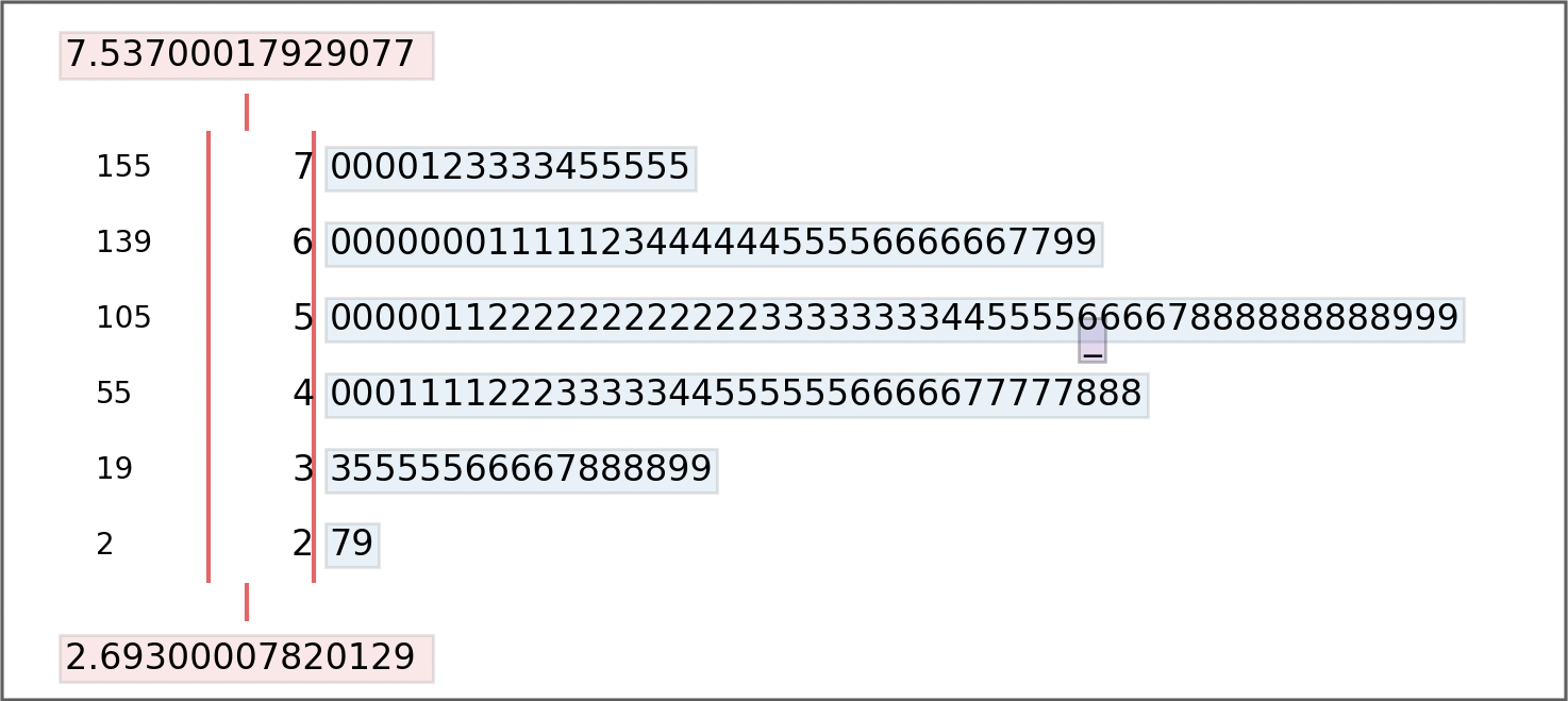
This stem-and-plot diagram gives the value of “happiness” for each country for 2017. The higher the value, the “happier” the country. We can see that the most common happiness value by country is in the range between 5 and 6.
The lowest and highest values are displayed in red. This particular stem-and-leaf was created in Python (using the stemgraphic and matplotlib libraries).
There are some variations to this classic visualization style.
Let’s take a look at another one — the dot plot.
The Dot Plot
Another useful multi-functioning example is that of the dot plot. With a dot plot, we can represent each value as a dot on our graphical display.
Each dot is representative of an entity AND represents a numerical value (for example, 1).
Going back to the UN Global Happiness data set, if I want to see where each country falls within this range of values (ie. organize into bins) I can create a dot plot:

In this example (created with Python Plotly library scatter() function), each country represents a single dot. The countries are grouped into bins that have a range of 0.5 on the “happiness” scale.
In this way, the dot plot gives us a visualization of the distribution of countries across each range. We can see that the bin with the range of 6.0–6.5 contains the largest number of countries.
But we’re not finished yet!
We can take this dot plot one level deeper. What if we want to group by larger regions — by continent?
We can display this information on the same dot-plot with each continent represented as a different colour:
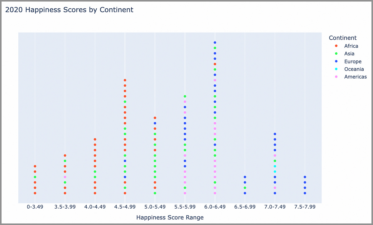
We are using the same dot plot format, but we add in an additional grouping of continents by color.
Visually, this shows a few fairly clear trends. Countries in Africa make up a large percentage of those that are at a happiness level less than 5. And on the high end, a higher percentage of countries are those in Europe.
According to well known data scientist, John Tukey:
If we are going to make a mark, it may as well be a meaningful one.
Grouping continents by colour provides us additional insights using the same dataset.
The Heat Map
Heat maps have become much more in-vogue these days. We see them on dashboards all the time now to represent comparisons between data values.
A common type of heat map is the choropleth map. This type of map uses variations in coloring to represent the magnitude of a statistical variable, The color intensity is shown across regions with varying levels of granularity (ie, municipal, state, provincial, national).
The colour serves multiple purposes in that it defines a region (ie a country) and the value associated with that region.
For example, using the same “Global Happiness” data from our previous example, displayed as a choropleth map:

The darker shades of blue in this data visualization denote higher levels of happiness (according to the GHI data set). The human eye is very good at discerning variations in the shade of a colour.
Another useful representation using this technique is to answer the question - which countries have become more/less happy over time?
For this, we can use 2 colors (red for “less happy” and blue for “more happy” and shade our map accordingly:

This example shows that some countries have become much happier (darker shades of blue)over this time frame and other have become much less happy (darker shades of red).
The darker shades catch our eye much more quickly, highlighting the more significant changes.
In Summary…
The thoughtful integration of multifunctional graphical elements into data visualizations adds depth to the interpretation of complex data.
The bottom line for effective visualization: If you can combine simplicity with depth, your plots can communicate in more meaningful ways.
So when applied in the right context, stem-and-leaf plots, dot plots, and choropleth maps can be extremely effective visualization tools.
One of the dangers of multi-functioning elements is that they may be unconventional for the viewer. In other words, the viewer may have not been exposed to the multivariate (more than one variable) methodology being used.
This can be remedied by providing an in-depth explanation of the visualization for those who may not be familiar with the particular style.
Therefore, the potential to improve data comprehension and the ability to provide interesting visual alternatives justifies the effort
Thank you for reading.
If you’re interested in knowing more about how to create useful visualizations for deeper data storytelling, check out my free 5-Day Email Course on Data Storytelling Fundamentals:

https://stats-and-stories.ck.page/datastorytelling
Let me know what you think! Any feedback/comments are very much appreciated!
IMHO: Use these charts with caution. Depending on your audience's experience and data savviness, this stem and leaf plot could captivate those willing to dive into details. However, could its complexity turn away a general audience? Better to be clear than clever, right?