

The Work of Du Bois: Five Provocative and Beautiful Visuals That Paved the Way For Modern Data Science
The Work of Du Bois: Five Provocative and Beautiful Visuals That Paved the Way For Modern Data Science
Some examples of Dr. Du Bois's pioneering work in data visuals and racial equality

W. E. B. Du Bois was creating modern data visualizations by hand well before they were a common tool for analysis.
Many of the visualizations we use today can be at least partly attributed to the work of this brilliant sociologist and researcher.
And Dr. Du Bois created these beautiful data visualizations before the field of data science had been defined.
In 1900, professor Du Bois (an African American graduate of Harvard University) was tasked with putting together a set of data visualizations as part of an exhibit to be displayed at the 1900 Paris World Exposition.
Vivid in colour, design, and innovation, these amazing visualizations stole the show, not only shining a spotlight on issues of racial equality, but also on the fields of sociology and quantitative research.
Here are five of his noteworthy data visualizations and their relevance to contemporary data science practices.
Tree Map Chart — One Of The First
To represent the various numbers of black folks in a range of occupations across the United States, Dr. Du Bois displayed a chart using a two dimensional area to represent number of black folks by occupation.
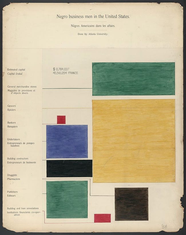
This visualization is one of the earliest examples of a tree map.
In this chart , the largest proportion of folks work in merchandise and grocery stores, followed by undertakers, publishers, pharmacists, etc.
Today, tree maps are used by economists, policy analysts, and social scientists to analyze and present data on economic disparities.
The data story:
What this chart shows is a clear imbalance in the representation of folks in certain fields — for example as bankers and other financial positions.
These two specific imbalances stand out vividly and effectively in red.
Flow Map — Historical Slave Routes
Du Bois opened up the Georgia study with one of the most iconic visualizations of the exhibition.
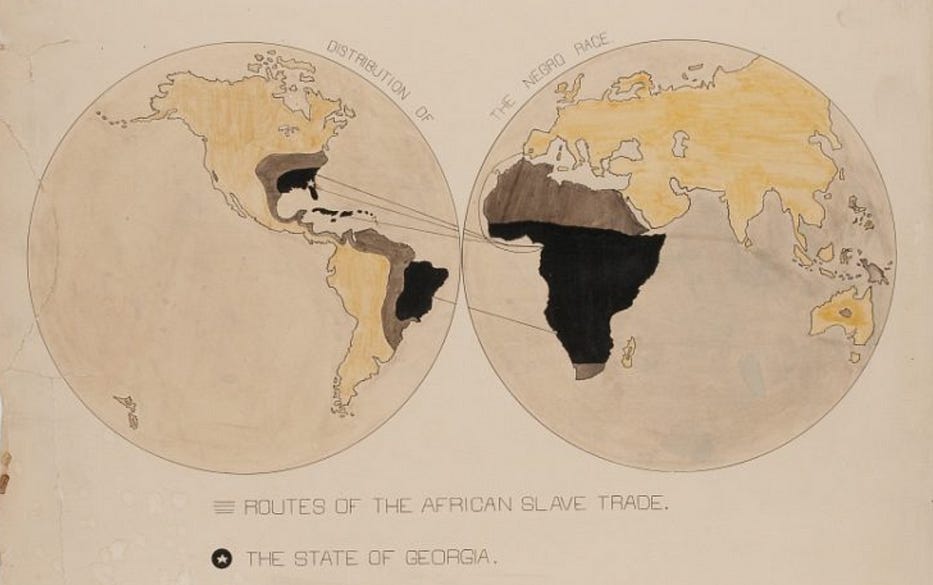
This map mirrors the function of modern flow maps, which illustrate movement between geographic locations such as migration, trade, or travel routes.
With this map, Du Bois captures the history and relevance of the entire African American population, showing the connections of African Americans to a place of origin, to their roots, to a place of cultural heritage and significance.
The data story:
The prevailing thinking of the time was that blacks were inferior in mind and thought because they lacked history and culture.
In one fell swoop, this map establishes origin and identifies the reasons that these folks were forcibly removed from their place of origin — via the 400-year colonial-imposed slave trade.
One of Dr. Du Bois’s most famous quotes appears on this slide:
The problem of the twentieth century is the problem of the color-line
— W.E.B Dubois
The story this map tells is that the purported “inferiority” of black folks was not an evolutionary characteristic but was a temporary state brought on by the racial and colour castes imposed by white colonial rule — via 400 year of the slave trade.
This flow map is a very powerful visualization.
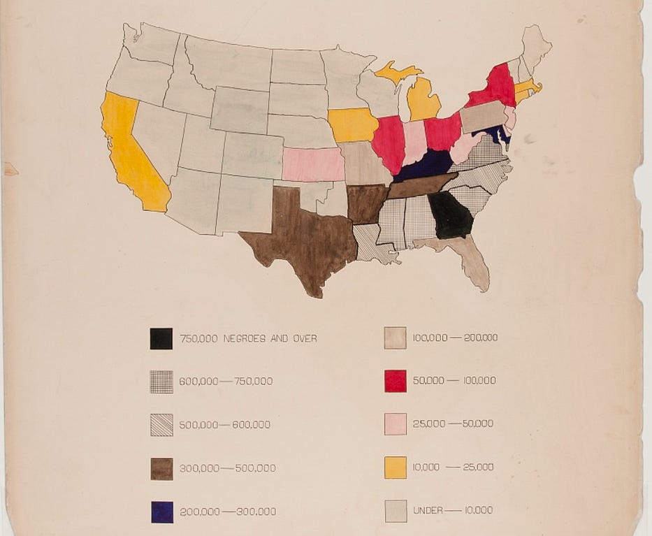
Choropleth Map — Regional Population Numbers
from the global flow map, the next step for Du Bois was to represent demographics at a national level.
His team displayed this visually using a choropleth map.
Choropleth maps use color coding to classify numbers or percentages from region to region, with darker shades typically representing larger numbers.
Modern choropleth mapping is used to depict data like population density, voting patterns, or economic indicators by geographic area.
The data story:
This map provides black population levels across the United States by giving the values by state. Each range of values is represented by either a distinctive colour or texture.
Using the technique of progressive disclosure, the next step of disclosure continues to the state level, and then even more precisely to the county level Dr. Dubois and his team did this very well for their exhibit.
Combination Data Visual — Pauperism
Another innovative and striking visualizations was the merging two individual data representations to show the extremely low number of black folks in the US state of Georgia who were paupers.
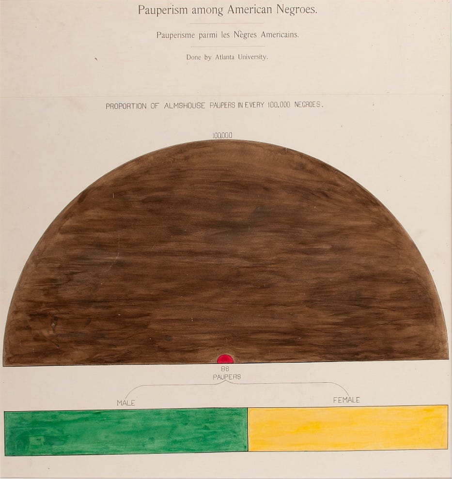
The top visualization in this image is a variant of a pie chart known as a part-to-whole diagram. The bottom visualization is s simple bar chart.
The big brown half-circle represents 100,000 Black folks and the tiny red circle represents the relatively tiny number of them (86) in almshouses. The second visualization takes those identified as paupers and separates them into gender.
The data story:
In this context, paupers were folks who relied on assistance to survive. Back then, these folks were in almshouses.
As with many of the visualizations presented in Paris, this dual-purpose chart highlights the progress and self-sufficiency of African Americans while also shedding light on the lack of national and state aid offered at the time.
The largeness of the brown half-circle relative to the tiny red circle dramatically highlights the position that in freedom, “Black folks were fine AND doing it on their own”.
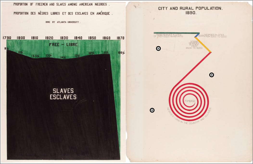
Stacked Bar Chart — From Slavery to Freedom
The period between 1860 and 1890 in the United States was one of significant change. The US Civil War of the 1860s led to the emancipation (freeing) of all slaves within the entirety of the country.
Dr. Du Bois captures this brilliantly in vivid colour with a stacked bar chart visualization that highlights this transition.
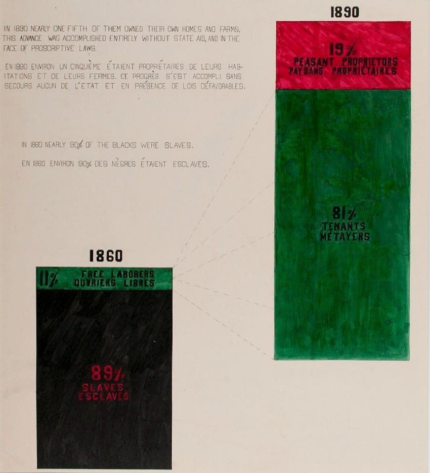
Stacked bar charts are an effective tool for showing changes in data distribution over time within a category.
It is used in modern data analysis for similar purposes.
The data story:
The first bar on the left shows the percentage of Black folks who were slaves vs. free in the year 1860. Slave numbers are shown dramatically in black and red.
After emancipation, with the bar on the right, we can see the huge transition from slaves to owners and tenants — all accomplished “entirely without state aid and in the face of proscriptive laws”.
The colours here are perfectly used. For me, the black dramatically shows the slavery numbers of 1860 as an all-consuming cancer, transitioning to the 1890 bar coloured in the rich green of freedom.
In Summary…
The presentation as a whole and within each individual visualization was groundbreaking. Many of the data visualizations used by Dr. Du Bois and his team are still used in modern data visualizations.
Dr. Du Bois also pushed the boundaries of the social structures of the day. He put together a team of Black researchers (some of who were women) at a time when the oppressive position was that Black folks were inferior in knowledge and motivation.
These visualizations are incredibly precious — every single one is one of a kind — drawn with skill, detail, care, and uniqueness.
They are lovely, and powerful, and still incredibly relevant today.
Thank you for reading.
If you want to learn more about data storytelling, check out my free 5-Day Email Course on Data Storytelling Fundamentals:

https://stats-and-stories.ck.page/datastorytelling
No strings attached. Let me know what you think! Any feedback/comments are very much appreciated!