

Sure Fire Streamlit: A Sidebar And Multi-visual Layout You'll Love
Sure Fire Streamlit: A Sidebar And Multi-visual Layout You'll Love
A modular Python Streamlit tutorial for interactive drop downs and data visualizations


Python Streamlit is a fast-growing framework for creating interactive maps using Python code.
Interactive maps are better than static maps as they provide granular configuration opportunities for your users.
Let me step you through the process of building an interactive dashboard application from scratch using the Streamlit framework.
Today, we will create:
A sidebar with two dropdown menus allowing the user to select both a year and a colour scheme
A global choropleth map showing results by country (for a chosen year)
A horizontal bar chart showing the Top 10 countries by value (for a chosen year)
A set of range values showing high, average, and low (for a chosen year)
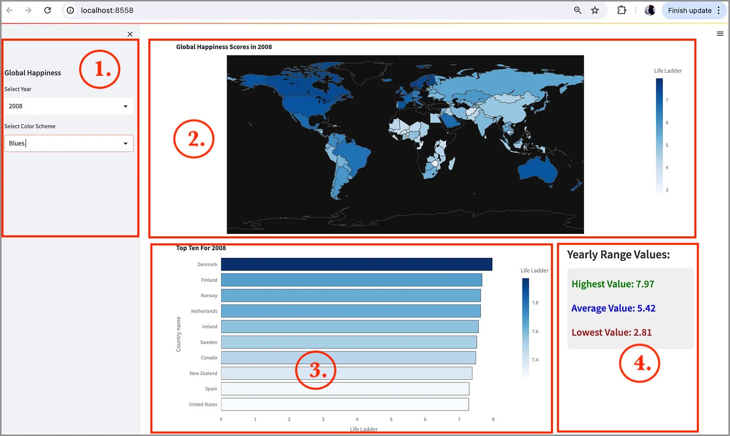
Visually, our results will look similar to:
Lot’s of awesome functionality to create, so let’s step through this code in a controlled and modular fashion!
The Dataset
For this exercise, let’s use the well known and well put together World Happiness Report dataset.
An updated version of the report that includes 2023 data can be downloaded HERE.
To make sure this dataset is ready to use, I recommend that after you have downloaded the dataset, open it up in a spreadsheet app (ie. Excel or Numbers) and “Export” the data to CSV format. This will clean up any data inconsistencies.
Once you have your file saved (as world_happiness_2023.csv for this tutorial), we are ready to code!
First, the Python Libraries
Let’s get started with the libraries needed for our application:
import streamlit as st
import pandas as pd
import plotly.express as px
For this first step, we need to import three necessary libraries:
streamlitfor creating the web application.pandasfor data manipulation and analysis.plotly.expressfor creating interactive visualizations.
Next, we need to be able to access the data set that we downloaded beforehand (world_happiness_2023.csv):
file_path = 'world_happiness_2023.csv'
data = pd.read_csv(file_path)

# Set dark theme for the entire webpage
st.set_page_config(layout="wide", page_title="World Happiness Analysis")
In this code, we read the dataset into a pandas data frame (called data). In the above snippet, we also set the page configuration to maximize screen space. This will ensure the displayed map is large enough to interpret (layout="wide”)
Once we have our data frame loaded and our layout set, we can get on to the actual coding of our application interface, starting with the sidebar.
1. Coding The Sidebar
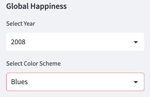
The first real visual display to set up is the sidebar. This is on the left hand side of our page and will contain the two dropdown menus for the user to interact with:
st.sidebar.subheader("Global Happiness")  # Add a subheader
years = data['year'].unique()  # Get unique years from the dataset
selected_year = st.sidebar.selectbox("Select Year", years)  # Dropdown 1

color_schemes = [
    "BrBG", "PiYG", "PRGn", "PuOr", "RdBu", "RdGy",
    "RdYlBu", "RdYlGn", "Spectral"
]
selected_color_scheme = st.sidebar.selectbox("Select Color Scheme", color_schemes)  # Dropdown 2
To set this up correctly we need to add a few lines of code:
st.sidebar.subheader("Global Happiness"): Adds a subheader to the sidebar.years = data['year'].unique(): Extracts unique years from the dataset.selected_year = st.sidebar.selectbox("Select Year", years): Creates a dropdown menu to select a year.color_schemesis a list of color schemes.selected_color_scheme = st.sidebar.selectbox("Select Color Scheme", color_schemes): Creates a dropdown menu to select a color scheme.
The guts of the code are the two selectbox() function calls that create each of the two drop down menus. The visual result:
Filtering the Dataset For Visual Display
Before we can draw each of our visualizations, we need to retrieve a subset of our data frame based on the year that the user has selected:
# Filter data for the selected year
data_year = data[data['year'] == selected_year]  # Filter the dataset for the selected year
The code filters the DataFrame to include only the rows where the 'year' column matches the selected_year.
Now we are officially ready to visualize the data!
2. Drawing Our Choropleth Map
To draw a choropleth map showing all country happiness scores by year, we can use the Plotly express choropleth() function:
# Choropleth Map
fig_choropleth = px.choropleth(
    data_year,
    locations="Country name",
    locationmode="country names",
    color="Life Ladder",
    hover_name="Country name",
    color_continuous_scale=selected_color_scheme,
    title=f"Global Happiness Scores in {selected_year}"  # Title for the map
)
fig_choropleth.update_layout(
    template="plotly_dark",  # Apply dark theme to the map
    margin=dict(t=30, b=0, l=0, r=0)  # Set margins for the map
)
st.plotly_chart(fig_choropleth, use_container_width=True)  # Display the map in Streamlit
The choropleth() function has a number of properties that we can configure to display our desired results.
We first pass in our new data frame (data_frame) for the selected year. The properties we set include the field to use for country name (Country name) and the value to set the color for each country (color).
The color_continuous_scale property contains the color scheme value selected by the user (from the drop down menu in the sidebar).
We then set a title and include the Year value to indicate the year chosen.
Lastly, we apply some visual settings. The update_layout function updates the layout of the map using:
template="plotly_dark": Applies the dark theme.margin=dict(t=30, b=0, l=0, r=0): Sets the margins.
st.plotly_chart(fig_choropleth, use_container_width=True): Displays the map in Streamlit, using the full container width.
Our resulting map should show the value for each country for the chosen year:
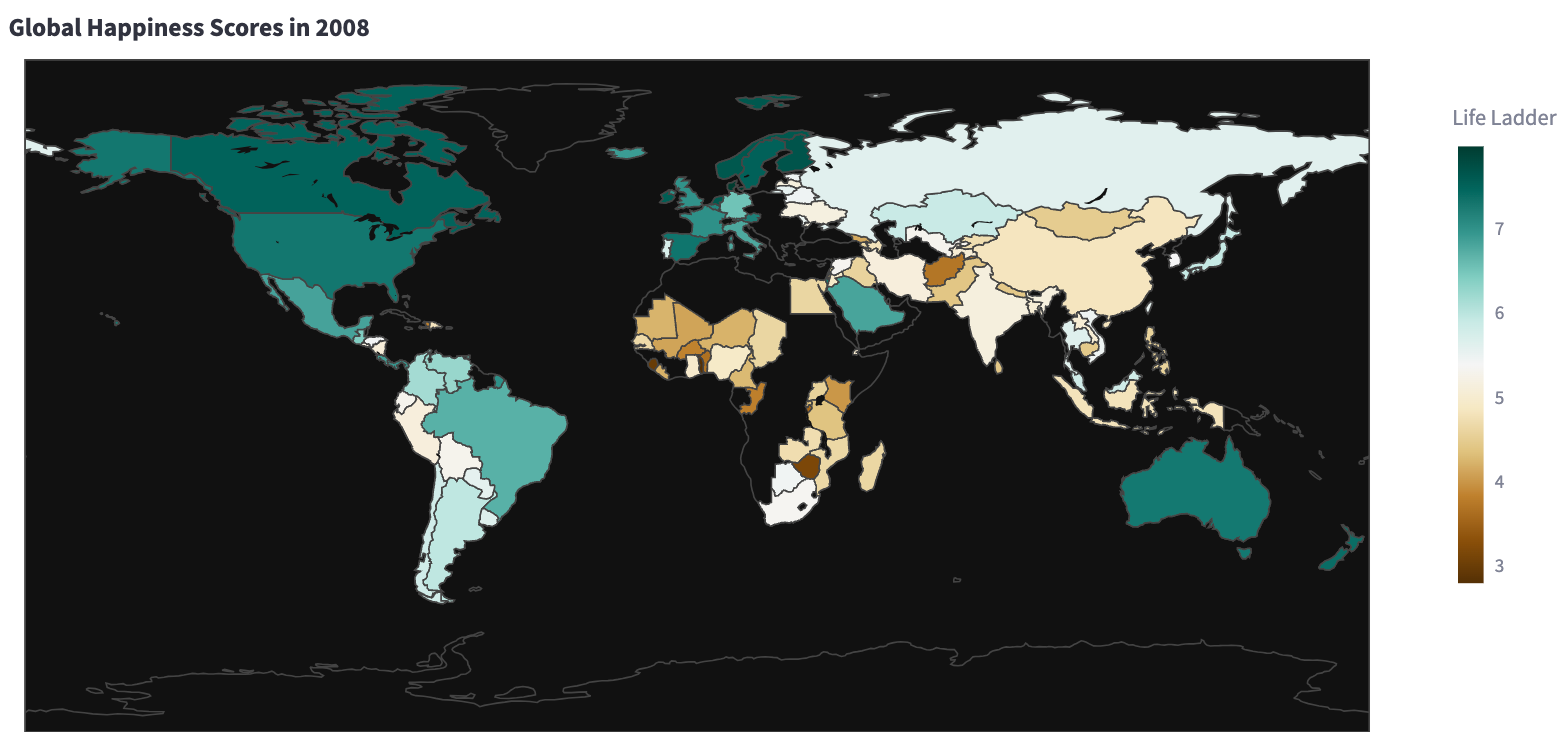
On the map dark green represents the “happiest” countries and dark brown represents the “unhappiest” countries.
Now that we have a working map, we can add in our second visualization - a horizontal bar chart.
3. Creating a Horizontal Bar Chart
To display these effectively, we first need to set up a two-column layout below our map.
Setting a Two-Column Layout Below Our Map
To set up a two-column layout, we set each column up individually:
col1, col2 = st.columns([3, 1])

with col1:
    top_10_countries = data_year.nlargest(10, 'Life Ladder')  # Get top 10 countries by happiness score
    fig_bar = px.bar(
        top_10_countries,
        x='Life Ladder',
        y='Country name',
        orientation='h',  # Horizontal bar chart
        color='Life Ladder',
        color_continuous_scale=selected_color_scheme,
        title=f"Top Ten For {selected_year}"  # Title for the bar chart
    )
    fig_bar.update_layout(
        template="plotly_dark",  # Apply dark theme to the bar chart
        yaxis={'categoryorder':'total ascending'},  # Order the y-axis by total ascending
        margin=dict(t=30, b=0, l=0, r=0),  # Set margins for the bar chart
        bargap=0.1,  # Reduce space between bars
        bargroupgap=0.1  # Reduce space between groups of bars
    )
    fig_bar.update_traces(marker_line_width=0.60)  # Make bars thinner
    st.plotly_chart(fig_bar, use_container_width=True)  # Display the bar chart in Streamlit
To start, we first create the two-column layout:
col1, col2 = st.columns([3, 1]): Creates two columns with a 3:1 width ratio. The first column is set to be 3x the width of the second column
With the first column we will draw our bar chart: In this column, we first select only the top 10 countries for the year using the nlargest() function
Then we can draw the actual chart using the px.bar() function, passing in a number of parameters (properties) for the bar chart:
x='Life Ladder': Sets the x-axis to the 'Life Ladder' column.y='Country name': Sets the y-axis to the 'Country name' column.orientation='h': Specifies a horizontal bar chart.color='Life Ladder': Sets the color of the bars based on the 'Life Ladder' column.color_continuous_scale=selected_color_scheme: Applies the selected color scheme.
Once we have the properties set, we can update the layout to a dark theme (plotly_dark) and set margins to optimize the layout.
fig_bar.update_layout(...): Updates the layout of the bar chart.template="plotly_dark": Applies the dark theme.yaxis={'categoryorder':'total ascending'}: Orders the y-axis categories in ascending order.margin=dict(t=30, b=0, l=0, r=0): Sets the margins.bargap=0.1: Reduces the space between bars.bargroupgap=0.1: Reduces the space between groups of bars.
The bar chart looks similar to this:
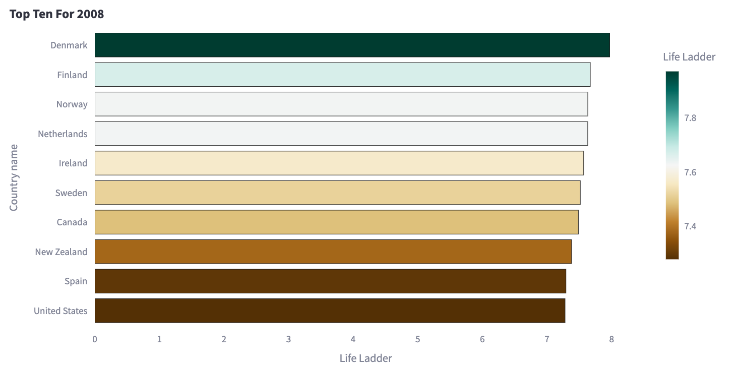
This example is using the default colour scheme (the first option in the dropdown menu).
Now that our chart is displayed, we can add in the 2nd column of data - the high, average, and low values for the chosen year.
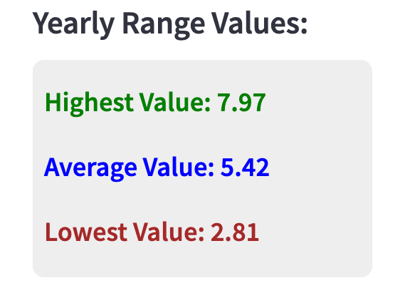
4. Displaying Range Values
To provide a simple demonstration of multi-column layouts, and to give an example of how to add markup to a Streamlit app, our Python code:
with col2:
    st.subheader("Yearly Values:")
    max_value = data_year['Life Ladder'].max()
    min_value = data_year[data_year['Life Ladder'] > 0]['Life Ladder'].min()
    avg_value = data_year['Life Ladder'].mean()

    st.markdown(
        f"""
        <div style="background-color:#eeeeee; padding: 10px; border-radius: 10px;">
            <h4 style='color:green;'>Highest Value: {max_value:.2f}</h4>
            <h4 style='color:blue;'>Average Value: {avg_value:.2f}</h4>
            <h4 style='color:brown;'>Lowest Value (non-0): {min_value:.2f}</h4>
        </div>
        """,
        unsafe_allow_html=True
    )
Remember that column 2 is only 33% of the column, so we have less room to work with. And to display our three numerical values in our smaller column, we can use the Streamlit markdown() function.
The results for col2 for the chosen year:
And that is all of the code that we need!
The resulting dashboard from our 80 lines of code:
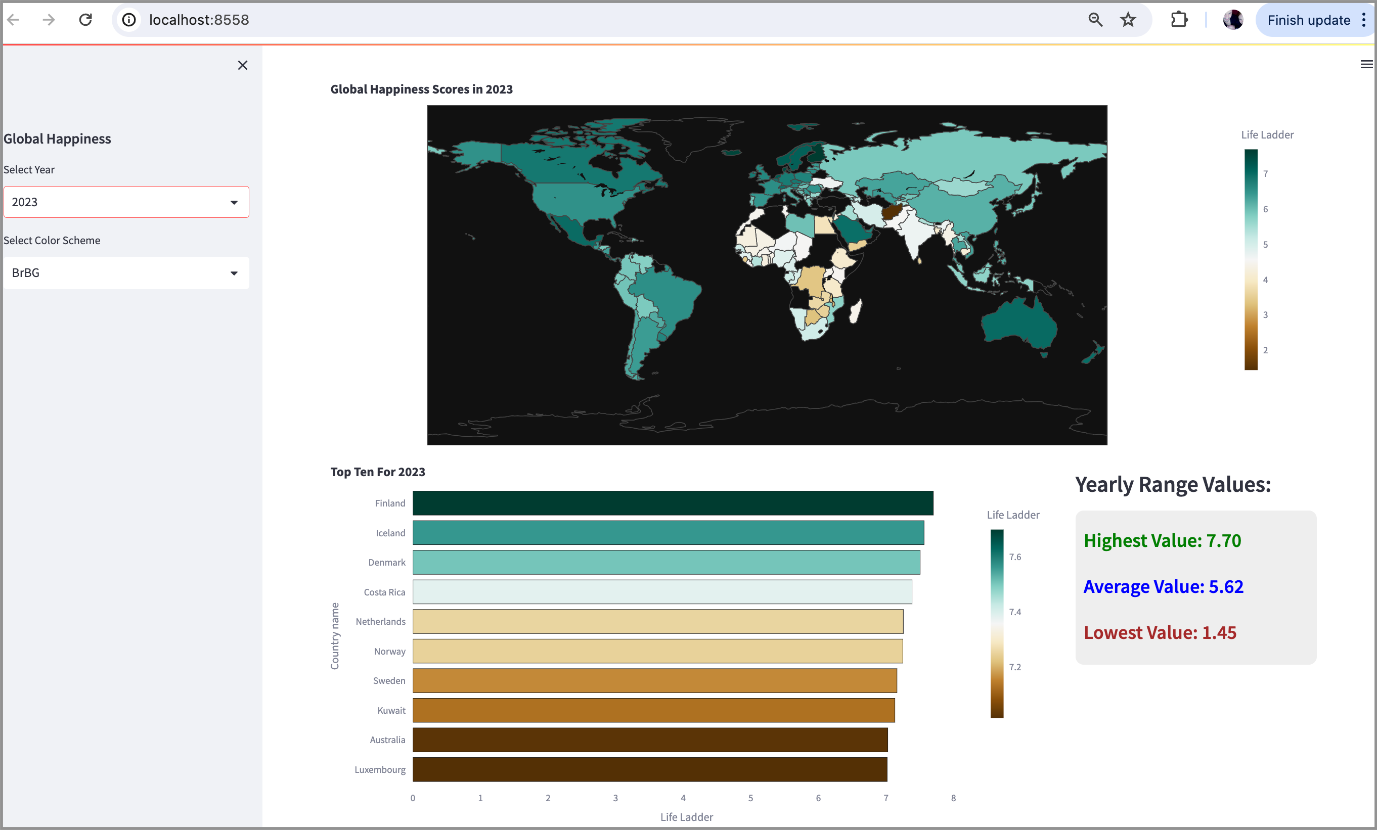
We have the two dropdown menus on the left hand side. The user can choose the year and the colour scheme to update all three visual displays.
Very nice!
In Summary…
Streamlit is really terrific for the simplicity and compactness of creating data visualization applications.
We were able to create an interactive data visualization dashboard with well under 100 lines of code.
This particular example demonstrates data visualization core functionality, not best practices.
We can address best practices with additional HTML/CSS a using the Streamlit markdown() function - or by providing additional configuration through the properties of each visualization.
These exercises are best left to additional articles - for example, a detailed article for those who are proficient in HTML and CSS.
Thank you for reading!
If you are interested in streamlining your Streamlit coding workflow, sign up for this free 5-day email course on Prompting GPT-4 for data visuals:
