

Streamlit Simplicity With GPT-4: One Powerful Prompt To Dashboard Creation
Streamlit Simplicity With GPT-4: One Powerful Prompt To Dashboard Creation
Using one GPT-4 prompt to create an interactive Python Streamlit dashboard code


Lately, I have been working GPT-4 hard to generate Python Streamlit dashboard code.
I’ve been putting in a bunch of time prompt engineering GPT-4 — so that you don’t have to.
And I have some great news - the complexity of the Streamlit dashboard design is removed with the simplicity of GPT-4 prompting.
If I have a useful data set, I can create a working interactive Python Streamlit multi-visual dashboard with a single GPT-4 prompt.
Let me show you how you can create a Streamlit dashboard with:
A dropdown menu allowing the user to select the Year
Global Choropleth map by country(updated by year).
Horizontal bar chart of top 10 countries (updated by year)
From just one careful prompt.
The Dataset — UN Global Food Security
My wife works for the UN Food and Agriculture Organization and often has to make difficult decisions related to global food security.
To find common ground for dialog and to support her work, today I am going to use a new dataset (to me). The UN food security dataset can be found HERE.
There are a few options to consider when downloading the dataset:
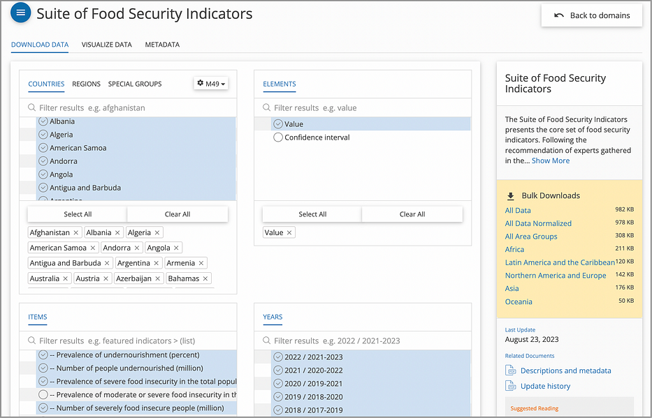
For the CSV file to download, I have chosen all of the countries for all of the years available (2000–2022), along with 4 important indicators:
Prevalence of undernourishment (%)
Number of people undernourished (million)
Prevalence of severe food insecurity in the total population (%)
Number of severely food insecure people (million)
After downloading, I saved the file as UN_food_security.csv.
For this exercise, we are interested in creating a global choropleth map that displays the prevalence of food insecurity in the total population for each Year. Relevant fields in the dataset are:
Area: The name of the geographical area, such as a country or region.
Item: The name or description of the item or indicator.
Year: The actual year or range of years as a string.
Unit: The unit of measurement for the data values.
Value: The data value.
On previewing the actual data, there are a few things to consider:
For the Item — this is the indicator field that we specified during the download. We know that there are 4 indicators. We can decide which indicator(s) we want to show with our data visuals.
For the Year — This one is a bit tricky. It is shown as a “range of years” with the middle year being the “actual” year. We will need to kludge some code to handle this
For the Value — some of the data use a comparison operator (i.e.,>2.5). We need to have a way to handle this data. The simplest way is to just remove the operator.
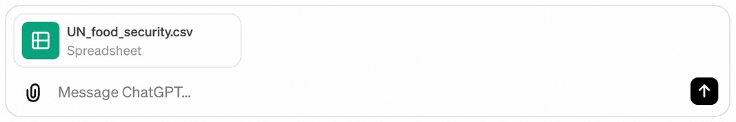
Now that we know what needs to be “massaged” we can upload our data file to GPT-4 and prompt it to do the rest.
Setting Up Our GPT-4 StreamLit Dashboard Prompt
To put it all together, our GPT-4 prompt needs to:
Read and preprocess the dataset to extract the necessary information.
Create a dropdown menu to allow the user to select the year.
Display a choropleth map for the selected year to show global food security values by country.
Display a horizontal bar chart for the countries with the highest levels of food insecurity for the selected year.
And these need to be created in a single dashboard using Streamlit
Putting all of these pieces together, here is the working prompt:
ONE SINGLE PROMPT to GPT-4:
Using the dataset provided, create the Python Streamlit code for a dashboard to display the following map and chart. From the Item field, use the Prevalence of severe food insecurity in the total population (percent) (3-year average).
For the Year, the data is in the format ‘YYYY-YYYY’ where the actual year is the middle year of the range. For the value, some values have “<” or “>” in front. Remove this value.
On the dashboard, create a dropdown menu to allow the user to select the year. Display a choropleth map that shows the global food security values by country for that year. Below the map, create a horizontal bar chart that displays the countries with the highest levels of food insecurity for that year.
Use the “YlOrRd” color scheme for both data visualizations. Use the Streamlit “wide” format for display.
You can literally copy and paste this into the GPT-4 chat window (with the CSV file, as shown above) and GPT-4 will generate working code.
Response from GPT-4 (WORKING CODE!):
import streamlit as st
import pandas as pd
import plotly.express as px

# Set page config to wide mode
st.set_page_config(layout="wide")
# Load and preprocess data
def load_data():
    data = pd.read_csv('UN_food_security.csv')
    item_filter = "Prevalence of severe food insecurity in the total population (percent) (3-year average)"
    filtered_data = data[data['Item'] == item_filter]
    filtered_data['Year_Middle'] = filtered_data['Year'].apply(lambda x: int(x.split('-')[0]) + 1)
    filtered_data['Value_Clean'] = pd.to_numeric(filtered_data['Value'].str.replace('<', '').replace('>', ''), errors='coerce')
    filtered_data.dropna(subset=['Value_Clean'], inplace=True)
    return filtered_data
data = load_data()
# Streamlit app
st.title('Global Food Security Dashboard')
# Dropdown menu for year selection
years = data['Year_Middle'].unique()
selected_year = st.selectbox('Select Year', years)
# Filter data for the selected year
filtered_data_year = data[data['Year_Middle'] == selected_year]
# Choropleth map on its own row
fig_map = px.choropleth(filtered_data_year,
                        locations="Area",
                        locationmode="country names",
                        color="Value_Clean",
                        hover_name="Area",
                        hover_data={"Year_Middle": False, "Value_Clean": True},
                        color_continuous_scale="YlOrRd",
                        title="Global Food Insecurity")
st.plotly_chart(fig_map, use_container_width=True)
# Horizontal bar chart on its own row, below the map
top_countries = filtered_data_year.nlargest(10, 'Value_Clean')
fig_bar = px.bar(top_countries,
                 x='Value_Clean',
                 y='Area',
                 orientation='h',
                 color='Value_Clean',
                 color_continuous_scale="YlOrRd",
                 title="Top Countries by Food Insecurity Level")
fig_bar.update_layout(yaxis={'categoryorder': 'total ascending'})
st.plotly_chart(fig_bar, use_container_width=True)
To run this code:
Ensure you have Streamlit, Pandas, and Plotly installed in your Python environment.
Replace the placeholder data loading and preprocessing code with the actual preprocessing logic shown earlier.
Save the script as a
.pyfile, for example,food_security_dashboard.py.Run the script using the command
streamlit run [name_of_file.py]in your terminal.
For my development environment, I use PyCharm. It has a built in Terminal window that I can open. From the command line, the command:
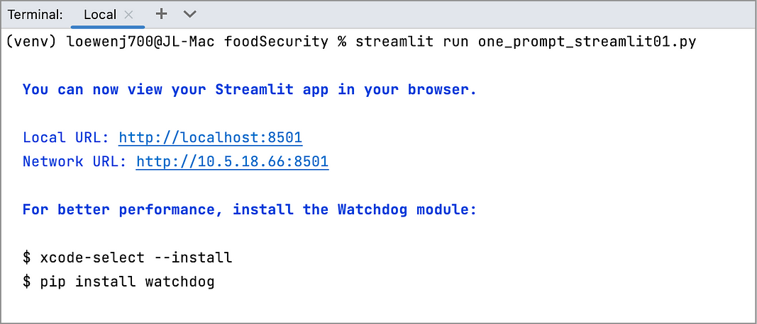
This will start the Streamlit application in your default web browser.
THE RESULT:

Presto! A beautiful and simple interactive Streamlit dashboard.
You can click on the dropdown menu to select a year. Both the map and the horizontal line chart are updated accordingly.
This is a useful and appealing dashboard for analyzing the global food security situation across a number of years.
Nice work putting this all together.
In Summary…
Yes, it is that quick, that simple, that easy. I’ve put in all the hard work refining GPT-4 prompts so that you don’t have to.
This entire interactive Streamlit dashboard— with a single GPT-4 prompt.
If you haven’t been experimenting with GPT-4 to improve your Python Streamlit dashboard creation workflow, now is the time to give it a go!
Thank you for reading.
If you want to learn more about how to prompt engineer GPT-4, sign up for this free 5-day email course on Prompting GPT-4 for data visuals. Let me know what you think:
