

Simple Interactive Python Streamlit Maps That Will Make You Shout
Simple Interactive Python Streamlit Maps That Will Make You Shout
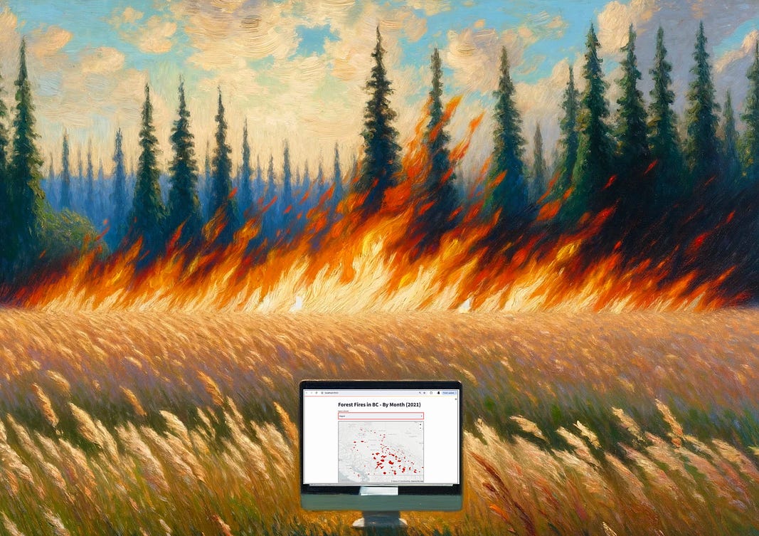
Data storytelling forest fire statistics from a NASA GIS data set

Python Streamlit is a revelation for creating interactive maps from GIS point data.
Interactive maps are better than static maps and can be used for deeper storytelling
For basic map creation, there are better Python tools than Streamlit, but if you want to create interactive maps that allow user input then Streamlit is the right tool for the job.
I have an awesome data set to test this out — Canadian forest fire GIS data (point data) from NASA’s website.
With this data we can create:
A static map that shows all forest fires in Canada for a period of time (ie. a year).
An interactive map that allows the user to select a shorter period of time (ie. each month) to view more granular data.
Can Streamlit do this for us?
Let’s give it a go!
The Problem
The forest fire situation in Canada over the past 10 years or so has been pretty terrible, particularly in British Columbia, where I am from.
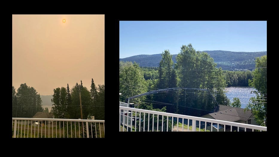
In the summer, there are many pollution days like this:
To show the monthly effects of forest fires, I want to create a data visual that shows forest fires over time (by month) for British Columbia, my home.
Now I know that NASA provides a comprehensive data set on global forest fires.
So let’s start there!
The Dataset
I have access to NASA’s global forest fire dataset (it’s public). You can download it from HERE.
The file that I want to use is fairly large — it’s approximately 240MB in size.
From a manual observation of the file, I can see that there are 19 data fields. The important ones for the sake of this coding exercise are:
latitude: The latitude coordinate of the fire detection.
longitude: The longitude coordinate of the fire detection.
brightness: The brightness of the fire in Kelvin.
acq_date: The acquisition date of the fire detection.
acq_time: The acquisition time of the fire detection.
confidence: The confidence level of the fire detection.
What I now know about this dataset
From preliminary analysis, this dataset contains:
all of the fires that were detected in Canada during the time-period .
two fields that I can use to indicate the size of the fire (in brightness and in heat) if I need to display this
latitude and longitude (GIS data) that I can use to position each fire as a point on a map.
the date of each fire
Seeing that there are latitude and longitude points, I know that I can plot each of these points on a map.
Questions that I want answered
Now I can craft the questions of this data that I am curious about:
How long of a period of time is covered in this file?
How many fires were there in Canada?
How many fires were there in British Columbia?
Now to streamline and simplify our data, let’s filter out only the BC records from this large CSV file.
Finding a geoJSON File For Canada
Now to figure out the answer to the 3rd question (how many fires in BC?), we will need to provide a 2nd dataset to GPT-4 — a geoJSON file that has the coordinates for the boundaries of British Columbia.
This is needed in order to narrow our results to display fires for just British Columbia.
There are quite a few sources for geoJSON files for Canada. I used the file found HERE.
Once I have the file downloaded, I can start to put together the code to retrieve the records from the file for British Columbia:
Import Libraries, load CSV file and GeoJSON file:
import geopandas as gpd
import pandas as pd
# Load the fire dataset
fire_data_path = 'LEO_jun_2021.csv'  # Replace with your file path
df = pd.read_csv(fire_data_path)
# Load the provided GeoJSON file for Canada's geographical data, filter for BC
canada_geojson_path = 'canada.geojson'  # Replace with your file path
canada_geojson = gpd.read_file(canada_geojson_path)

bc_geo = canada_geojson[canada_geojson['name'] == 'British Columbia']
First, we can import the necessary Python libraries: geopandas is used for geographical data operations, and pandas is used for handling data in tabular form. Next, we load a CSV file containing fire data into a pandas DataFrame. The file path is specified in fire_data_path
Lastly, we load and access the GeoJSON file we downloaded earlier and filter it to include only coordinates for British Columbia.
GeoDataFrame Creation, Spatial Join, Save New File
fires_gdf = gpd.GeoDataFrame(df, geometry=gpd.points_from_xy(df.longitude, df.latitude))
fires_gdf.set_crs(bc_geo.crs, inplace=True)

# Performing a spatial join
bc_fires = gpd.sjoin(fires_gdf, bc_geo, how="inner", predicate='intersects')

# Dropping the geometry column and any additional columns from the spatial join
bc_fires_filtered = bc_fires.drop(columns=[col for col in bc_fires.columns if col.startswith('index') or col == 'geometry'])

bc_fires_filtered.to_csv('BC_fires_2021.csv', index=False)
First, we create a GeoDataFrame from the BC fire data, setting the coordinate points from the longitude and latitude columns, and then aligns its coordinate reference system (CRS) with that of British Columbia's geographical data.
Next, we perform the spatial join (sjoin()) to filter fires within British Columbia and clean up the resulting DataFrame by removing unnecessary columns.
The final line of code stores the filtered records in a new file (BC_fires_2021.csv)
Great! Now we have a smaller file to work with (~5MB). Make sure this file is included as part of your project.
Static Streamlit Map of All Fires in BC
Let’s start first with a static map — and I am going to use Python Streamlit for this step. There are 3 reasons for this:
Streamlit is well supported by GPT-4 for this kind of mapping
Streamlit map creation does not require a geoJSON file (Plotly dash does)
I want to turn this static map into an interactive dashboard and the Streamlit library is a terrific solution to do this.
Streamlit Static Map Code (Using pydeck library):
import streamlit as st
import pandas as pd
import pydeck as pdk  # For map visualization

# Function to load data
def load_data():
    data = pd.read_csv('BC_fires_2021.csv')
    return data
# Load your dataset
data = load_data()
# Streamlit app
st.title('Map Visualization of Coordinates')
# Create a map using the latitude and longitude from the dataset
st.pydeck_chart(pdk.Deck(
    map_style='mapbox://styles/mapbox/light-v9',
    initial_view_state=pdk.ViewState(
        latitude=data['latitude'].mean(),
        longitude=data['longitude'].mean(),
        zoom=5,
        pitch=50,
    ),
    layers=[
        pdk.Layer(
            'ScatterplotLayer',
            data=data,
            get_position='[longitude, latitude]',
            get_color='[200, 30, 0, 160]',
            get_radius=3000,
        ),
    ],
))
The focal point of this code snippet is the pydeck_chart function. This function displays interactive maps using a Pydeck Deck object.
Here, this function is configured to show a map with points representing fire locations, centered on the average coordinates from the dataset. It allows users to visually explore geographic data distributions directly within a Streamlit app.
OK, Terrific.
Let’s load this file into our Python editor, Save it, and Run it.
I use PyCharm on Mac to write my Python code. This tool has a built-in terminal window that I can open to run the code in my Project:

You can see from the screenshot above that the Streamlit app is running on localhost. It will be displayed in the default browser on port 8502.
And the results:
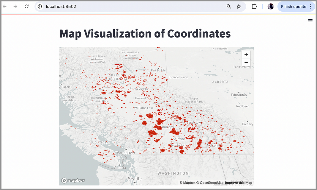
Wow, it really did work. This map shows each fire as a dot on the map. You can see clusters of fires in the southern interior of BC.
The image taken at the beginning of this article was from my brother’s balcony. He lives right in the middle of that large cluster of fires.
This map is a static map for the full range of months in our dataset.
The next step is to provide an interactive map to allow the user to select a more granular set of data.
Interactive Map For Fires of British Columbia
Now that we have a working map, let’s take it to the next level by creating a dashboard with a dropdown menu.
We can allow the user to select by month, giving them a more granular view of when the most fires are raging.
As this is quite a large file, let’s break it down into two pieces:
1. Loading the Dataset, Creating the Dropdown Menu
import streamlit as st
import pandas as pd
import pydeck as pdk  # For map visualization

# Function to load and preprocess data
def load_data():
    data = pd.read_csv('BC_fires_2021.csv')
    # Convert acq_date from string to datetime
    data['acq_date'] = pd.to_datetime(data['acq_date'])
    # Extract month and map it to month name
    data['month'] = data['acq_date'].dt.month_name()
    return data
# Load your dataset
data = load_data()
# Streamlit app
st.title('Map Visualization of Coordinates')
# Dropdown to select month
month_list = data['month'].unique()
selected_month = st.selectbox('Select a Month', month_list)
# Filter data based on selected month
filtered_data = data[data['month'] == selected_month]
As with the static map, we first load the dataset. Next, we create a dropdown menu using st.selectbox for users to choose a month. The dropdown is populated with unique month names from the dataset.
The dataset is then filtered to include only records corresponding to the selected month. This filtered data can then used for subsequent visualization tasks (ie. draw the points on a map).
2. Drawing Our Interactive Map
# Display map only if there is data for the selected month
if not filtered_data.empty:
    st.pydeck_chart(pdk.Deck(
        map_style='mapbox://styles/mapbox/light-v9',
        initial_view_state=pdk.ViewState(
            latitude=filtered_data['latitude'].mean(),
            longitude=filtered_data['longitude'].mean(),
            zoom=5,
            pitch=50,
        ),
        layers=[
            pdk.Layer(
                'ScatterplotLayer',
                data=filtered_data,
                get_position='[longitude, latitude]',
                get_color='[200, 30, 0, 160]',
                get_radius=5000,
            ),
        ],
    ))
else:
    st.write('No data available for the selected month.')
As with our previous example, the map is displayed using the pydeck library. Each point is also increased to a size of 5000 (get_radius property) to make it more visible.
Additionally, we have added a conditional check to make sure that the selected month actually has data to display. Otherwise an appropriate message is displayed.
Great! Now we can Save/Run our Python program in our editor.
And our beautiful result:
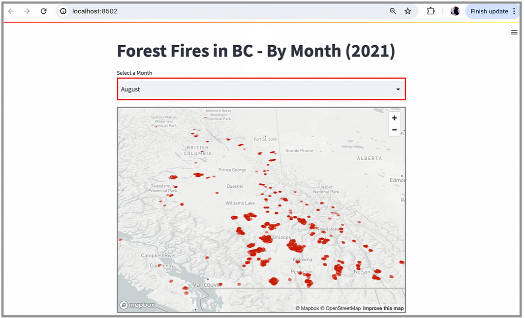
Awesome.
We have a dropdown menu to choose by month (highlighted in red) — and we have increased the radius for each fire point (to 5000) to clearly show each point clearer, and to provide a bit more dramatic color.
This is where Streamlit really shines. It creates terrific looking dashboards with a reasonable amount of code.
Nice work!
In Summary…
Not being a Streamlit expert prior to this exercise, I found this process of creating an interactive Python Streamlit dashboard WAY easier than I expected.
And we can simplify map creation even more by removing the step where we filter the dataset into a new CSV file. It is possible to generate a map from the original CSV file (for all of Canada).
If you follow a modular approach as laid out in this article, you can apply this process using any CSV file that includes GIS data.
Give it a try!
Thank you for reading.
If you’re interested in this topic…and want to learn more about data storytelling, check out my free 5-Day Email Course on Data Storytelling Fundamentals:

https://stats-and-stories.ck.page/datastorytelling
Let me know what you think! Any feedback/comments are very much appreciated!