

Sensational Data Storytelling: The Best Five Books For Your Library
Sensational Data Storytelling: The Best Five Books For Your Library
For blossoming data storytellers to help define and describe the narrative of your data.

Data scientists are inundated with vast amounts of data every day. The challenge? To extract meaningful stories from this data.
As a professor with 20+ years experience in computer science, I’ve spent my career helping students climb mountains of data to find meaningful narratives. I’ve assisted them in decoding dry numbers to support business decisions.
To help me do this well, I am always looking for direction and wisdom from those who know more than me.
Here’s my top five book recommendations to assist you in defining and describing the narrative of your data.
Pick 1. Storytelling with Data (Nussbaumer Knaflic)
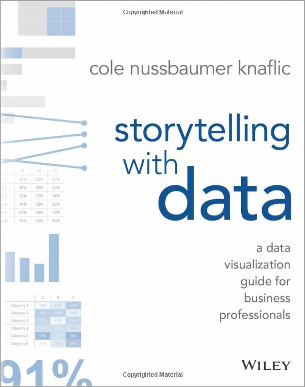
Ms. Nussbaumer Knaflic targets the essential skill of converting data into deep and insightful visualizations. The book contains numerous examples and practical advice to help business professionals improve their data visualization skills.
An example that sticks out for me is how she takes a complex, cluttered graph and through many steps, reconstructs it into an easy-to-comprehend visualization:
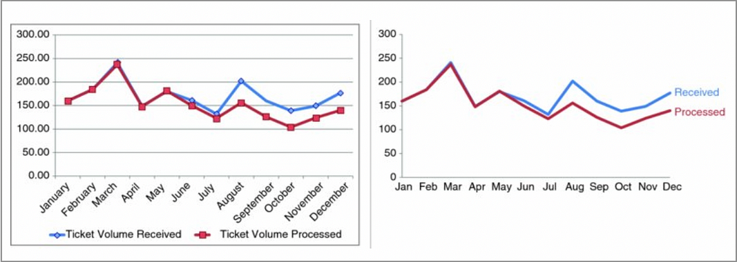
The diagram on the left is the classic Excel automatic chart generation. The chart on the right closely follows data visualization best-practices.
This visual transformation of the “before” and “after” is the practical demonstration of the principles she is promoting throughout the book.
This is such a great resource for specific examples of how to clarify the story your visualization is trying to tell.
Pick 2. The Truthful Art (Alberto Cairo)

Mr. Cairo is a strong advocate for integrity and accuracy in representing data. He focuses on how to convey complex data in a clear, engaging way, facilitating better decision-making based on solid data interpretation.
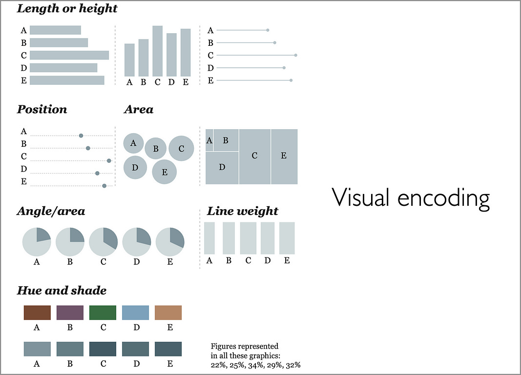
A very useful diagram in this book is the one that introduces various visual encoding techniques:
This book is filled with examples and case studies that highlight both the best practices and common mistakes in data visualization.
It’s an awesome guide to help you create effective and ethically sound stories from your data visual.
Pick 3. Visualize This (Nathan Yau)
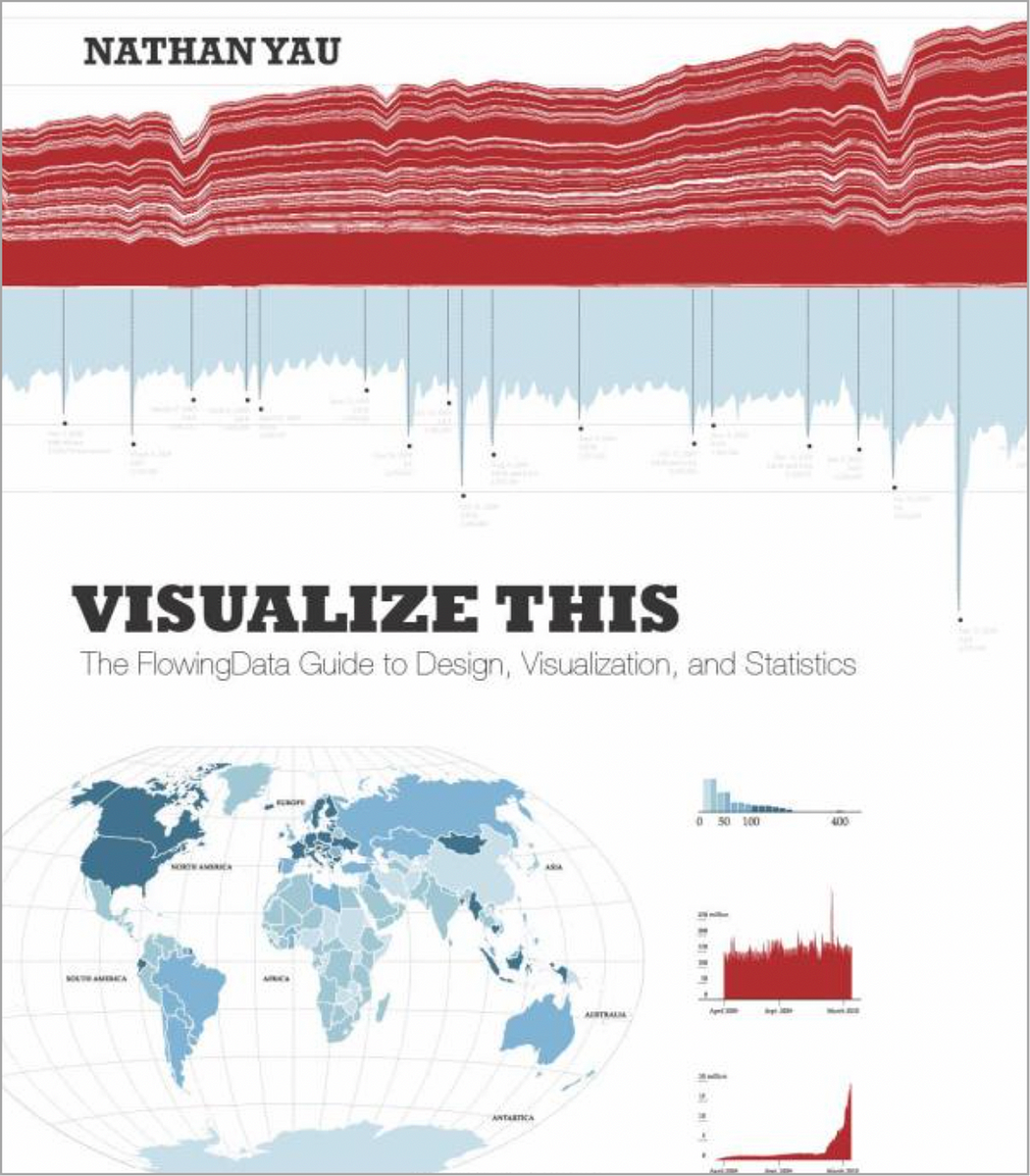
Mr. Yau’s book stands out for its emphasis on the practical application of data visualization.
For example, Yau demonstrates how to create a heat map from raw data, providing readers with practical skills they can apply directly. This hands-on approach makes the book an excellent resource for those who learn best by doing.
For some great examples of where Yau puts his principles in action go checkout his website: flowingdata.com. Here’s an application of his ideas of data in motion (US relationship progression):

This example shows relationship progression (over time) from first meeting to marriage.
Each dot represents a person, a colour the relationship phase that each person is in. The chart represents 1000 “average” people. The animation on the left is the timeline for relationship progression in the 1970s. The time on the right is the progression in the 2010s.
Pretty awesome.
Pick 4: The Visual Display of Quantitative Information (Edward Tufte)
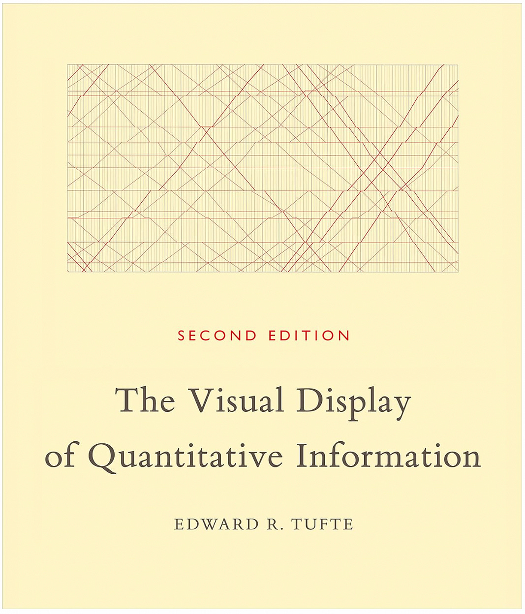
What’s not to say about this amazing book? I have a hard copy on my bookshelf and even my 11 year old daughter picks it up for the occasional read.
This book dissects and discusses visual display techniques from past to present, showing plenty of examples of the good, the bad, and the ugly.
On the good side is the inclusion (and dissection) of Charles Minard’s classic visualization diagram showing the terrible fate of Napoleon’s army:

Who doesn’t love a story about bad decisions resulting in massive casualties?
It is the deep historical context within this book that truly makes it timeless.
Pick 5. Data-Driven Storytelling (Multiple Authors)
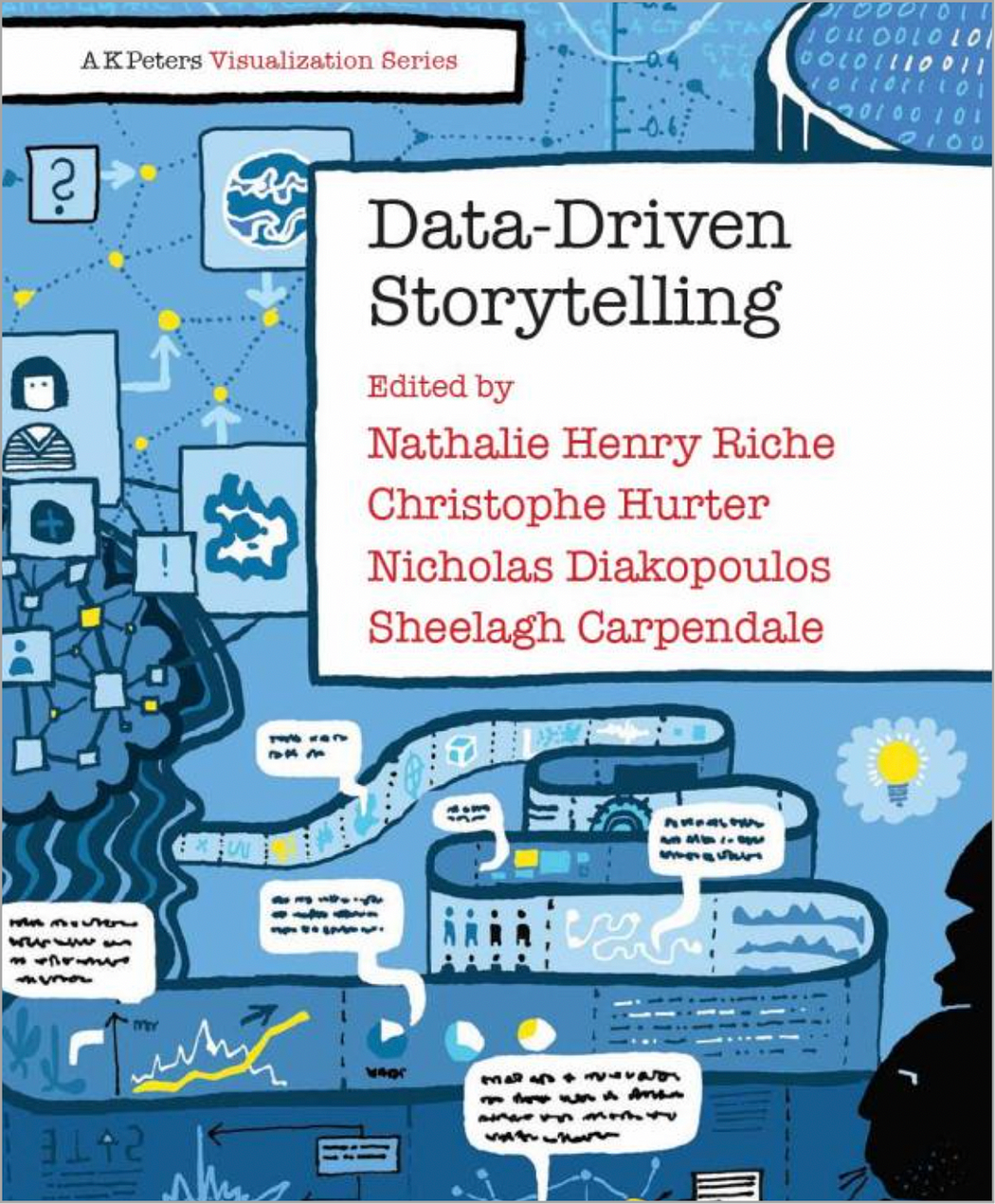
This book is a collaborative effort by several authors, each contributing their unique perspectives on data-driven storytelling.
An interesting example is the section on the role of emotion in data storytelling. It discusses how data can induce emotional responses and how this can be leveraged to bring some emotion into the narrative. After all, humans are emotional creatures.
It matches narrative techniques with data visualization by teaching readers to select the appropriate type of visualization to support a narrative arc.
Putting all the pieces together
How do all the pieces fit together in this domain? I really like this diagram:

What I like about this book (that separates it from others) is the practical advice includes how to use storytelling principles like setting, conflict, and resolution within a data context.
This makes abstract data much more relatable (bringing in emotional responses) and memorable.
In Summary…
Mastering data storytelling is not just about learning techniques but understanding their impact.
Each of these books offers practical examples that bring these techniques to life, providing a holistic view of data storytelling.
Whether you’re a seasoned data analyst or just starting out, these books can take your data from boring static numbers to moving and actionable stories.
Thank you for reading!
If you’re interested in this topic…and want to learn more about data storytelling, check out my free 5-Day Email Course on Data Storytelling Fundamentals:

https://stats-and-stories.ck.page/datastorytelling
Let me know what you think! Any feedback/comments are very much appreciated!