

Python Streamlit vs Dash Under the Hood: Which is Better?
Python Streamlit vs Dash Under the Hood: Which is Better?
Comparing Python Streamlit and Plotly Dash for interactive data visualization displays

Streamlit and Plotly Dash are two popular frameworks for building interactive data visualizations and applications.
A question I’ve been asked a few times recently is why would I chose one over the other?
Today, let’s take a ground-level look at each of their features, strengths, and weaknesses by implementing a dashboard to display UN global population projections data. And let’s create it twice: once for each framework.
The dashboard includes an interactive slider along with a choropleth map and a violin chart to show the percentage of the population by year that is projected to be over the age of 65.
Which is better? Let’s find out.
The Data Set
Let’s create a dashboard to tell us a story or two on global population projections — from a new report, the new UN population projections report (found HERE).
Taking a look at this dataset, we can see the fields:
Region, subregion, country or area : The name of the country or region the data pertains to.
ISO3 Alpha-code: The 3-letter country code as per ISO standards.
Year: The year to which the data entry corresponds.
Age columns: The remaining columns from “0–4” to “80+” appear to be age-specific data, likely representing percentages of the population within that age group.
There are a number of age columns. For this particular exercise, we want to focus on how these numbers are projecting a global aging population from the current year to the year 2100. The most important age column then for us to use is the 65+ age column as that gives us an aggregate of all the folks who are projected to be over 65 for a particular year (and a particular country).
How Can We View This Data Effectively?
For this exercise, we will use 2 data visuals and one “widget” for each dashboard:
Choropleth Map: A global map displaying the percentage of the population over 65 by country.
Violin Chart: Showing the distribution of population projections over time, for the over 65 population world-wide.
Interactive slider — allowing the user to click on each 5 year increment, updating both the choropleth map and the violin plot for that year.
And we will create these using both Plotly Dash and Streamlit
Let’s get to it, starting with Plotly Dash.
Python Plotly Dash
Plotly Dash is a Python framework that allows us to build web applications without any JavaScript. Dash apps are rendered in the web browser and can be deployed to servers.
Let’s take a look at how to create a Plotly Dash example for our population projections:
Section 1: Importing Libraries and Loading Data
import dash
from dash import html, dcc, Input, Output
import plotly.express as px
import pandas as pd

# Load your data
data = pd.read_csv('pp_median_country.csv')

# Preparing the additional total column for choropleth map
data['65+_total'] = data['65+']
Importing Libraries: This section imports necessary libraries for Dash, Plotly, and Pandas.
Loading Data: Reads the CSV file containing the population data and prepares the data by adding a '65+_total' column for the choropleth map.
Section 2: Initializing the Dash App and Defining The Layout
# Initialize the Dash app
app = dash.Dash(__name__)

# Define the layout of the app
app.layout = html.Div([
    html.H1("Population Over 65 Dashboard"),
    dcc.Slider(
        id='year-slider',
        min=data['Year'].min(),
        max=data['Year'].max(),
        value=data['Year'].min(),
        marks={str(year): str(year) for year in range(int(data['Year'].min()), int(data['Year'].max()) + 1, 5)},
        step=None,
    ),
    dcc.Graph(id='choropleth-map'),
    dcc.Graph(id='violin-chart')
])
Initializing the App: Creates an instance of the Dash app.
Defining the Layout: Sets up the layout of the app with a title, a slider for selecting the year, and two placeholders for the choropleth map and violin chart.
Section 3: Callback Function for Updating Choropleth Map
# Callback for updating choropleth map
@app.callback(
    Output('choropleth-map', 'figure'),
    [Input('year-slider', 'value')])
def update_map(selected_year):
    filtered_data = data[data['Year'] == selected_year]
    fig = px.choropleth(filtered_data,
                        locations='ISO3 Alpha-code',
                        color='65+_total',
                        hover_name='Region, subregion, country or area *',
                        color_continuous_scale='YlOrRd')
    fig.update_layout(title=f'Percentage of Population Over 65 in {selected_year}')
    return fig
Callback for Choropleth Map: Defines a callback function that updates the choropleth map when the year is changed using the slider.
Filtering Data: Filters the dataset for the selected year.
Creating the Map: Uses Plotly Express to create the choropleth map with the filtered data.
Updating the Layout: Sets the title for the choropleth map.
Section 4: Callback for Updating Violin Chart
# Callback for updating violin chart
@app.callback(
    Output('violin-chart', 'figure'),
    [Input('year-slider', 'value')])
def update_violin(selected_year):
    filtered_data = data[data['Year'] == selected_year]
    fig = px.violin(filtered_data, y='65+_total', box=True, points="all", color_discrete_sequence=['orange'])
    fig.update_layout(title=f'Distribution of Population Over 65 in {selected_year}',
                      yaxis=dict(range=[0, 100]))  # Setting static y-axis from 0 to 100
    return fig
Callback for Violin Chart: Defines a callback function that updates the violin chart when the year is changed using the slider.
Filtering Data: Filters the dataset for the selected year.
Creating the Violin Chart: Uses Plotly Express to create the violin chart with the filtered data.
Updating the Layout: Sets the title for the violin chart and specifies the y-axis range.
Section 5: Running the Dash App
# Run the Dash app
if __name__ == '__main__':
    app.run_server(debug=True)
Running the App: Starts the Dash server, allowing the app to be viewed in a web browser.
Now if we put these five sections together in order, we end out with approximately 55 lines of code. To run our Dash application, we need to make sure we have the Dash library installed.
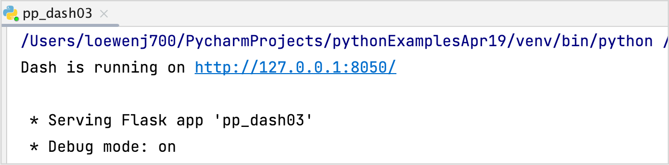
After we click “Run”, we can see if it was successful from the console (my example is in PyCharm):
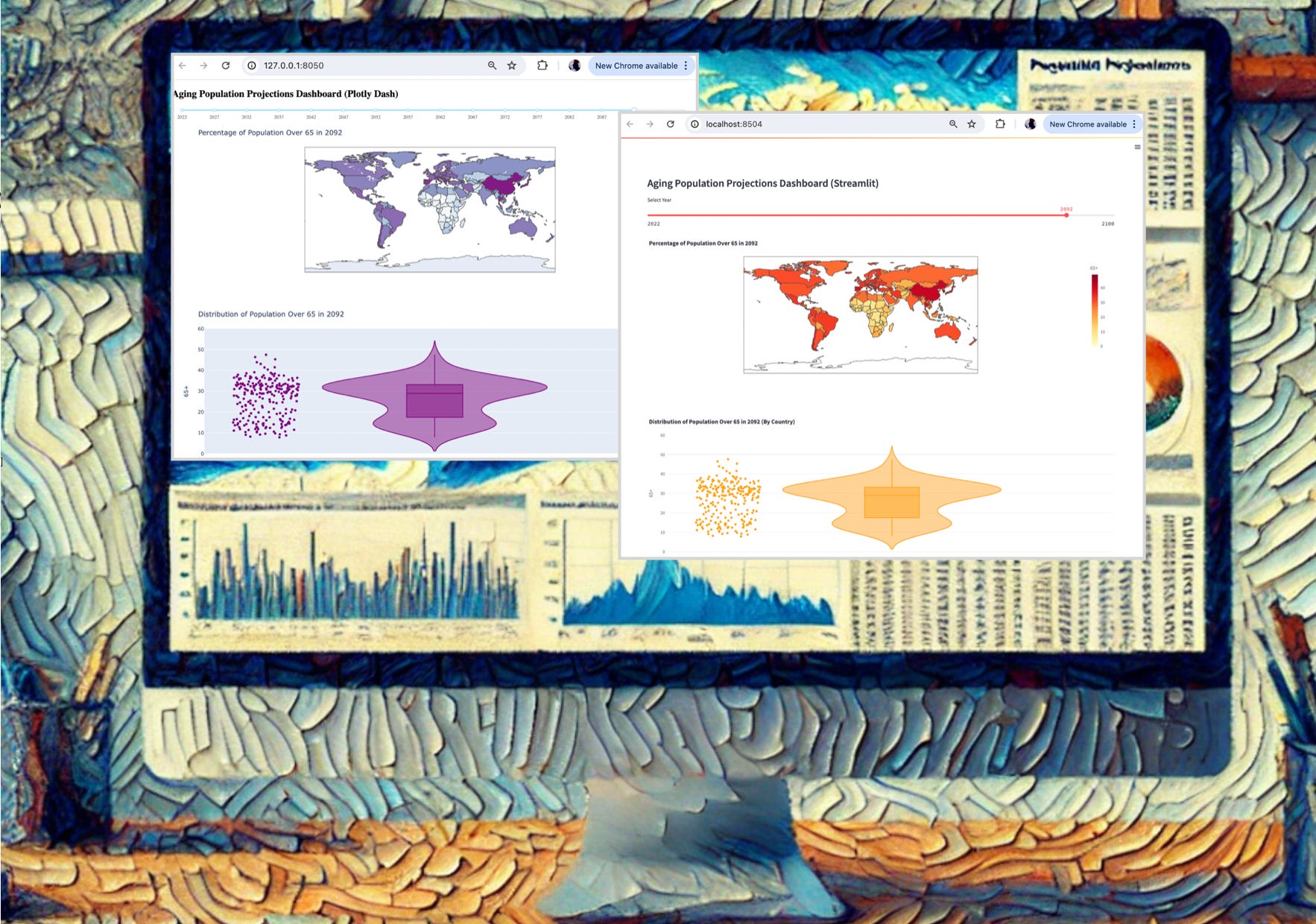
The and the application will load in our default browser at the default port of 8050. The beautiful display:
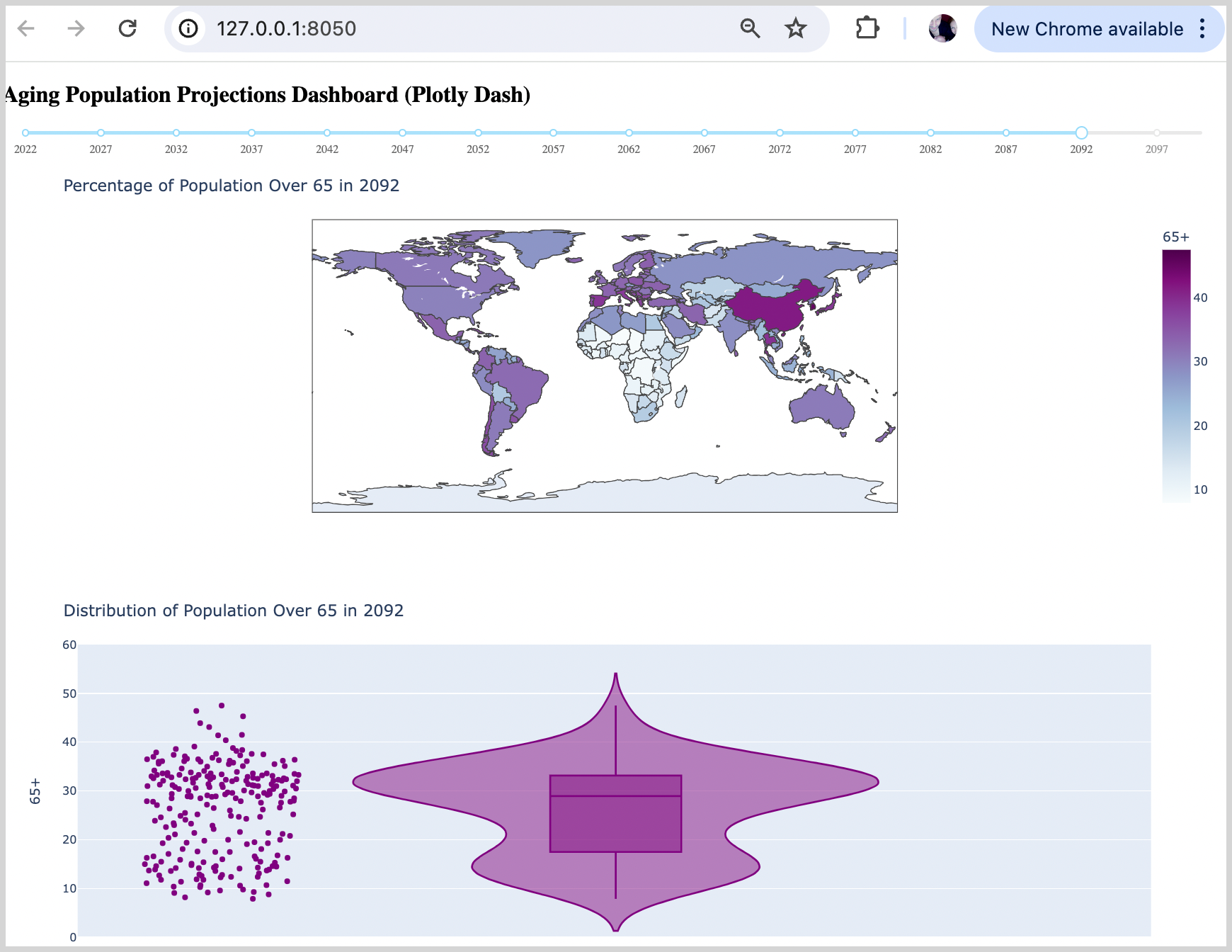
We can see our three (3) creations. The slider shows the year range (in 5-year increments) along with the resulting choropleth map and violin chart. Very nice.
Advantages of Plotly Dash:
Flexibility: Dash provides a lot of flexibility and customization options, making it suitable for more complex applications and layouts.
Performance: Dash can handle larger datasets and more interactive visualizations more efficiently than Streamlit.
Integration: Dash integrates well with other Plotly tools and libraries, providing a cohesive environment for building data-driven applications.
Disadvantages of Plotly Dash:
Complexity: Dash requires more boilerplate code and a deeper understanding of web development concepts, which can be a barrier for beginners.
Development Speed: Developing applications in Dash can be slower compared to Streamlit due to the additional setup and code required.
Alright, nice work! Now let’s take a look at our second framework, Streamlit.
Streamlit Example
Streamlit is an open-source Python library that makes it easy to create and share beautiful, custom web applications. Similar to Plotly Dash, Streamlit removes the need for JavaScript programming.
Let’s take a look at how to create a Streamlit example for our population projections:
Section 1: Importing Libraries, Load and Prepare Data
import streamlit as st
import plotly.express as px
import pandas as pd

st.set_page_config(layout="wide") # Load the data data = pd.read_csv('pp_median_country.csv')

# Calculate the maximum value of '65+' across all years for consistent scaling max_value = data['65+'].max()
Importing Libraries: This section imports necessary libraries for Streamlit, Plotly, and Pandas.
Loading Data: Reads the CSV file containing the population data.
Page Configuration: Sets the Streamlit app layout to wide.
Data Preparation: Calculates the maximum value of the
65+column across all years to ensure consistent color scaling in the choropleth map.
Section 2: Initializing the Streamlit App and Creating Slider
# Initialize the Streamlit app, create slider, filter on year
st.subheader("Aging Population Projections Dashboard (Streamlit)")

# Create slider with full width
selected_year = st.slider('Select Year', int(data['Year'].min()), int(data['Year'].max()), step=5, key='year-slider')
filtered_data = data[data['Year'] == selected_year]
App Initialization: Initializes the Streamlit app and sets up a subheader.
Slider Creation: Creates a slider widget for year selection, allowing users to select a year in 5-year increments.
Filtering Data: Filters the data based on the selected year from the slider.
Section 3: Creating A Choropleth Map
# Choropleth Map
fig_choropleth = px.choropleth(
    filtered_data,
    locations='ISO3 Alpha-code',
    color='65+',
    hover_name='Region, subregion, country or area *',
    color_continuous_scale='YlOrRd',
    range_color=(0, max_value)  # Set the color scale to be consistent
)
fig_choropleth.update_layout(title=f'Percentage of Population Over 65 in {selected_year}')
st.plotly_chart(fig_choropleth, use_container_width=True)  # Ensure full width
Choropleth Map: Uses Plotly Express to create a choropleth map showing the percentage of the population over 65 for the selected year.
Consistent Color Scale: Ensures the color scale is consistent across all years.
Full Width Display: Ensures the map uses the full width of the container.
Section 4: Creating A Violin Chart
# Violin Chart
fig_violin = px.violin(
    filtered_data,
    y='65+',
    box=True,
    points="all",
    color_discrete_sequence=['orange']
)
fig_violin.update_layout(
    title=f'Distribution of Population Over 65 in {selected_year} (By Country)',
    yaxis=dict(range=[0, 60])  # Set a static y-axis range from 0 to 100
)
st.plotly_chart(fig_violin, use_container_width=True)  # Ensure full width
Violin Chart: Uses Plotly Express to create a violin chart showing the distribution of the population over 65 for the selected year.
Static Y-Axis Range: Sets a static y-axis range to ensure consistency.
Full Width Display: Ensures the chart uses the full width of the container.
And that’s all of the code that we need. If we put these four sections of code together sequentially in a python file, and save it, we can run it as a Streamlit application. To do this, assuming we have the Streamlit library installed, we can run our application from the command line. (ie a terminal prompt).
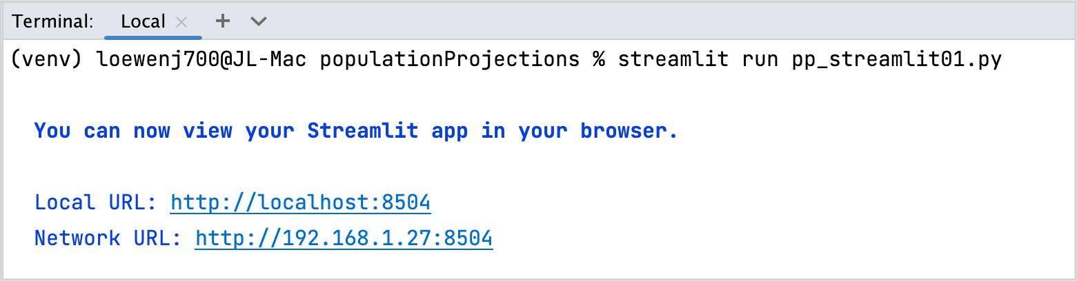
If you are using PyCharm, you can use the built-in terminal prompt (View/Tool Windows/Terminal) as shown in the image above.
And our beautiful results:
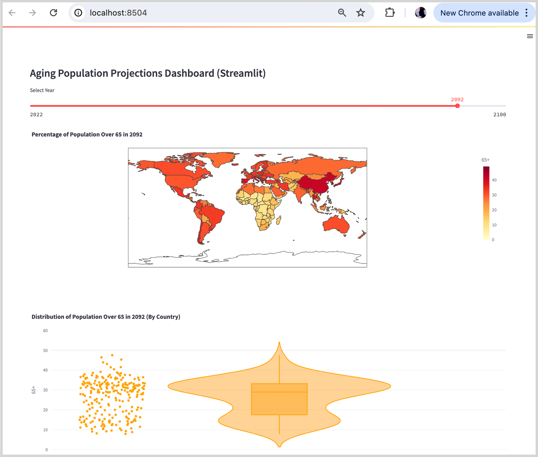
The results look very similar to our Plotly Dash results as both our apps (Dash and Streamlit) are displaying a Plotly choropleth map and violin chart.
Advantages of Streamlit:
Simplicity: Streamlit is very easy to use and requires minimal code to get started. It automatically handles many aspects of the web app, such as layout and state management.
Integration: Streamlit integrates seamlessly with the Pandas and Plotly libraries, allowing for easy implementation of a wide range of charting options with a standardized data frame format.
Speed of Development: Streamlit apps can be developed and deployed super-quickly, which is ideal for prototyping and iterative development.
Disadvantages of Streamlit:
Flexibility: The simplicity of Streamlit is a limitation when more complex layouts or customizations are required. Advanced users will find it less flexible than other frameworks.
Performance: Streamlit may not perform as well as other frameworks when dealing with very large datasets or highly interactive visualizations. There is no modularization so it requires full page reruns on execution. This can be inefficient (there are work arounds to this, but this requires additional programming knowledge).
Comparing Streamlit and Plotly Dash
Both Streamlit and Plotly Dash are powerful tools for creating data visualization applications, but they serve different purposes.
Streamlit:
Best For: Quick prototyping, simplicity, ease of use, and rapid development.
Pros: Easy to set up and use, integrates well with Python libraries, great for small to medium-sized projects.
Cons: Less flexible for complex applications, may have performance limitations with very large datasets.
Plotly Dash:
Best For: Complex applications, high customization, and performance with large datasets.
Pros: Highly flexible and customizable, better performance for larger datasets, integrates well with Plotly.
Cons: Requires more code and understanding of web development concepts, slower development speed compared to Streamlit.
Ultimately, the choice between Streamlit and Plotly Dash depends on the specific requirements of your project.
In Summary…
If you need to quickly develop a data visualization app with minimal code, Streamlit is best. If we compare the code, our Plotly Dash example is 54 lines of code and our Streamlit example is 40 lines of code.
With the Plotly Dash example, we have the coding overhead of setting the layout as a list using the finicky Dash HTML syntax. This requires extra code, and brain power.
With Streamlit, we only need specify the widget and it handles the layout for us. Quick prototyping using minimal code when using default settings. BUT as soon as we want to customize, then Streamlit becomes a bit of a bear. For more complex and customizable applications, Plotly Dash is the better option.
Hope that helps all you folks out there in Python-ville!
Thank you for reading.
If you’re interested in data visualization - and want to learn more about how to tell stories with your data, sign up for my free 5-Day Email Course on Data Storytelling Fundamentals:

https://stats-and-stories.ck.page/datastorytelling
No strings attached. Let me know what you think! Any feedback/comments are very much appreciated!