

Python Streamlit Spotlight: An Interactive Look At UNHCR Refugee Data
Python Streamlit Spotlight: An Interactive Look At UNHCR Refugee Data
A step-by-step modular approach to Streamlit application development with real data


Python Streamlit is a terrific tool for creating interactive data visualizations.
It packages all your visualizations up into a neat little application - including charts and maps - and displays them in your browser.
Ready to take Streamlit for a test drive with a dataset?
Recently, I found a new dataset (to me) on the UN High Commission for Refugees (UNHCR) website. It contains country-to-country movements for refugees:
from country of origin - where asylum seekers are going to
from country of asylum - where asylum seekers are coming from
So let’s create a Streamlit application that has:
A dropdown menu to select by country
A second dropdown menu to select by year
Radio buttons (2) to select country of origin or county of asylum
A global choropleth map to display the results by country and year.
And let’s go step-by-step using a modular development approach.
Our Dataset - Global Statistics from UNHCR Database
The UN High Commission for Refugees (UNHCR) tracks statistics on refugee movements across the globe.
Their data is freely accessible HERE.
After arriving at the download page we can be granular on the data that we select:
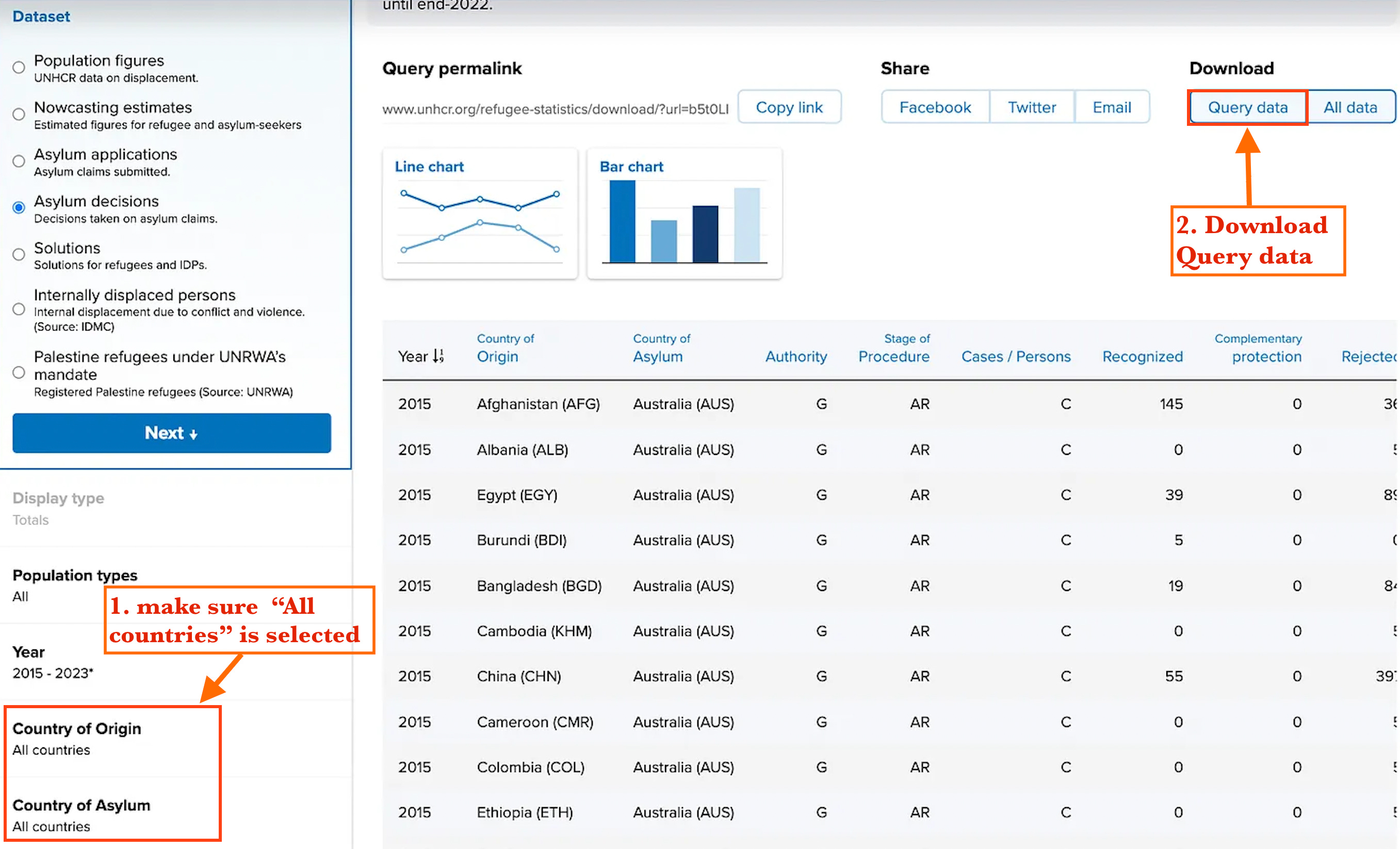
For this project, we want the dataset to contain the county of origin for each refugee and the country of asylum.
with this data, we can create a global map that shows the numbers of
from country of origin - where asylum seekers are going to
from country of asylum - where asylum seekers are coming from
Once we download the dataset, we can open it up in spreadsheet format to see what we are dealing with:
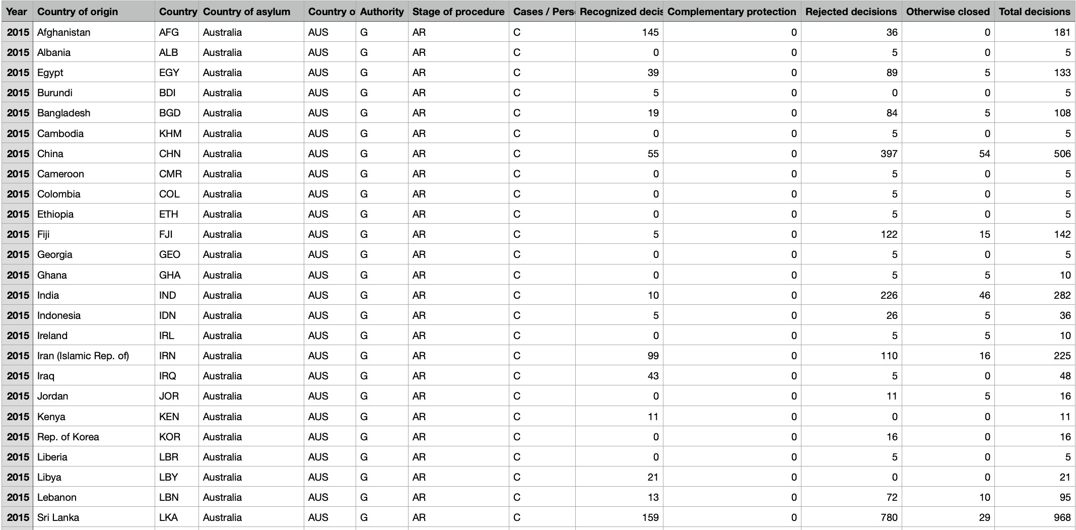
The data fields that we are interested in for this project are:
Country of origin (including 3-letter ISO code) - where a person seeking asylum is coming from
Country of asylum (including 3-letter ISO code) - where a person is actually seeking asylum
Recognized decisions - whether the person seeking asylum was accepted (numeric total by country)
Both the country of origin and asylum have what is called a “3-letter ISO code” that we can use for creating choropleth maps. Super useful!
Now let’s create our first map!
Static Map for Asylum Seekers to Canada in 2022
Using a modular approach, let’s go through the steps for creating a static map.
1. Imports and Setup:
Import the necessary libraries:
streamlitfor the web app framework,pandasfor data manipulation, andplotly.expressfor creating interactive visualizations.
import streamlit as st
import pandas as pd
import plotly.express as px
2. Data Loading Function:
Define a function
load_data()to read the dataset from a CSV file. This function also ensures that the 'Year' column is converted to an integer data type for any possible filtering or operations that require numerical year data.The function returns the loaded and slightly preprocessed DataFrame.
Call the
load_data()function to load the dataset into the variabledata.
def load_data():
    data = pd.read_csv('asylum-decisions.csv')
    data['Year'] = data['Year'].astype(int)
    return data

data = load_data()
3. Filter data for Canada:
Filter the DataFrame to include only the rows where the 'Country of asylum (ISO)' is 'CAN' (Canada) and the 'Year' is 2022.
The result is stored in
data_canada_2022, which now contains data specific to asylum decisions in Canada for the year 2022.
data_canada_2022 = data[(data['Country of asylum (ISO)'] == 'CAN') & (data['Year'] == 2022)]4. Aggregate data by country of origin:
The DataFrame
data_canada_2022is grouped by 'Country of origin (ISO)', and the 'Recognized decisions' for each group are summed.This operation aggregates the total recognized decisions for each country of origin, providing a summarized view suitable for analysis and visualization.
Reset Index:
reset_index()is called to transform the resulting Series back into a DataFrame, making it easier to work with for plotting purposes.
origin_data = data_canada_2022.groupby(['Country of origin (ISO)']).agg({
    'Recognized decisions': 'sum'
}).reset_index()
5. Choropleth Map Creation and Display:
An interactive map is created using plotly express
choroplethfunction.This map visualizes the number of recognized decisions per country of origin, using a color scale to indicate the quantity.
Display the choropleth map using
st.plotly_chart.
fig = px.choropleth(
    origin_data,
    locations="Country of origin (ISO)",
    color="Recognized decisions",
    hover_name="Country of origin (ISO)",
    hover_data={"Recognized decisions": True},
    color_continuous_scale=px.colors.sequential.YlOrRd,
    title="Recognized Asylum Decisions in Canada from Various Countries in 2022",
    labels={'Recognized decisions': 'Number of Recognized Decisions'}
)

st.plotly_chart(fig, use_container_width=True)
And that’s all the code we need!
Let’s load this file into our Python editor, Save it, and Run it.
Personally, I use PyCharm on Mac to write my Python code. This tool has a built-in terminal window that I can open to run the code in my Project:

You can see from the screenshot above that the Streamlit app is running on localhost. It will be displayed in the default browser (at whichever port above 8500 that is available):
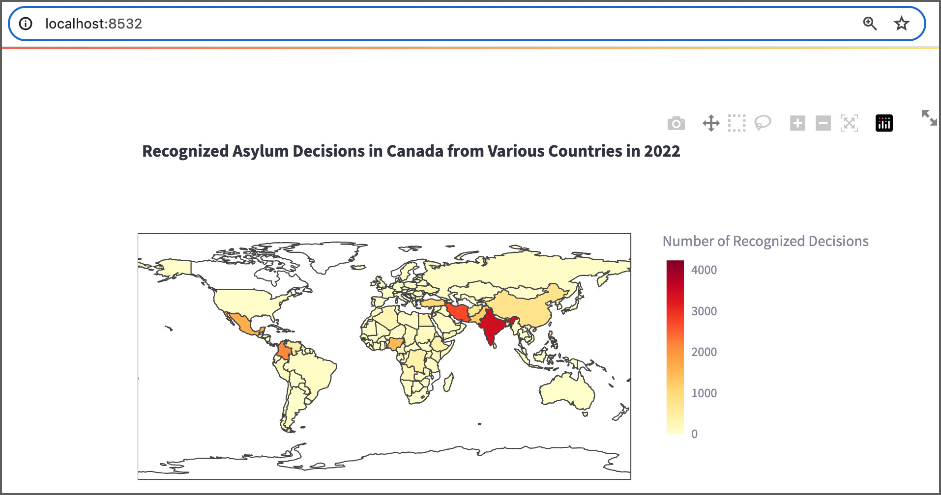
Terrific! We are on our way. We can see that Canada accepted a high number of refugees from India and Iran in 2022.
But this map is static, and only shows the results for one country for a single year.
The next step now is to make this map interactive.
Adding in Dropdown Menus By Country and Year
Now that we have a working static map, we can add in interactivity in the form of two dropdown menus:
By country - see where folks are coming from
By year - to see the changes over time
To do this, we can revise our initial code.
As there are a number of changes, here is the fully working code snippet (with changes explained below):
import streamlit as st
import pandas as pd
import plotly.express as px

# Load and prepare data
def load_data():
    data = pd.read_csv('asylum-decisions.csv')
    data['Year'] = data['Year'].astype(int)  # Ensure 'Year' is of type int
    return data

data = load_data()

# Create a mapping from ISO codes to full country names for countries of asylum
country_asylum_map = data[['Country of asylum (ISO)', 'Country of asylum']].drop_duplicates()
country_asylum_map = dict(zip(country_asylum_map['Country of asylum (ISO)'], country_asylum_map['Country of asylum']))

# Create a dropdown for selecting the country of asylum with full country names
selected_country = st.selectbox(
    'Select a country of asylum:',
    options=sorted(country_asylum_map.keys(), key=lambda iso: country_asylum_map[iso]),
    format_func=lambda iso: country_asylum_map[iso]  # Use mapping to show full country names
)

# Create a dropdown for selecting the year based on the selected country
years_available = sorted(data[data['Country of asylum (ISO)'] == selected_country]['Year'].unique(), reverse=True)
selected_year = st.selectbox('Select a year:', years_available)

# Filter data based on the selected country of asylum and year
selected_data = data[(data['Country of asylum (ISO)'] == selected_country) & (data['Year'] == selected_year)]

# Group by country of origin to aggregate recognized decisions
origin_data = selected_data.groupby(['Country of origin (ISO)']).agg({
    'Recognized decisions': 'sum'
}).reset_index()

# Create a choropleth map using Plotly
fig = px.choropleth(
    origin_data,
    locations="Country of origin (ISO)",
    color="Recognized decisions",
    hover_name="Country of origin (ISO)",
    hover_data={"Recognized decisions": True},
    color_continuous_scale=px.colors.sequential.YlOrRd,
    title=f"Recognized Asylum Decisions in {country_asylum_map[selected_country]} from Various Countries in {selected_year}",
    labels={'Recognized decisions': 'Number of Recognized Decisions'}
)

# Display the figure in Streamlit
st.plotly_chart(fig, use_container_width=True)
What we’ve added:
Mapping Creation: A dictionary is created to map ISO country codes to their corresponding full country names, ensuring the dropdown is user-friendly by displaying names instead of codes.
Dropdown Menu: The
st.selectboxfunction is used to create a dropdown menu where users can select a country of asylum.The dropdown is populated using the keys from the
country_asylum_mapdictionary, sorted by the country names for ease of use.The
format_funcparameter is utilized to convert ISO codes to full names in the display
Let’s load this code into our Python editor, Save it, and Run it.
NOTE: Make sure that the CSV we downloaded earlier is part of your project and available to this new Python file (ie. in the same directory).
Our awesome result:

Terrific! Now we can select a country from the first dropdown menu, and then a year to narrow our results on our map.
We can see where folks are coming from when they are seeking asylum - from any country for any year.
This is super useful!
This covers the first half of refugee movements (country of origin).
But we still have to answer the question of where are refugees from a particular country going to?
We can solve this by adding in another interactive element - radio buttons.
Adding in Toggle Functionality With Radio Buttons
Let’s create 2 toggling radio buttons to give the user the option of:
Country of origin - showing all the countries that a person from this country is seeking asylum in
Country of asylum - showing all of the origin countries that are seeking asylum here.
Let’s put together the new code for this:
1. Added Mapping for Country of Origin
This mapping was introduced to facilitate the use of full country names in the visualization - now it’s for both country of asylum and country of origin.
country_origin_map = data[['Country of origin (ISO)', 'Country of origin']].drop_duplicates()
country_origin_map = dict(zip(country_origin_map['Country of origin (ISO)'], country_origin_map['Country of origin']))
This code can be added just below the country_asylum_map variable.
2. Adding Radio Buttons for Data View Selection
Radio buttons were added to allow the user to toggle between viewing the data from the perspective of the country of origin and the country of asylum.
data_view = st.radio("View data for:", ('Country of Origin', 'Country of Asylum'))This code goes right below the code from Part 1.
3. Conditional Data Processing Based on Radio Button Selection
The data processing and filtering steps were significantly modified to accommodate the user's choice from the radio buttons.
if data_view == 'Country of Origin':
    # Display countries of origin for the selected country of asylum
    filtered_data = data[(data['Country of asylum (ISO)'] == selected_country) & (data['Year'] == selected_year)]
    group_data = filtered_data.groupby(['Country of origin (ISO)']).agg({
        'Recognized decisions': 'sum'
    }).reset_index()
    title_text = f"Recognized Asylum Decisions to {country_asylum_map[selected_country]} from Various Origins in {selected_year}"
    location_field = "Country of origin (ISO)"
else:
    # Display countries of asylum for the selected country of origin
    filtered_data = data[(data['Country of origin (ISO)'] == selected_country) & (data['Year'] == selected_year)]
    group_data = filtered_data.groupby(['Country of asylum (ISO)']).agg({
        'Recognized decisions': 'sum'
    }).reset_index()
    title_text = f"Recognized Asylum Decisions from {country_origin_map[selected_country]} to Various Asylums in {selected_year}"
    location_field = "Country of asylum (ISO)"
This includes conditional statements that determine how to filter and group the data based on whether the user wants to see data related to the country of origin or asylum.
This code replaces the filtered data from the previous code.
4. Dynamic Title and Location Field in Plotly Chart
The title and the location field in the Plotly choropleth chart are dynamically set based on the user’s selection from the radio buttons.
This ensures that the map visualization and the hover information are relevant to the selected data view. You can remove this code:
title=f"Recognized Asylum Decisions in {country_asylum_map[selected_country]} from Various Countries in {selected_year}",Copy codeAnd replace it with:
title=title_text, locations=location_field,These modifications fundamentally change how the application processes and visualizes the data, enabling dynamic interaction based on user inputs regarding the perspective of asylum decisions.
And our amazing result:

Phew! That’s a lot of coding but the end result is certainly worth it.
Very cool.
In Summary….
The end result is a fully functioning Streamlit Dashboard that allows us an in-depth look at global refugee movements:
where folks are seeking asylum to (by country and year)
where folks granted asylum are coming from (by country and year)
I hope you were successful at making it all work.
And please provide any questions/comments in the comments section.
Thank you for reading!
If you want to learn more about data storytelling, check out my free 5-Day Email Course on Data Storytelling Fundamentals:

https://stats-and-stories.ck.page/datastorytelling
No strings attached. Let me know what you think! Any feedback/comments are very much appreciated!