

Python Mastery: Choosing The Right Chart To Tell Your Data Story
Python Mastery: Choosing The Right Chart To Tell Your Data Story
Three practical data visualization charting examples using CO2 emissions data


With the current global deluge of data and information, there has never been a more important to communicate complex information in a clear and simple manner.
The key to this lies in choosing the the right data visualization techniques to tell the most interesting and relevant story.
The most common 2 questions asked around this are:
Where do I start?
How do I do it?
Let’s take a look at three useful techniques that will start you on your way to creating relevant and informative presentations :
small multiples
heat maps
stacked area charts
By starting with these three, we begin the process of learning how to choose the right visualization for specific kinds of data.
Now let’s get on with it - starting first with installing libraries, then downloading and accessing a useful dataset
Installing Libraries, Accessing a Dataset
First things first, we need to load the necessary libraries and the dataset. With Python, there are a number of terrific libraries that can be used for data visualizations.
For this task, we will be using pandas, seaborn, and matplotlib.pyplot.
Now before we can use these libraries, we need to make sure that they are installed. How you install them depends on the environment you are using. Personally, I use the PyCharm IDE so I can navigate to my project Preferences/Project/Python Interpreter and install each library there:

Or if you are using the command line (ie Terminal) you can install from a prompt:

Once we have the libraries installed correctly, we can add in the necessary import statements to use each library AND we can connect to our CSV file.
First though, let’s get our hands on a useful dataset.
The dataset:
The dataset that we are using in this tutorial is global CO2 data.
It was retrieved online from HERE.
The Python code to get us started:
import pandas as pd
import seaborn as sns
import matplotlib.pyplot as plt
# Load the data
data = pd.read_csv("CO2_emissions.csv", skiprows=4)
Notice that we are skipping the first 4 lines of the file as they do not contain relevant headers or data.
Visualization Our Data
Now o get an initial look at our data, let’s create a line chart displaying the CO2 emissions for all countries in our dataset. This will help us understand the overall trends before diving deeper into specific countries.
The Python code using seaborn library:
# Reshape the data
years = [str(i) for i in range(1990, 2020)]
reshaped_data = data.melt(id_vars=["Country Name", "Country Code"], value_vars=years, var_name="Year", value_name="CO2 Emissions")
# Create a line chart for all countries
plt.figure(figsize=(12, 6))
sns.lineplot(data=reshaped_data, x="Year", y="CO2 Emissions", hue="Country Name")
plt.title("CO2 Emissions for All Countries (1990-2019)")
plt.show()
We create a lineplot using seaborn. The results from trying to take the default and analyze all the countries at once:

Yikes! Waaaaaay too much going on there — you can clearly see that this data visualization is a total mess. Simple to code, but completely ineffective.
We need to find a different approach. If we are concerned about the highest offenders, we can take the approach of finding the Top 5 or 10.
Let’s pick 5 countries with higher levels of emissions: China, the United States, India, the Russian Federation, and Japan.
Data Visualization #1 — Small Multiples
To visualize and analyze the top 5 countries, we will first employ the “small multiples” technique.
Small multiples consists of creating a series of individual line charts, each depicting one country’s CO2 emissions. By arranging these charts side by side, we can easily compare and contrast the emissions trends of these countries.
The small multiples approach allows for a clear visual comparison, making it simpler to identify patterns and differences among the top emitters.
The Python code to make this work:
# Filter the data
top_countries = ["China", "United States", "India", "Russian Federation", "Japan"]
filtered_data = data[data["Country Name"].isin(top_countries)]

# Reshape the data
reshaped_data = filtered_data.melt(id_vars=["Country Name", "Country Code"], value_vars=years, var_name="Year", value_name="CO2 Emissions")

# Create small multiples of line charts
g = sns.FacetGrid(reshaped_data, col="Country Name", hue="Country Name", height=4, aspect=1)
g.map(sns.lineplot, "Year", "CO2 Emissions")

# Rotate the x-axis labels for better readability
g.set_xticklabels(rotation=45)

# Adjust the x-axis ticks to display every 10 years
g.set(xticks=[i for i, year in enumerate(years) if int(year) % 5 == 0], xticklabels=[year for year in years if int(year) % 5 == 0])

# Add a title for each subplot
g.set_titles(col_template="{col_name}")

# Adjust the space between the subplots
g.fig.subplots_adjust(wspace=.3)
# Show the plot
plt.show()
In the Python code above, you can see that we use the seaborn method FacetGrid() to enable the “small multiples” feature. The results:
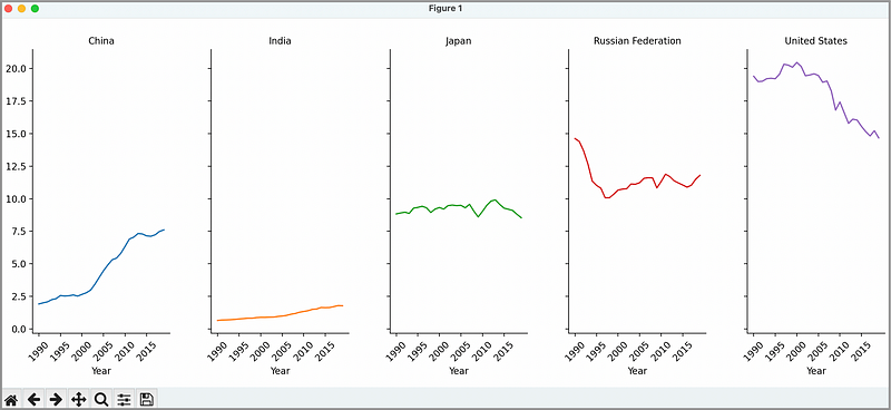
Now if you put each side by side, you can see the data independently for each country, but also compare against the other countries in the group. Clearly the United States is at the top and India at the bottom.
This visualization is not ideal though — because of the cognition required to do comparisons. The eye must traverse across a distance to compare one with the other — this may be very difficult if the values are very close.
Data Visualization #2— Heat map
Next, let’s create a heatmap to visualize the CO2 emissions for the top five countries across the years.
In this heatmap example, the rows will represent the countries, and the columns will represent the years. The color intensity in each cell will correspond to the CO2 emissions value for that country and year.
The Python code to make this work:
# Create a pivot table for the heatmap
heatmap_data = reshaped_data.pivot_table(index="Country Name", columns="Year", values="CO2 Emissions")

# Create the heatmap
plt.figure(figsize=(12, 6))
sns.heatmap(heatmap_data, cmap="YlGnBu", linewidths=0.5)
plt.title("CO2 Emissions of Top 5 Countries (1990-2019)")
plt.xlabel("Year")
plt.ylabel("Country")
plt.show()
In this example, we use the seaborn heatmap() method to create the actual heatmap. The results:

Ok, we can see clearly by color that the USA is darker — which indicates higher levels of CO2 emissions, and India is quite light, indicating less emissions. But the differences between China and Japan, particularly in the recent past are more difficult to pick up with the naked eye.
Again, we have to traverse distance with our eye to detect the difference — this makes it more difficult to detect.
Data Visualization #3 — Stacked Area Chart
Finally, let’s create a stacked area chart to visualize the combined CO2 emissions of these top five countries over time. This will give us a better understanding of the overall contribution of these countries to global CO2 emissions.
The Python code to make this work:
# Create a DataFrame with years as columns
stacked_data = filtered_data.set_index("Country Name").loc[:, years].transpose()
# Create the stacked area chart
plt.figure(figsize=(12, 6))
stacked_data.plot.area()
plt.title("CO2 Emissions of Top 5 Countries (1990-2019)")
plt.xlabel("Year")
plt.ylabel("CO2 Emissions")
plt.legend(title="Country")
plt.show()
In this code snippet, we create a stacked_data object, and then use the set_index() method to pass in the data.
The result after running our code:

Ahhh, now maybe this is the right one — tells a pretty vivid story.
In this format, it is much easier to see who is emitting most, and how their emissions have either increased or decreased over time.
We can tinker around and move the legend somewhere less obtrusive, but it is fair to say that most would agree that visually, this particular visualization tells the best story.
In Summary…
And there you have it! We’ve walked through the process of creating various data visualizations using Python and seaborn while focusing on cognitive design principles.
We started with a line chart to visualize overall trends, then used small multiples to compare top countries side by side. Finally, we created a stacked area chart to understand the combined CO2 emissions of the top countries and a heatmap to visualize the emissions across years.By using these visualization techniques, you can craft high-impact data visualizations that effectively communicate complex data in a way that is easy to understand and remember.
Keep experimenting with different visualization types and always remember to tailor your visualizations to your audience’s needs for maximum impact.
Thank you for reading.
If you want to leverage GPT-4 to help up your Python game, then sign up for this free 5-day email course on Prompting GPT-4 for data visuals. Let me know what you think:
