

Kahneman's System 1 and 2 Thinking for Data Storytelling: An Example
Kahneman's System 1 and 2 Thinking for Data Storytelling: An Example
How Kahneman’s principles of human cognition can assist in visual design


The saying “hit them fast, then make it last” is on-point for creating memorable data stories.
Grab your audience’s attention fast with something that hits the senses - and then you back it up with solid data, and an interesting story that makes the insightful part of your brain nod in agreement.
Kahneman’s insights are relevant to data storytelling because they focus on understanding how people think in a practical, use-it-now way.
Daniel Kahneman said that you have two systems in your brain.
System 1 is quick, it’s your gut reaction.
System 2 is thoughtful, it needs convincing.
When you’re telling a story with data, you’re playing to both systems.
How do you combine these two ways of thinking to grab the attention of your audience?
Let’s look at a specific example that is close to my heart — the decline of Canada in the Global Happiness rankings.
Case Study of Canada’s Global (un)Happiness
My wife works for the United Nations and is always curious about the various UN data sets that are publicly available.
Recently, I have been experimenting and creating with the UN Global Happiness Report data set (from HERE).
When I am putting together data visualizations, I create the data frame and the visualizations using the Python programming language. You can also ask GPT-4 to create the Python code for you.
Now if I create a chart using the standard “default” settings — for example if I am creating a time-series chart comparing 5 fairly happy countries and their global happiness numbers, the results look something like this:
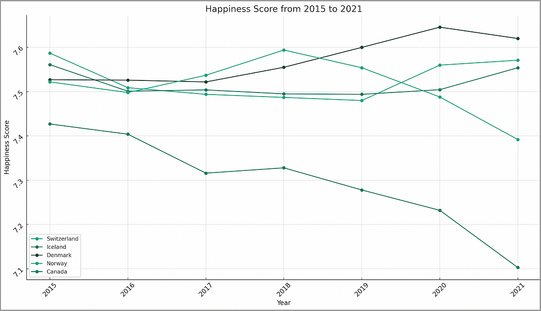
What interesting stories can be told from this data visualization? It’s hard to tell because there is a lot of “noise” in this visual.
If we look closely, it looks like Canada is on a downward trend compared to the other 4 countries that we are comparing it to.
This is an interesting story to tell. To get our audiences attention, we need to provide a clearer focus on the relevant data.
Leveraging Colour for Impactful Visualization
Color can dramatically enhance or diminish the effectiveness of your data visualization. It’s not enough to make the chart factually accurate, you need to use colour to communicate and emphasize key data points.
Contrast for Emphasis: Use contrasting colours to draw attention to critical elements or to distinguish between different data sets.
Harmony for Cohesion: Complementary colours create a balanced, visually appealing presentation, aiding in the viewer’s comprehension.
Accessibility Considerations: Always remember colour blindness and visual impairments. Tools like colourblind-friendly palettes ensure your visualizations are inclusive.
The concept of contrast for emphasis is based on the human cognition principle of pre-attentive attributes.
The human visual system processes these unconsciously and rapidly, enabling quick and efficient recognition of key elements in visual display. As an example, look at the image below:

Where are your eyes immediately drawn to?
To the red sails — there is a reason why RED often stands for danger. Our eyes are automatically drawn to it.
Another example using contrasting color:
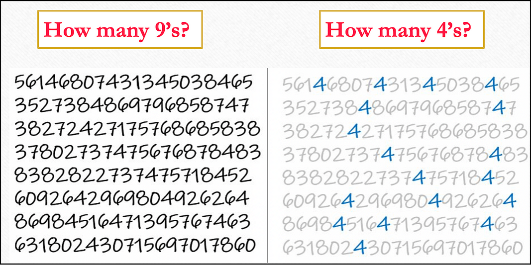
You really have to work to count the 9s in the image on the left. It is so much easier to find 4s in the image on the right.
So we can easily leverage this automatic human condition to highlight what we want our viewer to focus on. For example, our new and improved line chart:
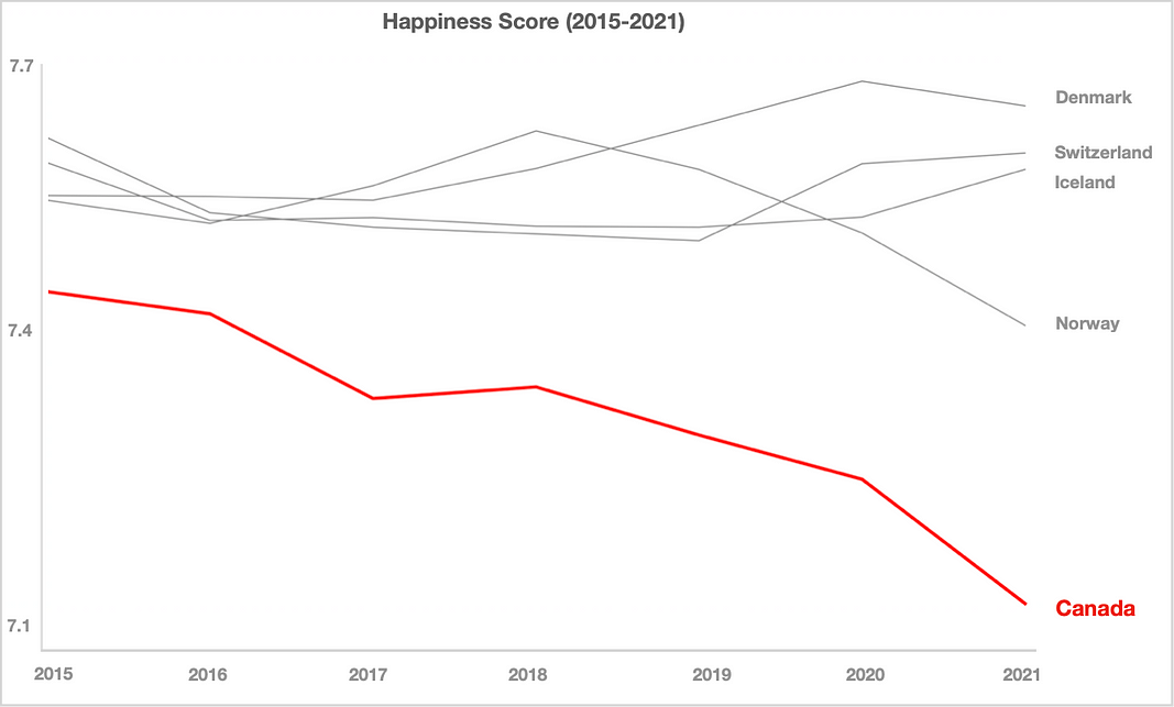
What has happened here with this diagram?
With pre-attentive attributes enabled, our audience’s attention is focused to the bright red, downward trending line of Canada.
No we have their attention!
In Summary…
Having an idea of the adjustments that are necessary, even with just the coloration of your data points, can really make your data pop and sizzle.
Pre-attentive attributes are an incredibly easy human cognition trait that you can leverage to your advantage.
As humans we have no choice here — we are wired this way!
Thank you for reading.
If you’re interested in this topic…and want to learn more about data storytelling, check out my free 5-Day Email Course on Data Storytelling Fundamentals:

https://stats-and-stories.ck.page/datastorytelling
Let me know what you think! Any feedback/comments are very much appreciated!
Nicely done! But your last figure is not a bar chart :)