

Is The New Version of Nathan Yau's 'Visualize This' Worth Investing in?
Is The New Version of Nathan Yau's 'Visualize This' Worth Investing in?
After almost a decade, this seminal book on data visualization and storytelling techniques is a complete face-lift

After almost a full decade, Dr. Nathan Yau has updated his seminal book Visualize This to reflect the current landscape of data visualization and storytelling.
This version (2nd edition) introduces some of the best ways currently available to visually communicate a set of data through readable, understandable, and useable charts, graphs, and maps.
As with any technical book version update, the questions that readers are apt to ask about a 2nd edition release include:
Was this update needed?
Is this update any good?
Are the examples current and relevant?
Do I need it in my data visualization and storytelling collection?
After a full read and exploration of Dr. Yau’s Visualize This: The FlowingData Guide to Design, Visualization, and Statistics (2nd edition), here are my answers to these questions.
Was an Update Needed?
The original version of Visualize This was published in 2015. This is many generations ago in the world of modern data science.
I am a huge fan of the first version of this book. It is in my top 5 all-time list for data visualization and storytelling reference books. The original version is chock-full of specific tools and examples to showcase the points, concepts, and ideas that Dr. Yau is promoting.
However, this strength of the first version was becoming a weakness. I was finding it less and less useful as a reference in my lectures and workshops as the tools and examples have become extremely dated. And of course, there has been a massive increase in Mobile device usage in the past 10 years. Any modern practical reference that includes tools and examples must showcase this new reality.
So this update was absolutely needed — like maybe 5 years ago.
Is This Update Any Good?
The 2nd version of Visualize This is brilliant. Dr. Yau has completely overhauled every aspect from the first book to reflect the (massive) changes in data visualization tools and techniques over the past 9 years.
As Dr. Yau said himself (on LinkedIn, retrieved Jun 5, 2024):
New examples, new tools, refined process. I rewrote almost every word.
For a proper update, I had to read the old book and work through my how-to examples. It was pretty painful, to be honest.
And this care and attention shows, right from the start, with a mosaic diagram showing all of the modern charting and encoding methods available for the modern data scientist.
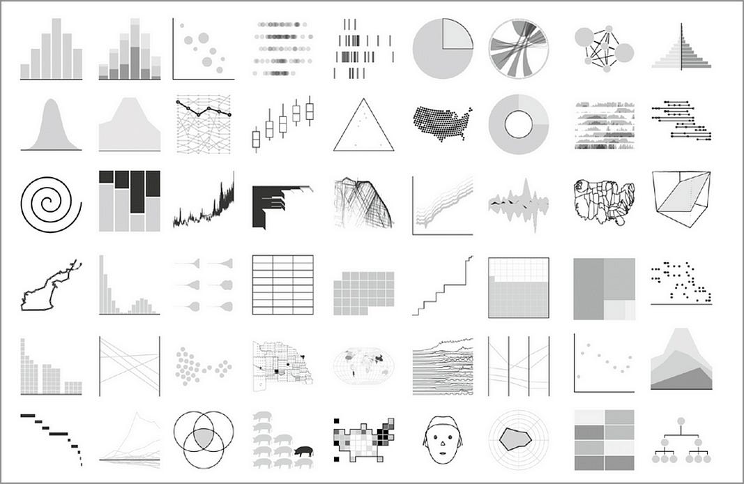
Dr. Yau is not just blowing smoke.
As with the first edition, Dr. Yau displays charts (and visual encodings for the more advanced) that show data patterns honestly and in a non-confusing way.
The Choosing Tools section lists current mainstream visualization tools like Tableau and PowerBI and simpler online visualization tools like DataWrapper (super easy to use to create presentation-grade visuals) and Flourish.
From a programming perspective, Dr. Yau covers both R and Python — giving use cases and examples where each tool can shine.
What I love about Dr. Yau’s writing style and approach (and this was not lost in the 2nd edition) is that he gives tools and examples for all levels of abilities. There are examples using point-and-click tools and for experienced programmers.
Are The Examples Current and Relevant?
Yes — Dr. Yau’s methodology and approach truly shine in this aspect. To start with, a data visual representing what polled users are currently using:
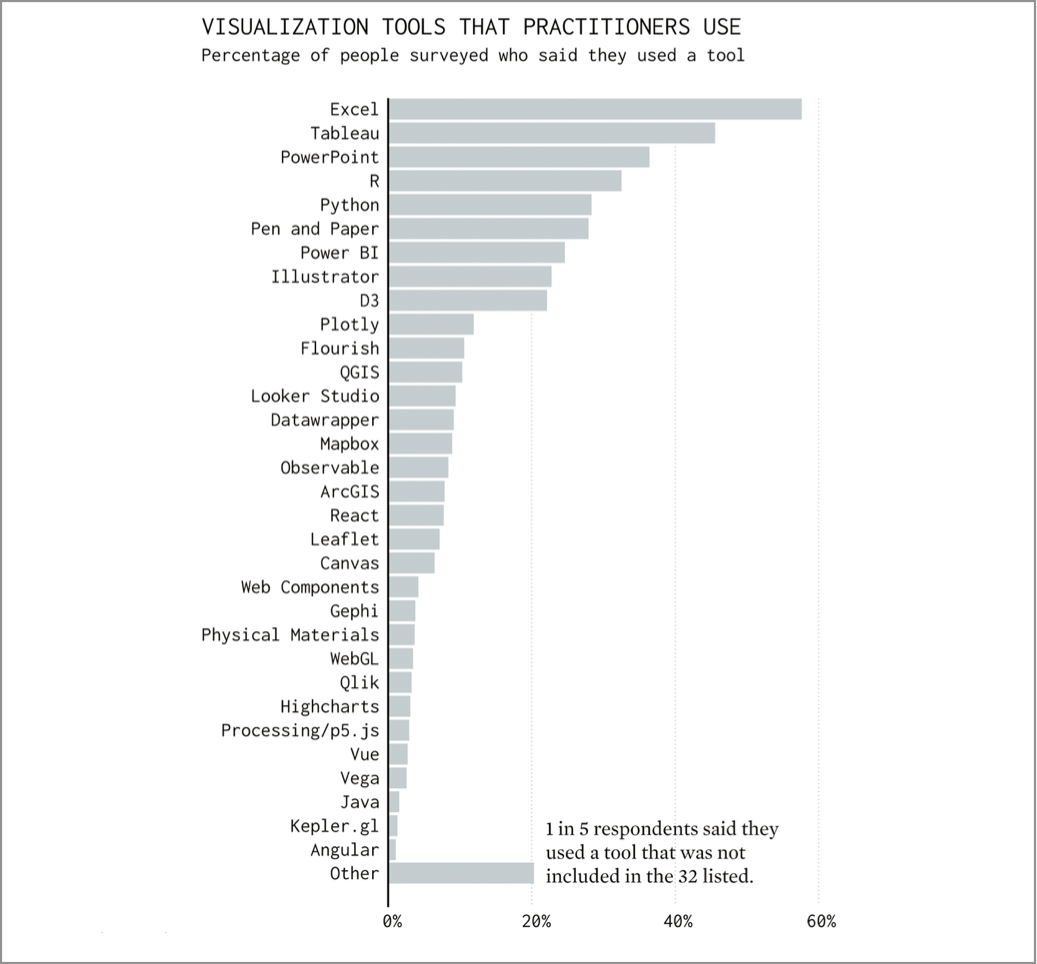
From this point on, Dr. Yau covers the entire data acquisition and formatting process with major updates in regards to the tools and methods used.
And this carries on into every example in the book - all are created with tools from this bar chart. This is an outstanding approach.
For example, scraping techniques using modern programming libraries like Python’s BeautifulSoup are provided. The discussion then flows into other modern Python libraries such as numpy and pandas which are used for filtering and formatting the data.
After data acquisition and formatting, the next step is the actual visualization process.
A good chunk of the rest of the book is set aside to explain and demonstrate the different types of data and the visualizations that can be used to best represent each data type.
Visualizations over Time
This includes line charts, bar charts, step charts, dot plots, and heat maps.
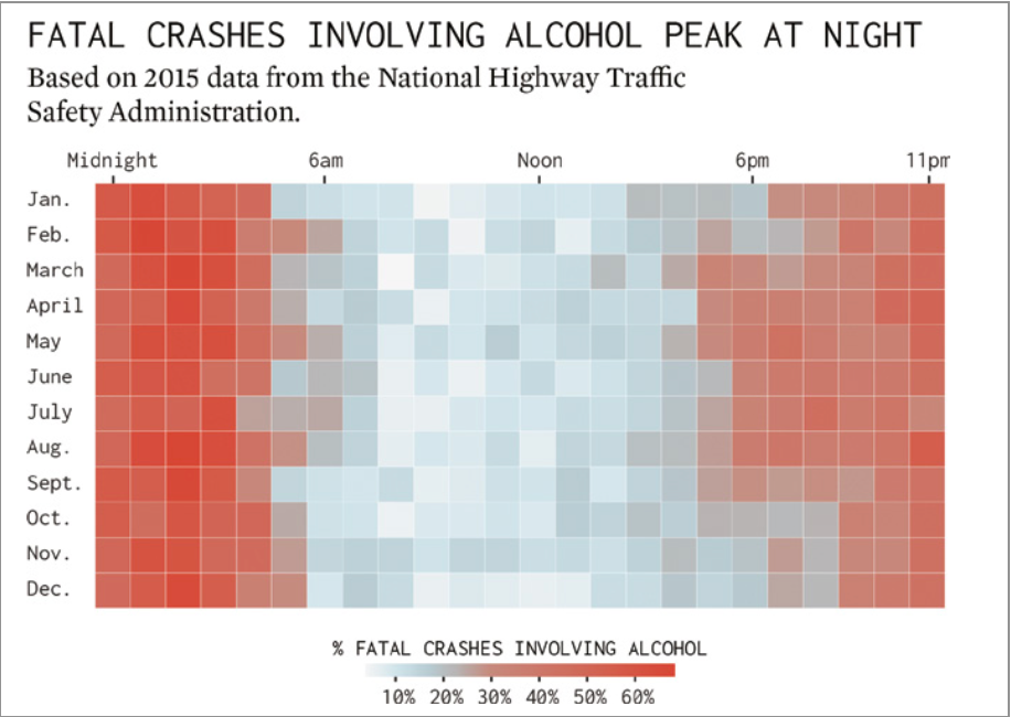
An aha! for me in this section is the use of colour in the fatal crashes heat map (specifically, the colour red) to highlight very clearly the dramatic increase in alcohol related driving deaths at night.
This drives home (I know, sorry) a clear message to try and stay off the roads at night to avoid bloodshed.
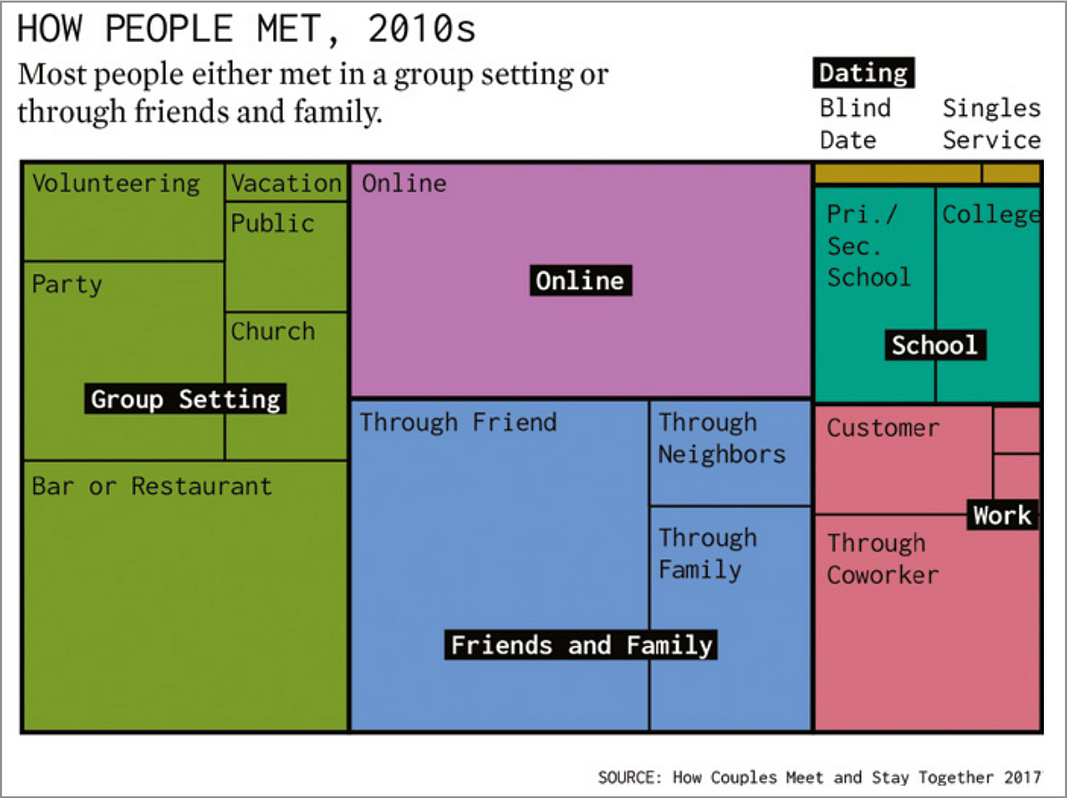
Visualizing Categories
Here Dr. Yau includes bar charts (amounts), bubble charts (size), pie/donut charts (parts of a whole), tree maps, rank and order, and stacked area charts.
An aha! for me in this section is from Dr. Yau’s example on tree maps where he uses external graphics tools (like Adobe illustrator) to modify the default tool visualizations (ie. from R) to be more visually appealing and accessible.
Visualizing Relationships
For visualizing relationships, eamples include scatterplots, bubble plots, barbell charts, multi-variate, connections, and network graphs.
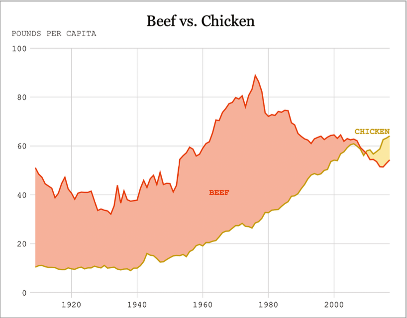
An aha! point for me in this section is the modern representation of a classic relationship diagram to show increased chicken consumption relative to beef consumption in the USA over time.
This style of chart goes way back to the original designs of William Playfair in the late 1700s.
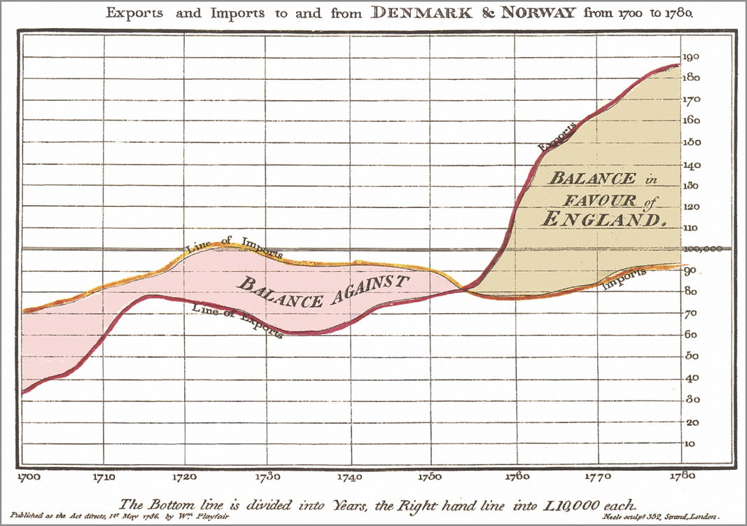
You can see the similarities to the time-series chart representing imports/exports to England from 1786 — almost 250 years ago.
Visualizing Space (and Time)
This chapter is my favourite chapter of the book as I am a big fan of visualizations through mapping. Dr. Yau discusses and gives examples for geocoding tools, maps (choropleth, hexagonal), scaled symbols (ie. bubble maps), points, lines polygons (GIS data), space and time (sequenced maps).
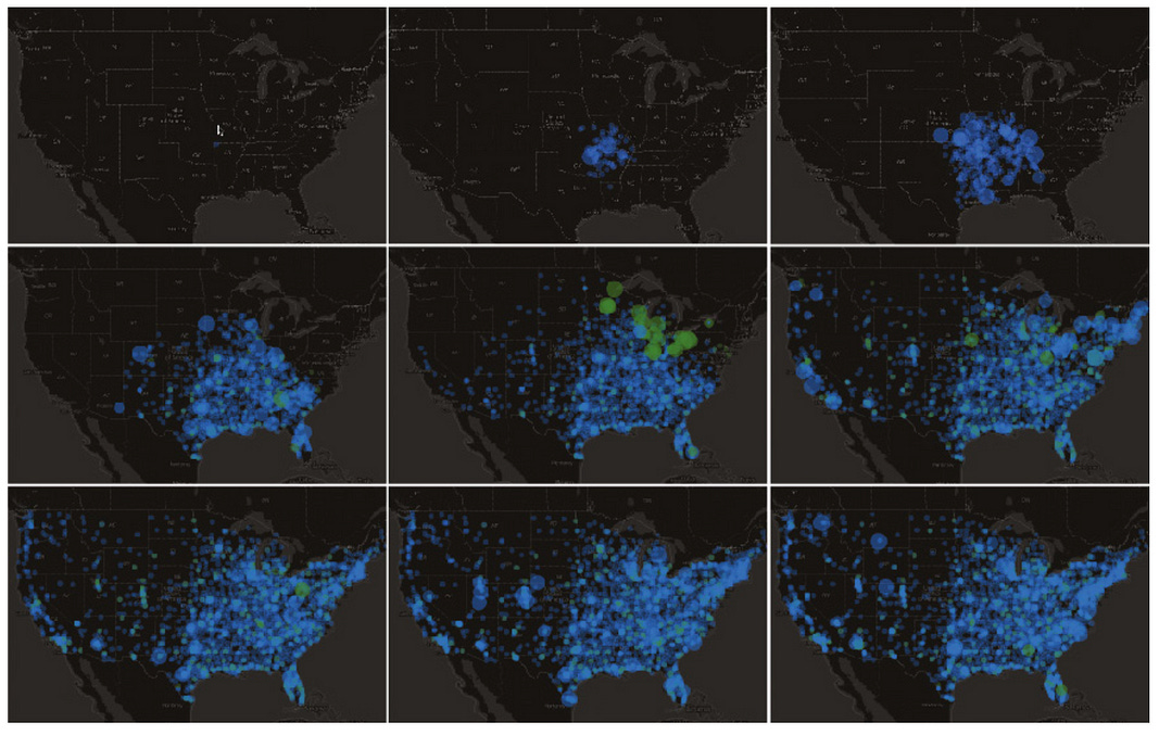
The aha! learning point for me in this chapter is the visual map sequencing as a useful representation of growth over time. Dr. Yau again includes his own creations to highlight the usefulness of each methodology presented.
A useful addition here would be a short exercise on how to use a modern library, like Python Plotly, to help us create an animated map sequence over time. An example in R is included but with the current popularity of Python, another example would not be out of place.
A Bit on Data Analysis
After all of the terrific examples of data visualization types and usage, Dr. Yau discusses his methodology around exploratory data analysis. How do you extract useful insights from this data? And more specifically, how does Dr. Yau come up with so many awesome charts, graphs, and maps from publicly available data sets?
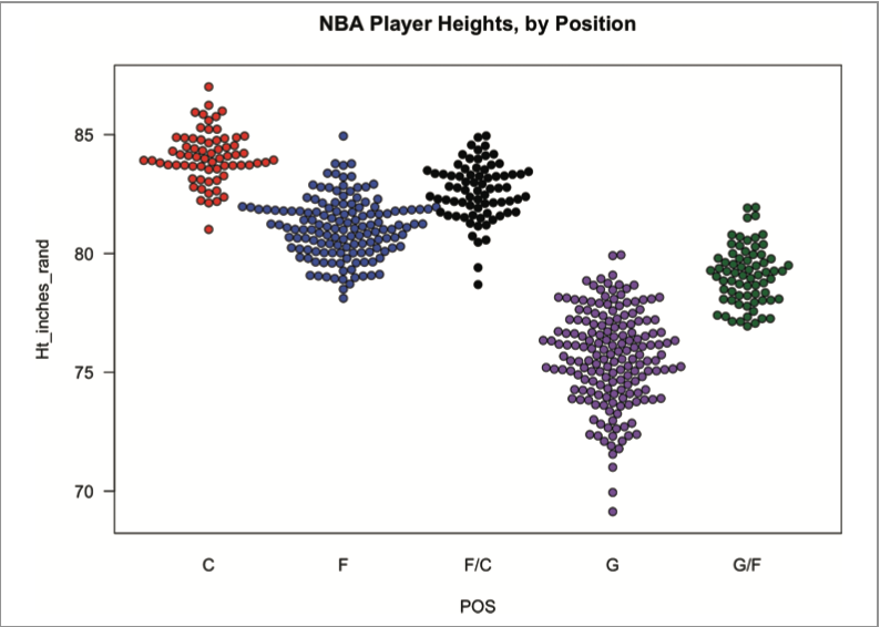
Dr. Yau posits that we can start with some basic charting to summarize our data (mean, median, min/max, percentile, etc). A box-plot example is provided to showcase this. Distributions are covered including histograms, density plots, and bee swarm diagrams.
He uses the idea of the ranges and types of data to set the table for deeper exploration, for finding comparisons, patterns, uncertainty, and outliers.
Armed with deeper findings, you can then tell your story — to help others “connect the abstract to the reality” (Visualize This, Yau, 2024).
Lastly, there is an entire chapter dedicated to data visualization best practices. Included in this section are the 3 A’s (affordances, aesthetics, and accessibility), and a discussion on visual metaphors — how you can include elements in your visualization to represent the context of the data.
This is an effective finishing point as it segues nicely into the main points that Dr. Yau highlights throughout this text — that your graphics be readable, understandable, and usable (Visualize This, Yau, 2024).
Do I Need This Book in My Data Storytelling Library?
This book provides a terrific suspension bridge across the chasm between dry hard to find and hard to understand numbers and how we can bring them to life in an interesting and beautiful way.
What I love best about Dr. Yau’s writing is that it is all from his own personal perspective. Almost every single example in this book is his own carefully constructed creation. He is talking, and doing.
This personal reflection he provides is a golden nugget at this moment in time where we are constantly deluged with the impersonal style of LLM models.
This 2nd version is an outstanding update with current and relevant new examples and illustrations.
I have my hardcopy version and it is at the top of the stack on my desk.
Thank you for reading.
If you want to learn more about data storytelling, check out my free 5-Day Email Course on Data Storytelling Fundamentals:

https://stats-and-stories.ck.page/datastorytelling
No strings attached. Let me know what you think! Any feedback/comments are very much appreciated!
John, thanks for the review. I received notice of the new version of Dr. Yau's book a couple weeks ago. I was leaning towards purchasing it and your detailed review helps finalize the decision.