

How Data Storytelling Can Be Your New Superpower
How Data Storytelling Can Be Your New Superpower
Matching numbers with narratives for terrific storytelling

Data storytelling turns a set of data into an interesting storyline for as broad of an audience as possible.
With the ubiquity of advanced data analysis tools now available (powerBI, Tableau, Python, Canva, etc), the process of taking a set of data and visualizing a graph from it has been greatly simplified.
Yet, according to Storytelling with Data author and guru, Cole Nussbaumer-Knaflic, modern schooling methods do not teach learners how to communicate effectively with data.
Many of us spend years of formal education learning about numbers and language, yet rarely are these combined in a way where we use our language skills to tell stories about a set of numbers.
We humans are natural storytellers, yet we are not naturally adept at telling stories about our data.
The result is a sea of ineffective, unexplained, confusing charts and graphs.
How can we do better? We can start with an understanding of how to combine numbers with narratives.
We Have Different Ways of Thinking
Despite this modern educational gap, our brains have evolved to think both quantitatively (what, how much) and qualitatively (why, how).
While modern education often fails to merge quantitative data with narrative, diverse cultural approaches remind us of the value in doing so.
During my PhD research, at the intersection of computer science, Indigenous knowledge, and education, I spent time researching how various cultures integrate both quantitative and qualitative thinking for decision-making. This blending of data with narrative illustrates effective data storytelling, offering a model for combining diverse ways of thinking.
Hard numbers work well when we are dealing with absolutes — they provide a static, abstract view on a set of data. However, this does not always transfer to the reality of daily life for someone who rarely, if ever, deals in abstractions.
An Indigenous fisherman, for example, would base their decision on how, where and what to fish for on approximations from many different inputs.

Weather, temperature, water depth, time of year, and their internal knowledge of their past results based on these variables. Adaptive thinking is essential — yesterday’s data may have no relevancy on the decisions that need to be made today.
The research of Berkes and Grant (2007) on qualitative thinking of fishermen in Grenada highlights the practicalities of adaptive, real-time qualitative thinking in decision making. In fact, many Indigenous folks are baffled by the need of Western scientists to quantify everything in excruciating detail. This Western methodology often misses the underlying relationships between the different pieces of data.
Indigenous knowledge systems demonstrate the innate human capacity to interpret complex environmental data through narrative. This approach mirrors the essence of data storytelling, where combining qualitative insights with quantitative data improves our depth and breadth of knowledge.
Modern methods have improved upon how this knowledge is gathered, disseminated, and related, yet the way in which different cultures approach knowledge dissemination needs to be considered. For many this has traditionally been qualitative in practice.
Understanding the integration of diverse ways of thinking prepares us to confront the challenge of quantitative storytelling, where traditional practices and modern needs intersect.
The Challenge of Quantitative Storytelling
Traditionally, qualitative thinking (ie. stories) would be used and approximations applied in order to achieve results (ie. the number of fish caught under a certain set of conditions).
This knowledge would be passed down to the next generation of fishermen. This is how much of Indigenous knowledge was maintained over time — often in lieu of a written language.
This tradition underscores a natural human inclination to attach narratives to values — a skill that lacks sufficient application in contemporary education, leading to data visualizations that lack storytelling elements.
Many of us are innately wired to attach stories with values — yet many schooling systems do not combine these. Hence, many visualizations of data do not include narratives— and they should.
Edward Tufte, a pioneer in data visualization, in his classic book The Visual Display of Quantitative Information states that “words and pictures belong together”. He also notes that the separation of the two is the end result of a long-standing feud between artists and writers for “scarce space”.
Explanations that give access to the richness of the data make graphics more attractive to the viewer.
Making Complexity Accessible
Viewers often need the assistance that words provide. And conversely, many viewers need graphics to explain words and numbers.
Data storytelling provides a bridge between these domains. For those of us who think effectively with visualizations, a chart or graph may clarify.
For those of us who are unable to interpret a visualization, text integration in the form of captions and annotations can fill in the gaps.
Here’s a simple example.
Global Trends in CO₂ Emissions Per Capita Over Time:
Global warming is a hot-topic issue and is scientifically connected to the increases in global CO₂ emissions per person over time.
By visualizing these trends on a line graph, it’s easier to see the overall direction in which global emissions are moving —clearly upward (since around 1830) over the years. How can we effectively tell this story to those who are qualitative thinkers?
The use of a line graph simplifies the interpretation of data trends across multiple years, highlighting periods of significant change or stability.
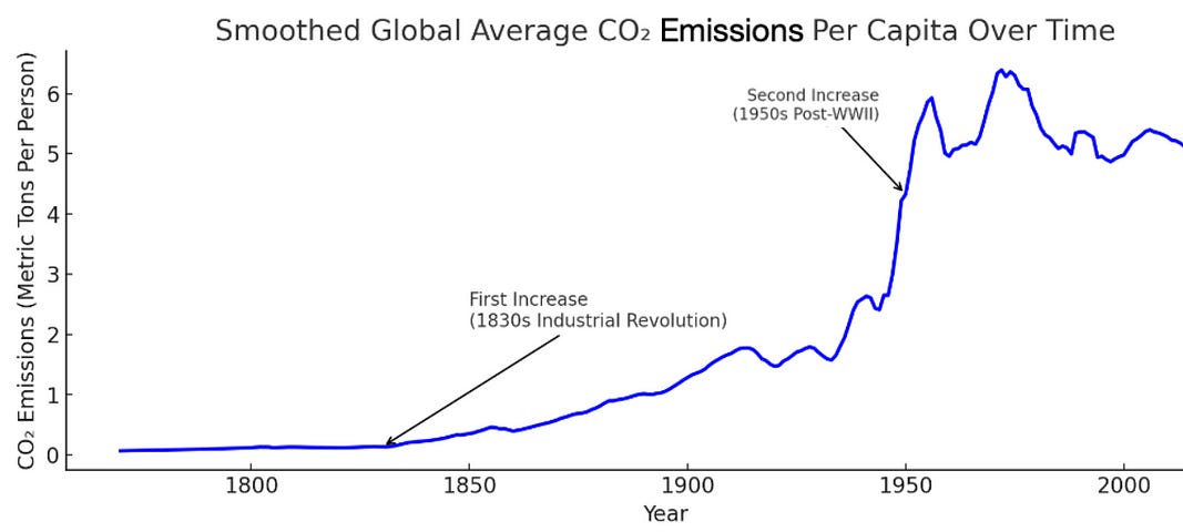
The annotations for two periods in time tell a story about the effects of early industrialization and the post World War II boom. The use of a line graph highlights periods of significant change
For a qualitative thinker, this type of chart is often referred to as a “hockey stick” chart as the dramatic increase shapes the chart to look like, well, a hockey stick.
This qualitative observation removes the quantitative abstraction and detail from the raw data, providing a more relevant context to those who need it.
By converting the data into a visualization, you can:
Highlight Important Insight: The visual draws attention to important trends, comparisons, and changes that might not be immediately apparent from tables of data.
Enhance Understanding: Visual representations can be easier to interpret than pure data.
Facilitate Communication: Effective visualizations are used to communicate information in a presentations. For example, the “hockey stick” chart makes the data more dramatic and relatable.
The annotations can then be used as effective storytelling tools to accentuate the pivotal points in the data.
Tools For Finding Stories in Your Data
There are a myriad of tools available to find stories in your data. Some of the most popular:
For Technical Users:
Tableau: Offers interactive data visualization for complex analysis.
Power BI: Enables creation of interactive reports and dashboards, integrates well with Microsoft products.
D3.js: A JavaScript library for customizable web-based data visuals.
For Non-Technical Users:
Google Charts: Easy chart and graph creation for embedding in websites or presentations.
Canva: User-friendly platform for designing infographics and data graphics.
Flourish: Allows production of interactive visuals without coding, suitable for any audience.
In Summary…
Data storytelling is about “making complexity accessible” (Tufte).
Start with your data. What story does it tell? How can you share this story to make others understand and care?
There are many tools available to help you find the stories in your data: Tableau,
Combining words and pictures together with narrative tell a deeper story to the viewer. To provide clarity, viewers may need the help that words provide, or conversely, the visual that helps clarify the words.
Keep in mind that the point of a visualization is to clarify data.
If the visual does not clarify, then it is an utter failure.
References
Tufte, E. R. (2001). The visual display of quantitative information (2nd ed.). Graphics Press.
Nussbaumer Knaflic, C. (2015). Storytelling with data: A data visualization guide for business professionals. Wiley.
Berkes, F., & Grant, S. (2007). Fisher knowledge as expert system: A case from the longline fishery of Grenada, the Eastern Caribbean. Fisheries Research, 84(2), 162–17.
If you’re interested in this topic…and want to learn more about data storytelling, sign up for my free 5-Day Email Course on Data Storytelling Fundamentals:

https://stats-and-stories.ck.page/datastorytelling
No strings attached. Let me know what you think! Any feedback/comments are very much appreciated!
The importance of data analysis reports in the work of a data analyst cannot be overstated. These reports are the embodiment of data analysis, representing the final step in the analysis process and serving as a foundation for decision-making. Even if the initial analysis is excellent, the inability to produce a clear, logically sound, and highly readable report can render all prior efforts futile.