

Effective Data Storytelling: 3 Simple Tools For Better Results
Effective Data Storytelling: 3 Simple Tools For Better Results
The art of incorporating narrative into data visualization presentations


As a Computer Science professor of 25 years, I know that data on its own can sometimes be as dry as the Sahara, and difficult to interpret.
As data scientists, we know that data can tell great stories, but many of us hit the workforce unequipped and uninformed on how to do this.
A narrative with visual support can fix this. Everyone loves a good visual and a good story.
We want to connect our audience with the data as information, on a human level — to make it relatable, memorable, and impactful.
Let’s take a look at three ways to do this effectively: narrative flow, the Greek 3-part play formula, and storyboarding.
1. Narrative Flow: Turning Data into Stories
A narrative in data visualization is more than a story; it’s a guided path for your audience to understand the data at depth.
It includes context, characters (data points), and a plot (the message or insight). A well-crafted narrative turns boring old numbers into an interesting story.
It guides audience through complex information, highlight key insights, and inspire them to act.
The process of crafting a narrative in data storytelling involves 3 key steps:
1. Establishing The Context:
Setting the Stage: Every narrative starts with setting the stage. Provide background information to help your audience understand the context of the data. What are they looking at? Why does it matter?
Relevance: Connect the data to a larger story or trend in the industry, society, or world at large. Make it relevant to your audience’s interests or needs.
2. Identifying Characters and Plot:
Characters (Data Points): When data storytelling, your characters are the data points. You want to highlight key figures, trends, or anomalies that will play a leading role in your story.
Plot (Message or Insight): What message or insight do you want your audience to take away? Structure your data presentation to build towards this insight (more on this in a bit).
3. Structuring Your Narrative:
Introduction: Clearly state what the presentation will cover and what the audience can expect to learn.
Development: Walk the audience through the data, highlighting key points and how they connect to form the bigger picture. Use visualizations to aid understanding and retention.
Conclusion: Summarize the key insights and close with a call to action or question to ponder.
Once we have crafted our narrative, we can put this in to action by organizing it into a complete story.
A useful tool for doing this — a tool that has survived thousands of years — is the Greek Three-Part Play
2. Greek Three Part Play Formula in Data Storytelling
The three-part-play formula is a time-tested structure for storytelling and it can easily be adapted for data narratives. Let’s go through the three parts using a real-life example.
Act 1. Introduction: Setting the Context
Begin your data story by establishing context. This is where you engage your audience and set the expectations.
For example, if your data is about CO2 emissions, start by describing the current CO2 emissions situation.
A “hockey stick” chart immediately shows “the drama” with CO2 emissions.
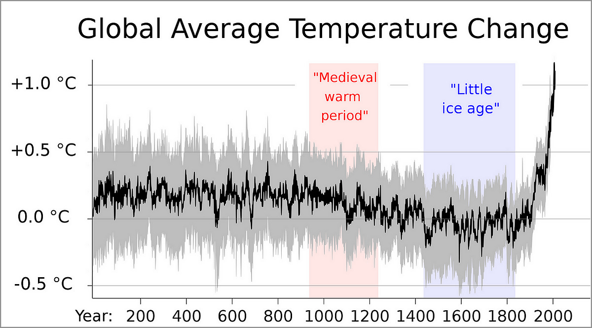
With the hockey stick chart, we can set the initial scene as one of a very clear, and alarming, increase in global average temperatures. We can attribute this increase to global increases in CO2 emissions.
Now your audience is paying attention.
Act 2. Middle: Analyzing the Data
The middle section is where you go into the data at depth. You highlight trends, patterns, and insights. Visual aids can be used to demonstrate these points effectively.
For example, to set the scene, we can provide a global view using a choropleth map:
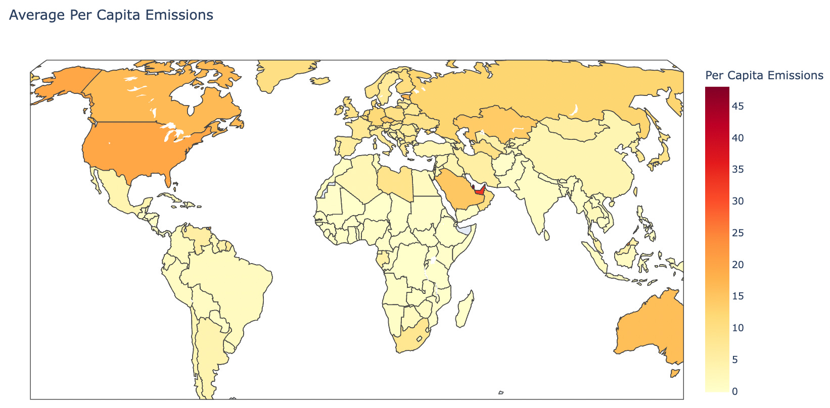
Almost everyone likes a good map. We are visual by nature and if we add in distinctive color hue, our eyes can easily pick up the darker hues and associate them in this map as being higher per capita producers of CO2.
The terrific advantage of this visual is that we can represent all countries in the same view. Each of us can focus in on our area of interest. Or if there are a few countries that we want to highlight, we can do so with this single visualization.
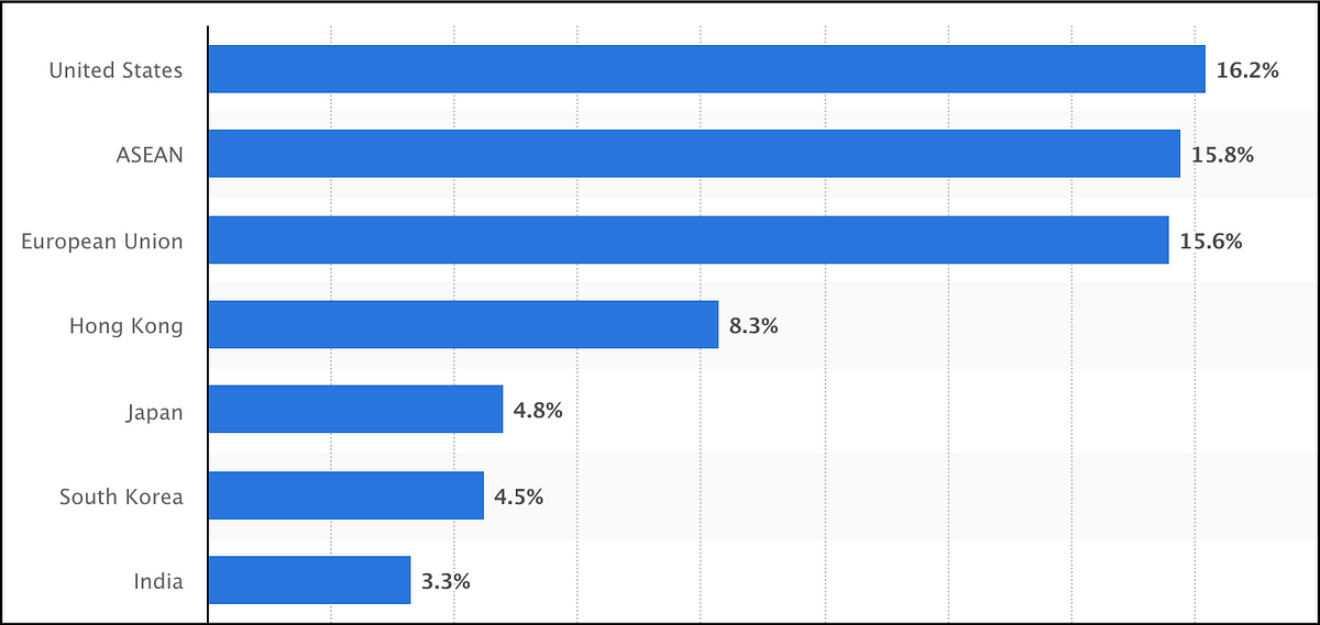
Next, to sharpen the focus on a few countries of interest, we can implement, a time series chart to show increasing, or decreasing CO2 emissions.
We can identify protagonists and antagonists in our story by comparing some of these “main players” over the past 20 years:
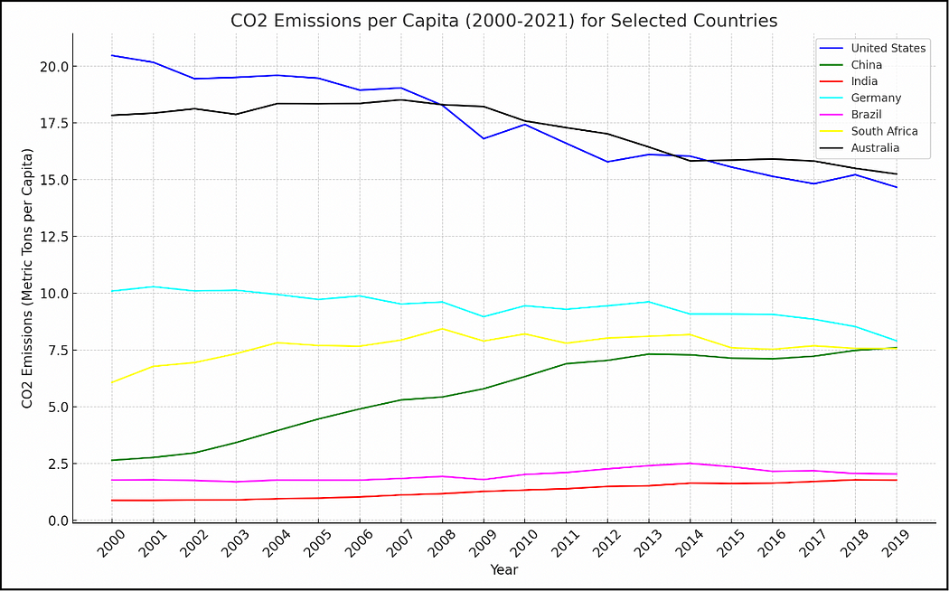
For protagonists, we can highlight how countries such as the United States and Australia have decreased CO2 emissions per capita over the past 50 years.
For antagonists, we can perhaps look at China as increasing its omissions per capita.
To play out the antagonist role more deeply, we can use a data visualization such as a stacked-area chart to show total emission amounts over the past 50 years:
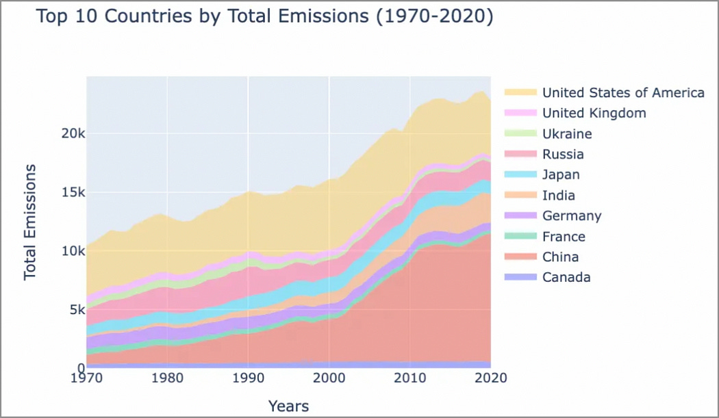
In this stacked-area chart, if we want to focus on the increase in emissions from China, we can dramatize it by showing the increase of the orange area on the chart. China is a “dark smog of industrial growth”.
To tell this story more completely, we need to pursue other angles — for example, our initial antagonist (China) may not be the only “bad guy”.
We can highlight that China produces the most goods in the world for export (by far), and that the largest consumer of these goods is:
The United States of America.
So maybe they are the main antagonist here? The US has “offshored” a lot of their manufacturing, leading to a decrease in per capita CO2 emissions on US soil. But perhaps they are guilty by proxy.
Of course, I am over-simplifying and over-dramatizing this story for effect — but you get the idea.
Bottom line: once you have created the narrative plot, you can tell your story much more effectively with supporting visuals.
Act 3: Conclusion: Summarizing Key Insights
Finally, wrap up your narrative by summarizing the key insights.
You want to end with actionable steps or conclusions drawn from the data.
For example, using the trends and analysis presented here, you can highlight the fact that determining who the “real” CO2 emissions antagonists are is not just a matter of CO2 emissions levels.
Consumption levels (and other factors) must also be factored into this equation.
3. Storyboarding Your Data Presentation
Storyboarding is another common method to set up your data story.
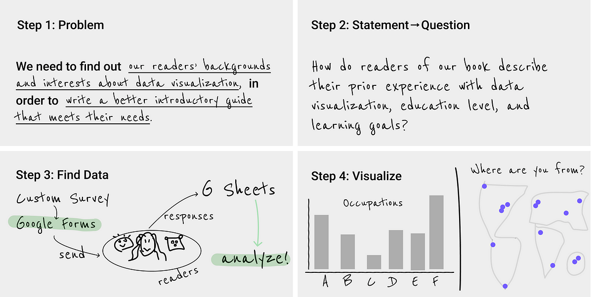
You can use storyboarding on a dataset to:
Identify the issue that interests or motivates your audience.
Rethink the problem into a question that you can research
Describe your plan to find the data that you will use to answer the question.
Identify the visualizations that can be used to best showcase the data that you use.
An example using these 4 points to create a simple storyboard (from Daugherty, Ilkyankou, 2024):
To modify this example for our CO2 story:
Problem: We want to find out who is responsible for increasing global temperatures.
Statement → Question: Who is responsible for increased CO2 emissions that are raising the temperature of the planet?
Find Data: UN data on greenhouse gas emissions (https://data.un.org/)
Visualize: Create charts to tell our story. Fit the most relevant charts within our data narrative (ie. created from the “Narrative Flow” toolkit)
With storyboarding, you should also:
Sequence the Data Presentation: Decide the order in which information will be revealed to the audience. For example, with CO2 emissions, we show global trends before zooming into individual countries
Plan Transitions and Emphasis: Determine where to focus attention at different stages of the presentation. This could involve highlighting certain years or shifts in trends and planning how to guide the audience’s eye from one part of the data to the next.
And we put this all together by incorporating clear and engaging language:
Clarity: Avoid jargon or technical terms that might alienate your audience.
Engagement: Use storytelling techniques such as metaphors, analogies, and personal anecdotes to make your data more relatable and engaging.
And that’s all there is to it!
In Summary…
A good data story can change minds, influence decisions, and initiate action.
To tell a good story, start with the framework that works best for you. Personally, I work really well with visual flowcharting, so storyboarding ist the tool that I find most useful.
When applying the three tools laid out here to craft your story, you should also:
Keep it simple — do not add words just to make it sound intelligent. Some of the best writing ever is simple in form (“To be or not to be”)
Sound like yourself — write your story yourself — that way it is in YOUR words using YOUR style. — this will come out as passion in the telling of your story.
Empathize with the readers — be sympathetic and patient, always willing to simplify and clarify
Keep practicing and refining your narrative skills, and you’ll improve on how you and your audience interact with data.
Thank you for reading!
If you’re interested in this topic…and want to learn more about data storytelling, sign up for my free 5-Day Email Course on Data Storytelling Fundamentals:

https://stats-and-stories.ck.page/datastorytelling
No strings attached. Let me know what you think! Any feedback/comments are very much appreciated!
Interesting