

Data Storytelling The Death Penalty Using Python and Streamlit
Data Storytelling The Death Penalty Using Python and Streamlit
Visualizing global death penalty numbers with the Streamlit framework

With modern data visualization, there is an ever-growing list of awesome tools that can assist in creating eye-popping graphs and charts in record time.
For example, by integrating Python’s Streamlit and Plotly libraries we can easily design a prototype interface to explore shifts in global issues by country.
Showcasing death penalty data in the form of modern data visuals shows us where the world stands on one of the most controversial practices in the legal system. Some countries have moved away from it, while others still hold on.
Using this recent and comprehensive data set, let’s work together to create Streamlit application that tells us historical and current stories on global death penalty trends.
The Datasets
To build our interactive dashboard, let’s work with two primary datasets: the death penalty dataset and the COW-to-ISO mapping dataset. Together , these datasets combine the death penalty data and country boundaries, allowing us to represent the data visually on a global map.
1. Death Penalty Dataset
This dataset contains detailed information about the death penalty status of countries across different years.
It can be downloaded from HERE.
It includes both historical and modern data, allowing us to track how the use of the death penalty has changed globally. The key fields in this dataset are:
Country: The name of the country.
Year: The year for which the death penalty status is recorded.
COWCODE: The country code from the Correlates of War (COW) project. This is a numeric code assigned to each country, and it is essential for linking the country to its ISO3 code.
COWYEAR: A combination of the COW country code and the year (COWCODE + Year).
COWCODE2 / COWYEAR2: Duplicates of COWCODE and COWYEAR for additional uses in the dataset.
Deathpenalty: The status of the death penalty in the country for a given year. This field takes on values from 0 to 4, with each number representing a different status:
0 = Abolished: The death penalty has been fully abolished.
1 = Abolished for ordinary crimes only: The death penalty is only abolished for ordinary crimes.
2 = Abolished for ordinary crimes only, but used during the last 10 years: The death penalty is abolished for ordinary crimes, but has been used within the last 10 years.
3 = Abolished in practice: The death penalty is still legally present but is not actively used.
4 = Retained: The death penalty is still fully in use in the country.
2. COW-to-ISO Mapping Dataset
The second dataset provides a mapping between the COW (correlates of war) country codes and their corresponding ISO3 codes, which are used for the choropleth map.
Why is this dataset necessary? The Harvard data set uses COW codes to identify countries whereas the Plotly choropleth() function uses ISO3 codes to represent a country on a map. Therefore, we need to provide a way to map one to the other.
The “cow2iso” dataset can be downloaded from HERE.
The relevant fields in this dataset are:
country_name: The name of the country. This field provides a more user-friendly label for each country.
Iso3: The ISO 3-letter country code, which is used for mapping countries in the choropleth map. This code is essential for ensuring that each country is plotted correctly on the map.
cowcode: The COW country code, which is used to link this dataset to the death penalty dataset.
From these 2 data sets, let’s create a web app that displays:
A choropleth map that visualizes the death penalty status of countries over a selected year.
A time-series line chart that shows the number of countries that have not abolished the death penalty over the last century.
Let’s break down how we can achieve this with Streamlit and Plotly.
Setting Up the Environment
Before we start writing our code, we need to install Streamlit and Plotly. Use the following command to install the necessary libraries:
pip install streamlit plotly pandasNow the first step in our code is to load the data. In our example, we have two datasets:
Death Penalty Data: Contains country-wise death penalty status across years.
COW-to-ISO Code Mapping: Links country COW codes to ISO3 codes, which are used to map countries on the Plotly choropleth map.
import streamlit as st
import pandas as pd
import plotly.express as px

# Set wide layout
st.set_page_config(layout="wide")

# Load the data
@st.cache_data
def load_data():
    death_penalty_df = pd.read_excel('death_penalty_2024.xlsx', sheet_name='CDPD version 1 June 2024 (7)')
    cow2iso_df = pd.read_csv('cow2iso.csv')

    # Ensure both 'COWCODE' and 'cowcode' are integers
    death_penalty_df['COWCODE'] = death_penalty_df['COWCODE'].astype(int)
    cow2iso_df['cowcode'] = cow2iso_df['cowcode'].astype(int)

    # Merge death penalty data with cow2iso to get ISO3 codes
    merged_df = death_penalty_df.merge(cow2iso_df[['cowcode', 'Iso3']], left_on='COWCODE', right_on='cowcode', how='left')
    return merged_df

# Load the data
merged_df_final = load_data()
Here, we:
Load the Excel and CSV files using
pandas.Merge the datasets based on COW codes to map countries using ISO3 codes for visualization.
We also use Streamlit’s caching feature @st.cache_data to cache the data and ensure the app runs efficiently without reloading data on every interaction.
Data Visualization 1: Global Choropleth Map
Next, we create a choropleth map that allows users to explore global death penalty trends over different years.

In the screenshot of our finished map, you can see that there are a few pieces to this application:
A menu on the left hand side allowing the user to select the visual to display
A dropdown (list box) allowing the user to select a Year
A choropleth map displaying the death penalty values, by country, for the selected year
A text area explanation indicating what each value represents
For the dropdown, the map is updated each time the user selects a different year.
Our code for this first page:
# Filter data for the selected year
def filter_data_by_year(df, year):
    return df[df['Year'] == year]

# Main Streamlit app
def main():
    st.sidebar.title('Navigation')
    page = st.sidebar.radio('Go to', ['Global Map', 'Time-Series Chart'])

    if page == 'Global Map':
        st.title('Global Death Penalty Status Map')

        # Dropdown for selecting years in increments of 10
        selected_year = st.selectbox('Select Year', [i for i in range(1950, 2021, 10)])

        # Filter the data for the selected year
        filtered_data = filter_data_by_year(merged_df_final, selected_year)

        # Plot the map using Plotly
        fig = px.choropleth(
            filtered_data,
            locations='Iso3',
            locationmode='ISO-3',
            color='Deathpenalty',
            hover_name='Country',
            color_continuous_scale='ylorrd',
            range_color=(0, 4),
            labels={'Deathpenalty': 'Death Penalty Status'},
            title=f"Global Death Penalty Status in {selected_year}"
        )

        fig.update_layout(
            height=600,  # Adjust height for better visualization
            width=1000,
            margin={"r": 0, "t": 50, "l": 0, "b": 0},  # Reduce margins for full-screen display
        )

        # Display the figure
        st.plotly_chart(fig)
Python Code Explanation:
Part 1 of our logic: (
if page == 'Global Map':) this part of our logic is executed if the user selects the 1st option from the left-hand menu. This is the default selection when the page first loads.Year Selection: We use a
selectboxfor users to select a year in increments of 10.Filtering Data: The
filter_data_by_yearfunction filters the dataset to show only the data for the selected year.Choropleth Map: We use
px.choropleth()from Plotly to create an interactive map, where:locations='Iso3'maps countries by their ISO3 codes.The
colorrepresents the death penalty status.
Displaying Death Penalty Status Values
Below the choropleth map, we include an explanation of what each value (0-4) means in terms of death penalty status.
        # Explanation of Death Penalty values
        st.markdown("""
        **Death Penalty Status Values:**

        - **0 = Abolished**: The death penalty has been fully abolished.
        - **1 = Abolished for ordinary crimes only**: The death penalty is only abolished for ordinary crimes.
        - **2 = Abolished for ordinary crimes only, but used during the last 10 years**: The death penalty is abolished for ordinary crimes, but has been used in the last 10 years.
        - **3 = Abolished in practice**: The death penalty is not actively used, but still legally exists.
        - **4 = Retained**: The death penalty is still fully retained and used.
        """)
This section uses Streamlit’s markdown() function to render formatted text that explains each death penalty status value. You can add this piece of code directly below the st.plotly_chart(fig) line of code.
Data Visualization 2: Time-Series Line Chart
On the second page, we visualize a time-series line chart that shows the number of countries that have not abolished the death penalty over the last 100 years (1924-2024).
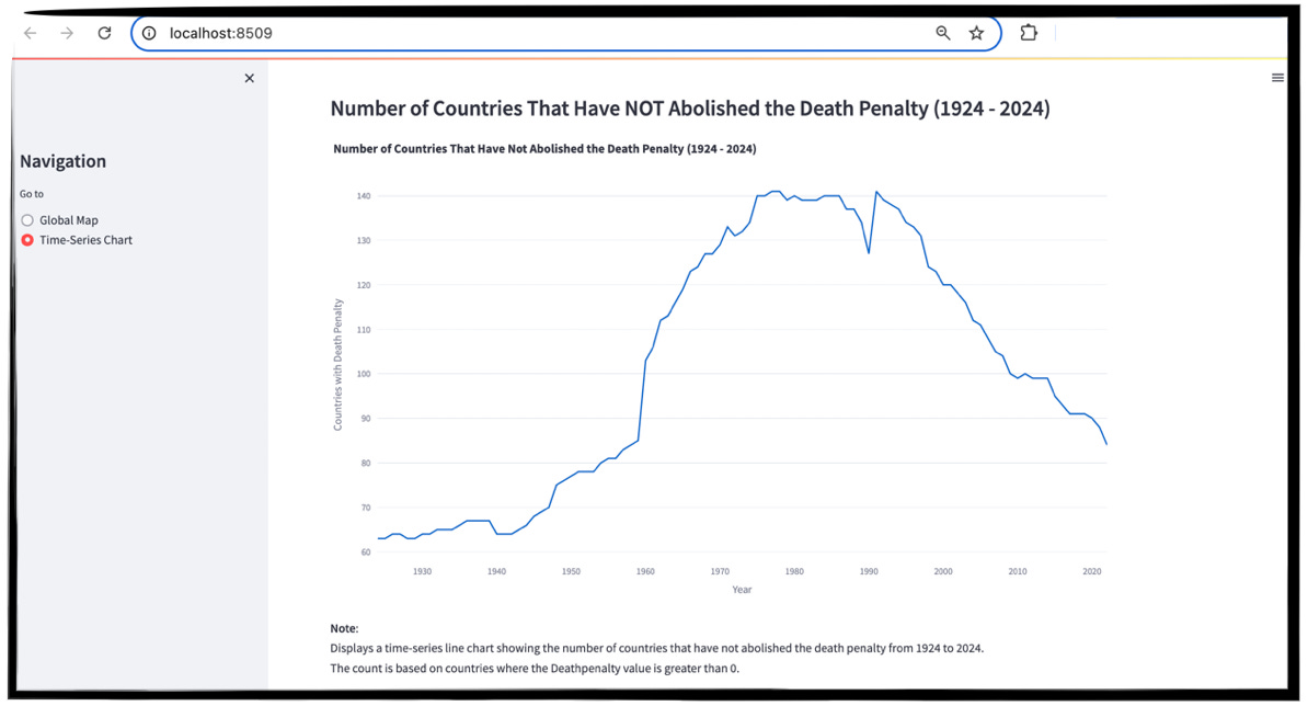
In the screenshot of our finished line chart, you can see that there are a few pieces to this application:
A menu on the left hand side allowing the user to select the visual to display
A time-series line chart displaying the number of countries (by total count) that still implement the death penalty over a 100-year timeline (1924-2024).
A text area explanation indicating what each value represents
Our code for this second page:
   elif page == 'Time-Series Chart':
        st.subheader('Number of Countries That Have NOT Abolished the Death Penalty (1924 - 2024)')

        # Filter and count countries that have not abolished the death penalty (DeathPenalty > 0)
        time_series_data = count_countries_not_abolished(merged_df_final)

        # Filter for the last 100 years (1924-2024)
        time_series_data = time_series_data[(time_series_data['Year'] >= 1924) & (time_series_data['Year'] <= 2024)]

        # Plot the time-series line chart
        fig = px.line(
            time_series_data,
            x='Year',
            y='Number of Countries',
            title="Number of Countries That Have Not Abolished the Death Penalty (1924 - 2024)",
            labels={'Number of Countries': 'Countries with Death Penalty'}
        )

        fig.update_layout(
            height=600,
            width=1000,
            margin={"r": 0, "t": 50, "l": 0, "b": 0},
        )

        # Display the time-series line chart
        st.plotly_chart(fig)

        st.markdown("""
        **Note**:
        Displays a time-series line chart showing the number of countries that have not abolished the death penalty from 1924 to 2024.
        The count is based on countries where the Deathpenalty value is greater than 0.
        """)
Python Code Explanation:
Part 2 of our logic: (
elif page == 'Time-Series Chart') this part of our logic is executed if the user selects the 2nd option from the left-hand menu.Counting Non-Abolished Countries: We group countries by year and count those with a death penalty status greater than 0.
Plotting the Line Chart: Using
px.line()from Plotly, we visualize the number of countries with the death penalty over time (1924-2024).Using Markup for Storytelling: The
st.markdown()function allows us to add in formatted text as part of our Streamlit page.
Awesome! You can copy this code/paste this code sequentially right after our previous code. This is another terrific part about prototyping with Streamlit - the code is modularized in a way that makes it super-easy to add on additional data visualizations.
Running Our Streamlit Application
To start the Streamlit application, we can use a Terminal Window from our system. I use PyCharm for my development environment and it comes with a built-in Terminal Window.
To run the code, we type in streamlit run [filename]:
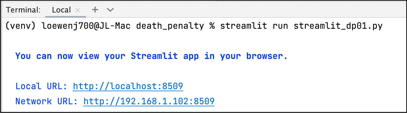
The streamlit application is then loaded into your default browser at the first available port (after 8500).
And that’s all there is to it!
In Summary…
By combining Streamlit and Plotly, you can build an interactive web app that allows users to display a wide range of interactive data visualizations.
This approach is perfect for quickly creating prototype dashboards that are easy to deploy and share.
Streamlit handles the app structure, input controls, and layout, while Plotly provides an extensive array of customizable visualizations. This makes the combination ideal for anyone with limited web development skills to create professional-grade data visualizations.
Give it a try - let me know how it goes for you by leaving a comment!
If you’re interested in this topic…and want to learn more about data storytelling, sign up for my free 5-Day Email Course on Data Storytelling Fundamentals:

https://stats-and-stories.ck.page/datastorytelling
No strings attached. Let me know what you think! Any feedback/comments are very much appreciated!