

Better Data Storytelling: Exploratory Research Techniques Using Data Visuals
Better Data Storytelling: Exploratory Research Techniques Using Data Visuals
A tutorial on exploratory analysis and visualization of the UNHCR refugee data set

With data visualization and storytelling, there is great value in clear, concise images to get your point across.
But how do you really get your data to stand out? What can you do to move your audience towards action?
As Nathan Yau points out in his new book (Visualize This, 2nd edition), If we were always looking for the most efficient and accurate way to present data, we would use bar charts most of the time. Most everyone has seen bar charts and can interpret them with relative ease. Quantitatively, this works very well.
But what if you want to go beyond quantitative, to generate emotional appeal? You may need to find something more interesting and eye-catching.
As a first step, we can perform exploratory research to visualize our data in many different ways - to find a visual or set of visuals to really capture our audience
What is exploratory research? Let me explain and provide some useful examples on how we can explore a dataset and bring it to life.
Exploratory Research
In order to get to a place where you can tell a story with a dataset, you need to go through the exploration phase.
Here your natural curiosity is a catalyst. What questions do you have of the data? What are you interested in finding out about the data?
Cole Nussbaumer-Knaflic, in her seminal book Storytelling With Data (2015) describes the exploratory phase as being similar to hunting for pearls in oysters. You may have 100 oysters and are able to find 2 pearls. The key to being successful in the exploratory phase is to look at the data in many different ways.
Dr. Yau (2024) provides us with a great list of questions we can ask. Here’s a few of useful ones:
what is this data about?
How did things change over time?
How are things related?
What stands out?
Is this normal?
Let’s look at some examples using a cool dataset - the United Nations High Commission for Refugees (UNHCR) data set on global asylum seekers.
The Dataset
The UN High Commission for Refugees (UNHCR) tracks statistics on refugee movements across the globe.
Their data is freely accessible HERE.
After clicking the link to get to the download page, we can be granular on the data that we select:
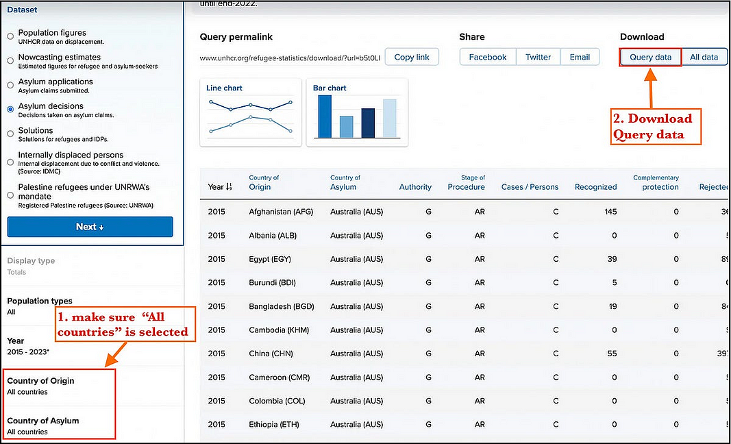
For this project, let’s retrieve the county of origin for each refugee and the country of asylum.
With this data, we have refugee data showing movement in two directions:
from country of origin — where asylum seekers are going to
from country of asylum — where asylum seekers are coming from
Once we download the dataset, we can open it up in spreadsheet format to see what we are dealing with:
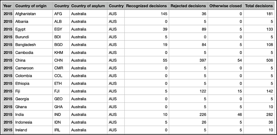
The data fields that we are interested in for this project are:
Country of origin (including 3-letter ISO code) — where a person seeking asylum is coming from
Country of asylum (including 3-letter ISO code) — where a person is actually seeking asylum
Recognized decisions — whether the person seeking asylum was accepted (numeric total by country)
Both the country of origin and asylum have a 3-letter ISO code that can be used for reliable unique identification.
What Stories Can We Tell?
With an idea of what the data set contains, we can let our curiosity guide us through the next step.
For me, as a Canadian, I am interested in asylum seekers coming to Canada, rather than those leaving Canada to seek asylum elsewhere (there are not very many).
Questions that come to mind:
Where are folks coming from?
How does Canada compare to other countries in accepting refugees?
Has this changed over time for their origin?
Has this changed over time in total numbers?
To try and answer these questions in the most compelling way, we can look at the charting options that are available.
Again, Dr. Yau’s Visualize this provides us with a plethora (60 to be exact) of visualization options to choose from.
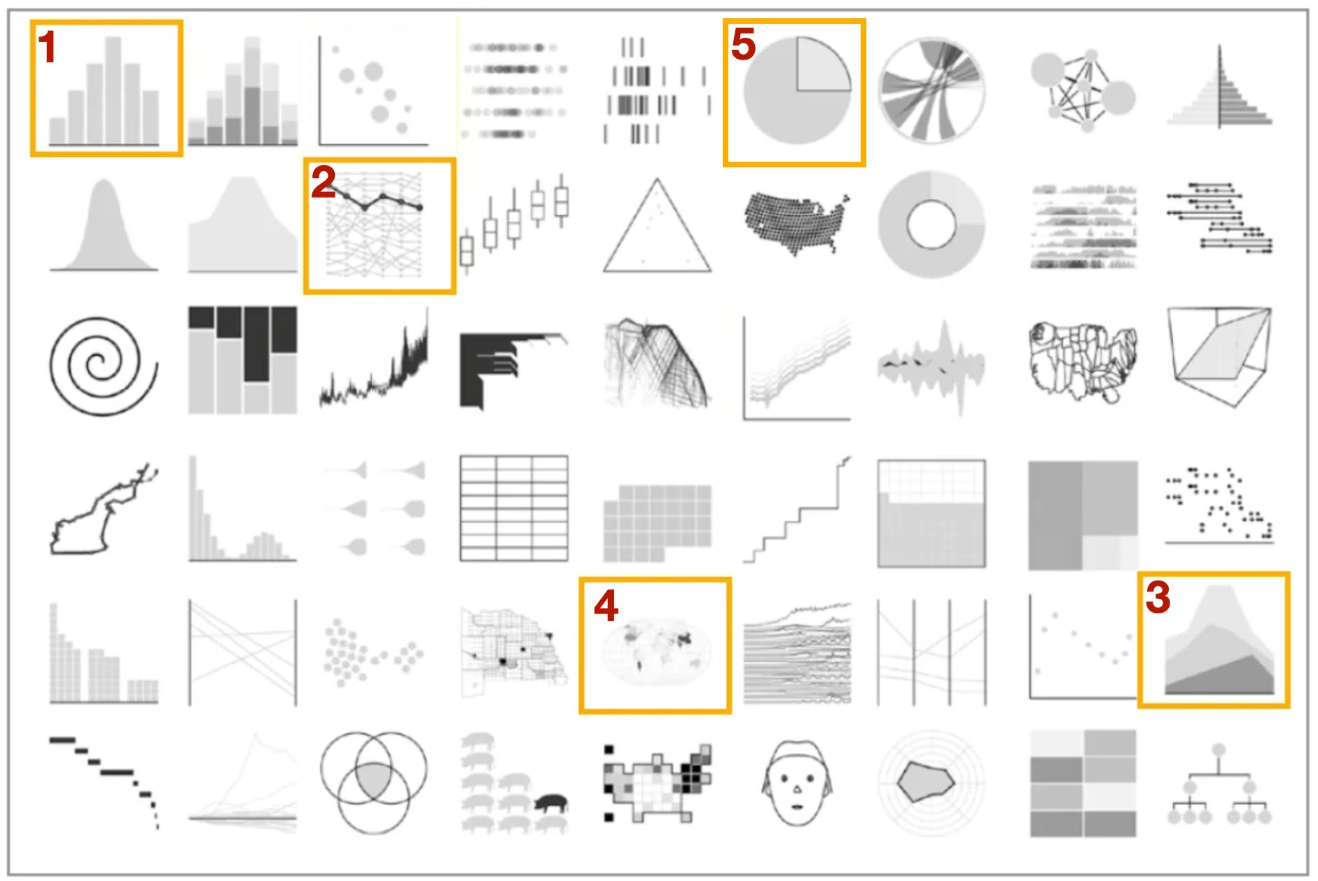
For this exploratory exercise today, let’s take a look at 5 different exploratory options (highlighted in orange):
Bar Chart
Time Series Line Chart
Stacked area Chart
Choropleth Map
Sunburst Chart (proportional like a pie chart, but 2 levels)
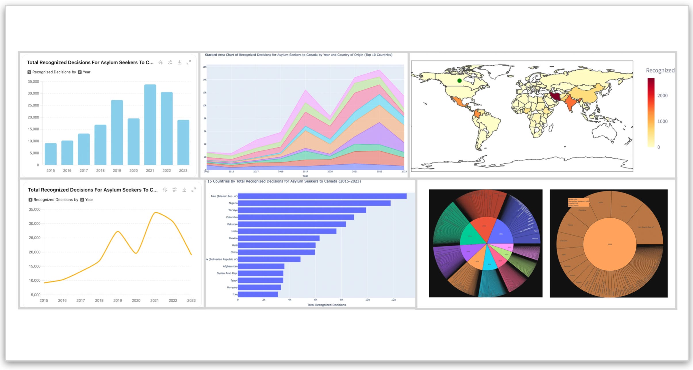
Exploration 1. Bar Chart
Bar charts are one of the most popular data visualizations that are used today. They are a great starting point when we are first exploring our data.
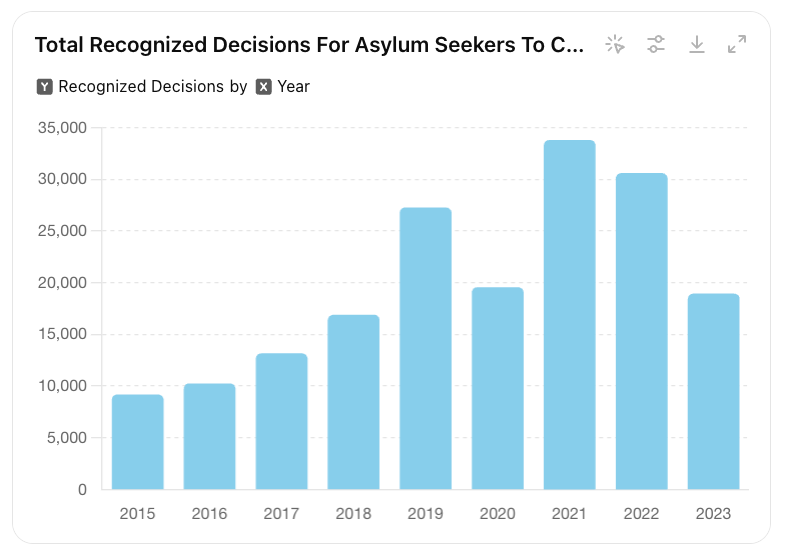
We can see with this bar chart that there was an upward trend of accepted asylum seekers until 2021 (excluding the Covid year of 2020) and a downward trend since then. This chart gives us a very clear representation of raw numbers of asylum seekers to Canada.
OK, great, now what about the makeup of the folks who are seeking asylum in Canada. Where are they coming from?
We can start with a bar chart that shows the numbers for the range of our dataset (2015-2023):
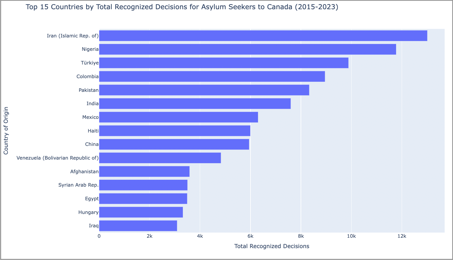
But what about if we want to compare Canada to the rest of the world during this time period?
With a bar chart, it can be difficult to show this. A time series chart might do a better job so let’s give it a try.
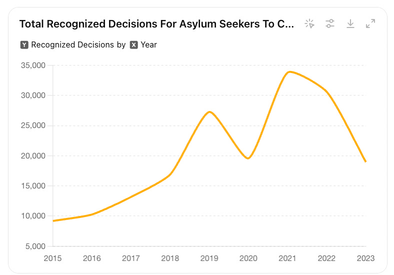
Exploration 2. Time Series Line Chart
To start with, let’s convert our bar chart in the previous example to a line chart.
Representing just Canada with a line chart:
The next step is to provide other countries for context. Using best practices for data visualization, we can add in the rest of the countries from our dataset:
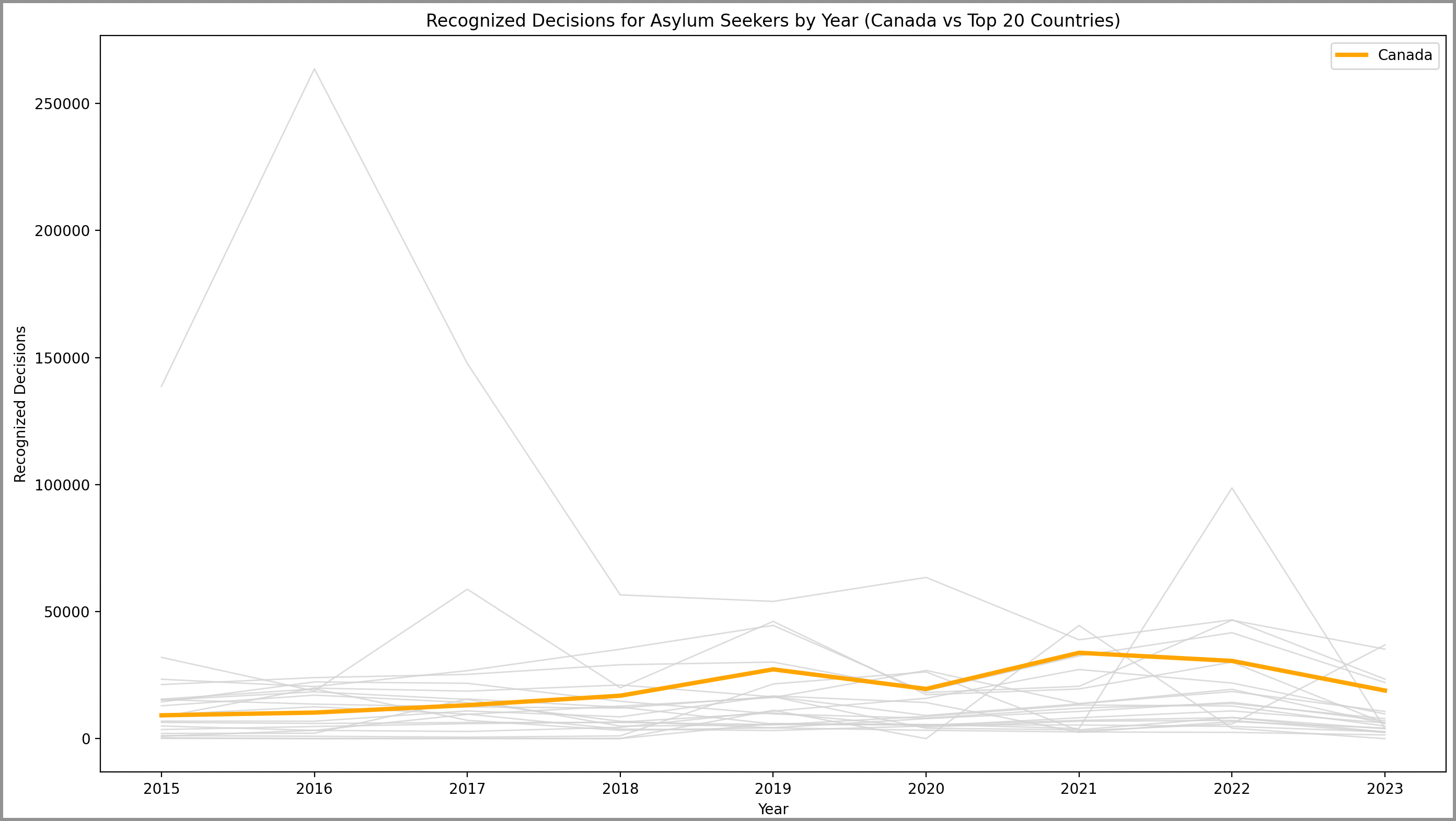
Now if we leave Canada in orange and represent the other countries as a light shade of grey, we get an idea of Canada’s position relative to other nations.
We can see from this chart that Canada does indeed accept a large number of refugees relative to the rest of the world. The large spike we can see in 2016 is for Germany who accepted a very large number of Syrian refugees during this time.
Great!
So now we know how Canada compares to the rest of the world and we have overall numbers on where folks are coming from (by total number).
But what about if we want to track the changes over time (ie. from year to year)?
We need to get a bit more granular here. A stacked area chart can help us visualize this.
Exploration 3. Stacked Area Chart
A stacked area chart is a terrific way to look at changes in volume over time. In the case of our dataset, change in volume would be the number of folks who are seeking asylum to Canada from year to year.
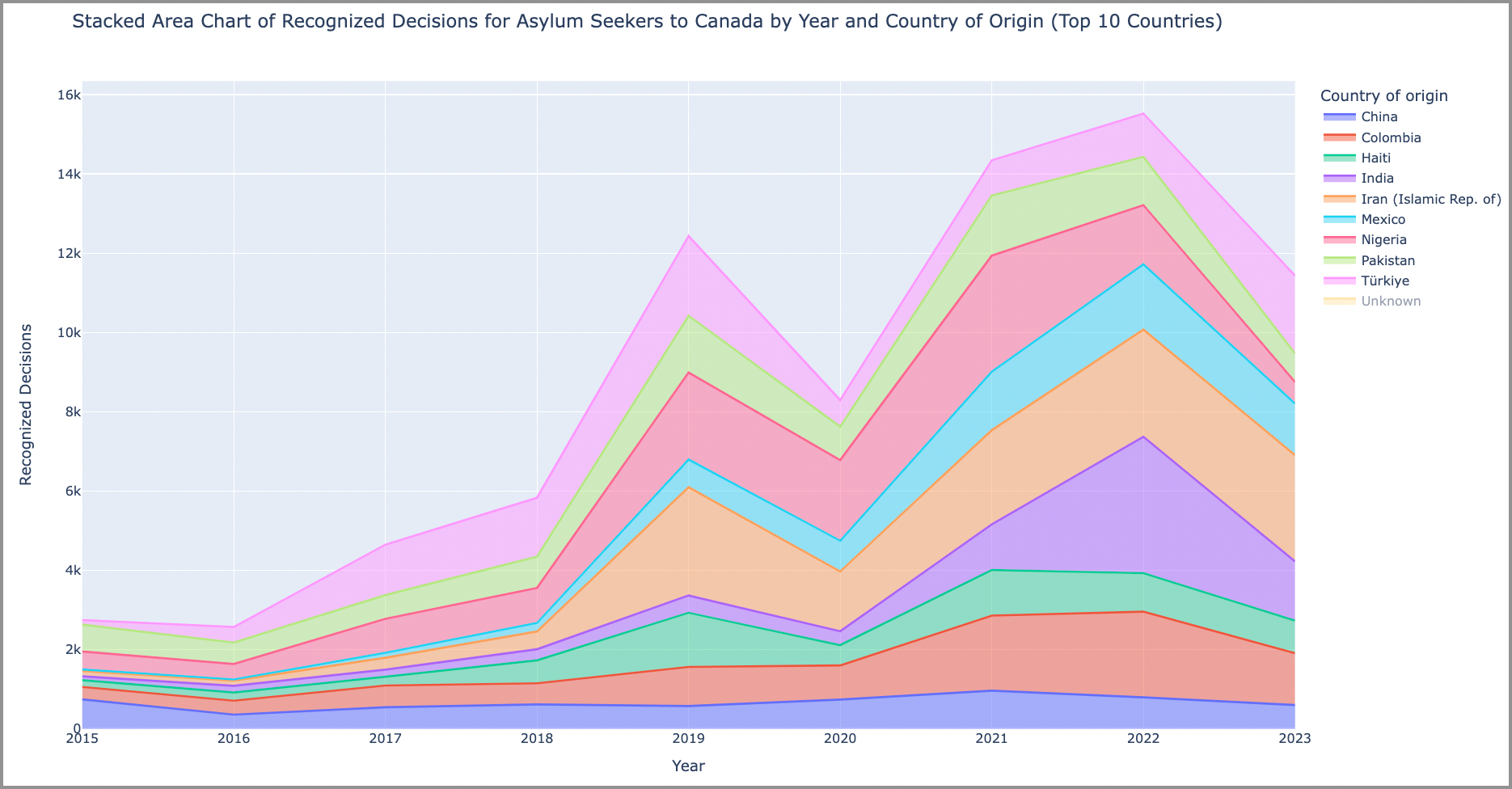
This particular chart shows us the breakdown of where folks coming to Canada are seeking asylum from. It has been narrowed down to the Top 10 countries by volume to keep the user from getting lost in too much detail.
If we look closely, we can see that the orange area represents the large number of Iranian folks seeking asylum in Canada.
With the right data, stacked area charts can really provide dramatic visuals about changes over time.
This particular chart was created using the Python Plotly express library. This library has a built-in function called area() that creates this style of chart.
Now even after these 3 terrific visualizations, what were are still lacking is a useful visualization that gives us a clear global view of asylum seekers by country to Canada.
A useful representation to provide this for us is a choropleth map.
Exploration 4. Choropleth Mapping
Choropleth maps provide shaded areas to show the variation in data across a geographic area (ie. by Country).
With our dataset, choropleth maps can provide us with a global visualization of asylum seekers by country:
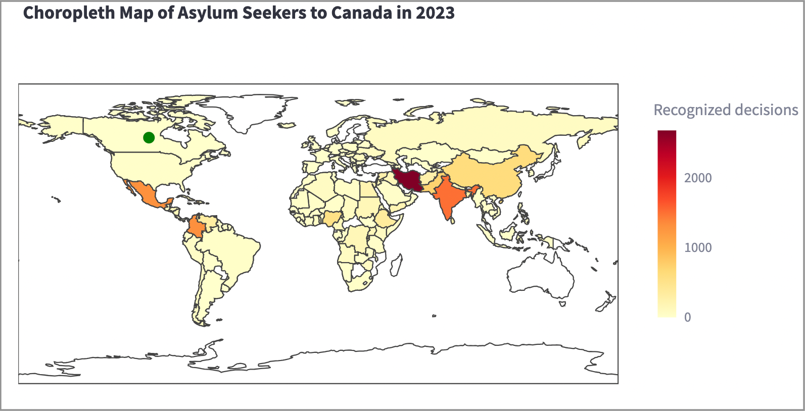
In this example, darker colours and shades represent countries with higher numbers of asylum seekers to Canada. The destination country in this example (Canada) is highlighted using a green circle (like a “green light”).
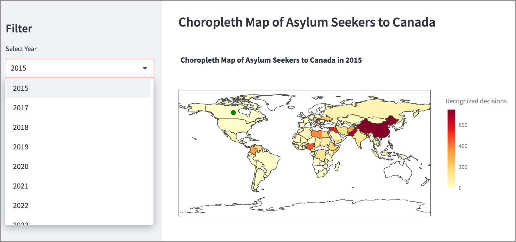
For additional functionality, a choropleth map can be combined with a modern coding library like Streamlit (for Python) to provide interactivity, allowing the user to select the Year to display:
With choropleth maps created using Python Plotly, the user can hover over each country to retrieve further information (ie. the exact numbers).
Exploration 5. Sunburst Chart
Sunburst charts are a beautiful way to represent data. Though perhaps not the most effective method for visualizing many forms of data, they are still very nice to look at.
Sunburst charts always catch my eye. I am drawn towards them and am always curious about what data points they are representing.
We can represent the data for Canada for each asylum seeking country for each year in our dataset:
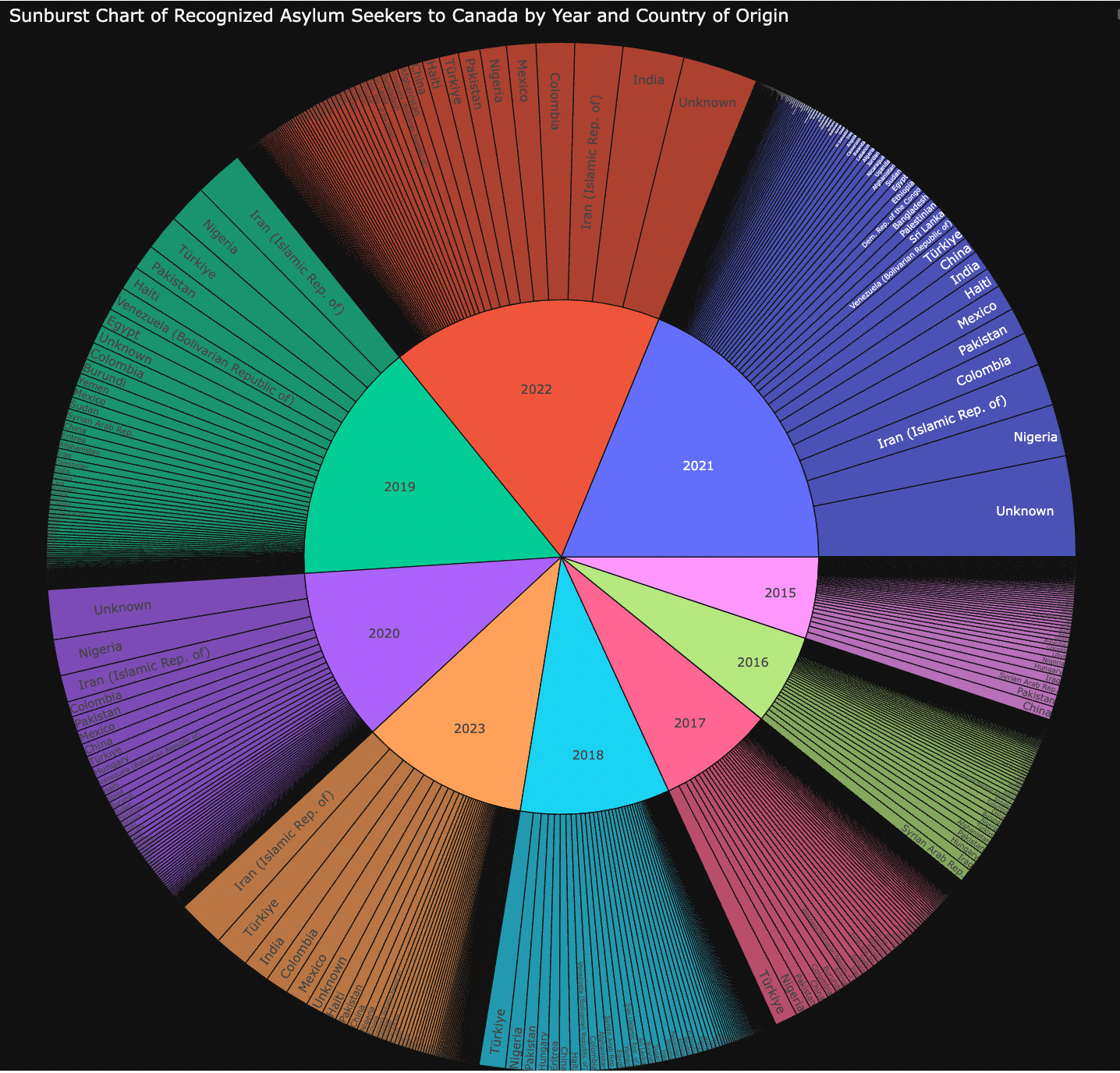
Very colourful and striking but also very “busy”. There is a lot to digest in a chart like this. However, one of the great advantages of modern data visualization tools, like Python Plotly, is that they allow for user interactivity. We can go a level deeper with this visualization (created in Python Plotly) by clicking on each individual year to get a closer look at the data.
For example, if we click on the year 2023, we can view just the data for that year:
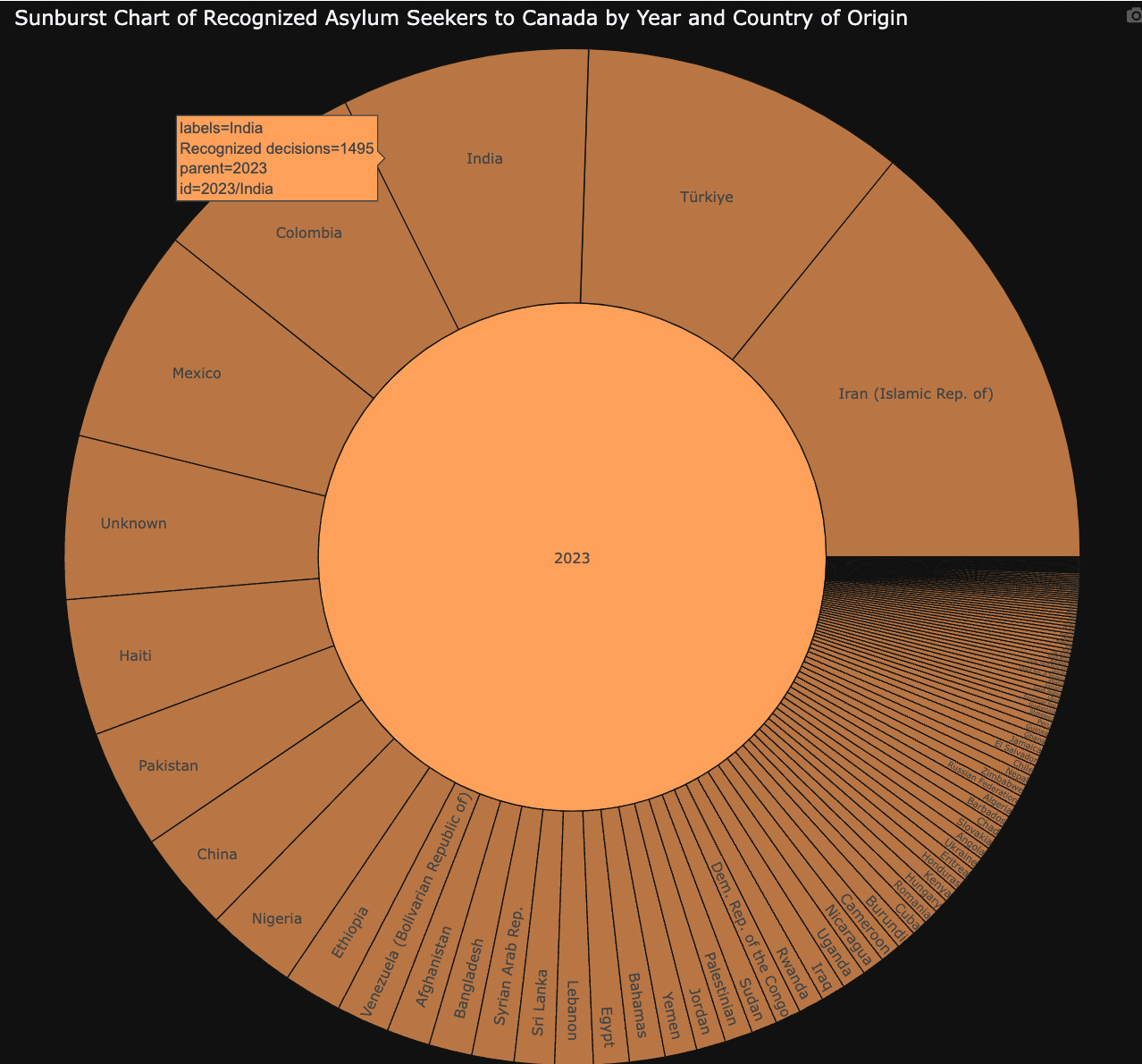
And if we mouse-over a particular country (ie. India), we can view additional data about that particular country. Very useful.
In Summary…
The goal of this article is to provide readers with examples on how to use different charting and mapping techniques to perform exploratory analysis on a dataset.
This process can help you answer any questions that you have about the data. Or, if you do not yet have any questions, it can help you formulate some.
I hope you found this exercise useful, and entertaining.
Thank you for reading!
NOTE: All of the examples in this article were created with Python code (using the Plotly express and Streamlit libraries).
All code files and CSV file are in a Github repository HERE.
If you’re interested in this topic…and want to learn more about data storytelling, sign up for my free 5-Day Email Course on Data Storytelling Fundamentals:

https://stats-and-stories.ck.page/datastorytelling
No strings attached. Let me know what you think! Any feedback/comments are very much appreciated!
References:
Yau, N. (2024). Visualize this: The FlowingData guide to design, visualization, and statistics (2nd ed.). Wiley.
Knaflic, C. N. (2015). Storytelling with data: A data visualization guide for business professionals. Wiley.