

A Beautiful and Timely Python Multi-page Streamlit Application
A Beautiful and Timely Python Multi-page Streamlit Application
Showcasing historical summer Olympic data through multiple data visualizations


Streamlit is an open-source app framework that allows data scientists and analysts to create interactive web applications with ease.
Using just a few lines of Python, you can turn data scripts into shareable web apps.
And combined with a data visualization library like Plotly, you can create beautiful charts and maps with only a few lines of code.
In this article, let me step you through how to use Streamlit to create a multi-page interactive application that visualizes Olympic medal data.
The application will have three pages:
an overview of medal counts,
a country-specific analysis, and
a choropleth map displaying global medal distributions.
Let’s get to it!
The Data Set
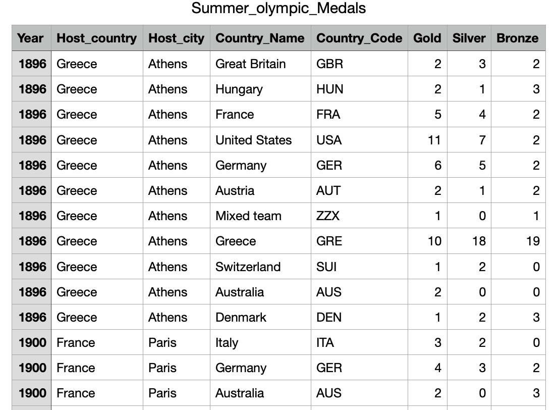
The data used to accomplish this task is the “Olympic Medals by Country” dataset. It is available on Kaggle, HERE.
In this data set, the data is organized by year, country, and a count of “Gold”, “Silver” and “Bronze” medals. Here is a screenshot of the first 15 rows of the dataset:
Now let’s start to set up our Python Streamlit application code.
Setting up Our Streamlit Application
To start with, you need to make sure you have Streamlit installed on your system. To do this, from the command line:
pip install streamlitAnd for this entire exercise, we will need four total libraries in our Python code.
import streamlit as st
import pandas as pd
import plotly.express as px
import plotly.graph_objects as go
The pandas library is used to create data frames - which is just a fancy way to say that our data will be organized in a way that can be interpreted by the charting and mapping functions.
The Plotly library is a terrific library for creating charts and maps. For this exercise we will use both express and graph_objects modules.
Our last task pre-Streamlit code is to access our CSV file and to create a pandas data frame:
# Load dataset
file_path = 'Summer_olympic_Medals.csv'
data = pd.read_csv(file_path)


# Helper function to get medal counts
def get_medal_counts(df, group_by_column):
    return df.groupby([group_by_column])[['Gold', 'Silver', 'Bronze']].sum().reset_index()
We take advantage of the built-in pandas function read_csv()to load our data into a data frame. Then we create a simple function (to be used later) that gives us medal counts.
Now let’s get crackin’!
Streamlit Page 1: Olympic Medal Overview
The first page of our Streamlit application provides an overview of the total medals won by each country. Users can select a range of years to filter the data and see the top 20 countries by total medals.
def page_overview():
    st.subheader("Global Medal Counts By Year Range (Choose Range)")

    year_filter = st.slider("Year Range", int(data['Year'].min()), int(data['Year'].max()),
                            (int(data['Year'].min()), int(data['Year'].max())))

    filtered_data = data[(data['Year'] >= year_filter[0]) & (data['Year'] <= year_filter[1])]
    medal_counts = get_medal_counts(filtered_data, 'Country_Name')
    medal_counts['Total'] = medal_counts['Gold'] + medal_counts['Silver'] + medal_counts['Bronze']

    top_countries = medal_counts.sort_values(by='Total', ascending=False).head(20)

    #st.subheader("Top 20 Countries by Total Medals")
    fig = px.bar(top_countries, x='Total', y='Country_Name', orientation='h', title="Top 20 Countries by Total Medals",
                 color='Country_Name', color_discrete_sequence=px.colors.qualitative.Prism)
    fig.update_layout(showlegend=False, height=600)
    st.plotly_chart(fig)
The function starts by displaying a subheader that gives a description and instructions.
Next, a slider widget is created using st.slider. This slider allows users to select a range of years between the minimum and maximum years present in the dataset. The default range is set to cover the entire span of years available
The dataset is then filtered based on the selected year range from the slider. The get_medal_counts function is called to aggregate the medal counts (Gold, Silver, and Bronze) for each country within the filtered data. A new column Total is added to the aggregated data to represent the total number of medals won by each country (to be used later).
Next, a horizontal bar chart is created using Plotly Express (px.bar). The chart displays the total medals on the x-axis and the country names on the y-axis. The height of the chart is set to 400 pixels for better visual presentation. Our new chart:
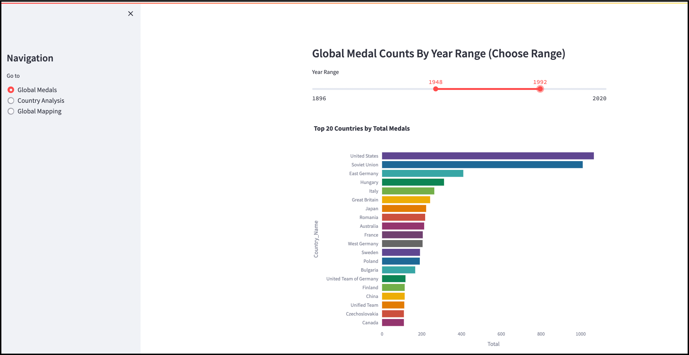
The view above is with our sidebar widget in place. We will add this at the end of our code.
Alright, that looks pretty good! You can move either end of the slider to narrow down or widen the range of years that are displayed. This chart provides an overview of the top medal receiving countries. For a deeper level of granularity, we can create an interface that allows us to choose individual countries.
Streamlit Page 2: Country-Specific Analysis
The second page of our Streamlit application provides a detailed analysis of the Olympic medal counts for a selected country over the years. This page allows users to select a specific country and view the trends in two charts:
Gold, silver, and bronze medals over time
Total medal counts broken down by type (gold, silver, bronze)
The entire page 2 is set up into a single function:
def page_country_analysis():
    st.subheader("Country-Specific Analysis")

    country = st.selectbox("Select Country", data['Country_Name'].unique())
    country_data = data[data['Country_Name'] == country]

    #st.subheader(f"Medal Count for {country}")
    fig = go.Figure()
    fig.add_trace(go.Scatter(x=country_data['Year'], y=country_data['Gold'], mode='lines', name='Gold',
                             line=dict(color='gold', width=2)))
    fig.add_trace(go.Scatter(x=country_data['Year'], y=country_data['Silver'], mode='lines', name='Silver',
                             line=dict(color='silver', width=2)))
    fig.add_trace(go.Scatter(x=country_data['Year'], y=country_data['Bronze'], mode='lines', name='Bronze',
                             line=dict(color='#cd7f32', width=2)))
    fig.update_layout(title=f"Medal Count for {country} Over the Years", height=400)
    st.plotly_chart(fig)

    total_medals = country_data[['Gold', 'Silver', 'Bronze']].sum().reset_index()
    total_medals.columns = ['Medal Type', 'Count']

    #st.subheader(f"Total Medals for {country}")
    fig = px.bar(total_medals, x='Count', y='Medal Type', orientation='h', title=f"Total Medals for {country}",
                 color='Medal Type', color_discrete_map={'Gold': 'gold', 'Silver': 'silver', 'Bronze': '#cd7f32'})
    fig.update_layout(height=300)
    st.plotly_chart(fig)
To start, a header is created, then a dropdown using st.selectbox to allow users to select a country from the list of unique country names in the dataset.
The dataset is filtered to include only the data for the selected country (using the data frame created earlier).
Next, a time series chart is created using Plotly's go.Scatter function. The chart includes three lines representing the counts of gold, silver, and bronze medals over the years for the chosen country (from the dropdown).
Each line is colored according to the medal type (gold, silver, bronze), with a specified line width of 2 pixels. This is an extra step to match our Olympic theme.
Moving on to the bar chart, we display total gold/silver/bronze counts for the chosen country.
Our beautiful display:
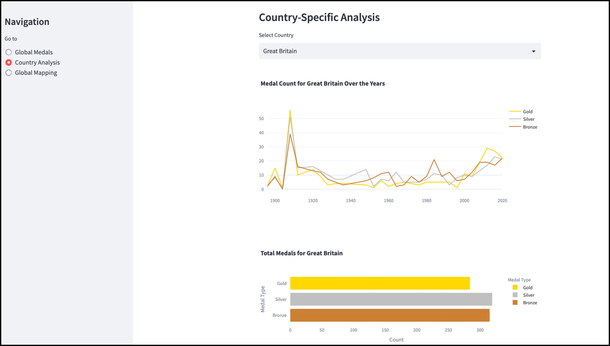
Awesome. Now we have a dropdown menu allowing the user to choose a country. The line chart and bar chart are both updated with new data for the chosen country.
Now for our last page, let’s pull right back out and take global view of medal winners - let’s create a choropleth map that allows us to see winners by each Olympiad.
Streamlit Page 3: Global Choropleth Map and Medal Table
The third page of our Streamlit application provides a global view of the distribution of Olympic medals. This page allows users to select a specific year and visualize the total medals won by each country on a world map.
And let’s add a table below to give a breakdown by country and by medal type.
def page_choropleth():
   # st.subheader("Choropleth Mapping")

    year = st.selectbox("Select Year", sorted(data['Year'].unique()), key='year_select')

    year_data = data[data['Year'] == year]
    medal_counts = get_medal_counts(year_data, 'Country_Name')
    medal_counts['Total'] = medal_counts['Gold'] + medal_counts['Silver'] + medal_counts['Bronze']

    st.subheader(f"Global Distribution of Total Medals in {year}")
    fig = px.choropleth(medal_counts, locations="Country_Name", locationmode='country names', color="Total",
                        hover_name="Country_Name", color_continuous_scale=px.colors.sequential.YlOrBr)

    fig.update_layout(height=500)
    st.plotly_chart(fig)

    st.subheader(f"Medal Counts by Country in {year}")
    sorted_medal_counts = medal_counts.sort_values(by='Total', ascending=False)

    st.dataframe(sorted_medal_counts)
A dropdown menu is created using st.selectbox to allow users to select a specific year from the list of unique years in the dataset. The key parameter ensures that the widget's state is maintained properly.
The dataset is filtered to include only the data for the selected year. The get_medal_counts function aggregates the medal counts (Gold, Silver, and Bronze) for each country within the filtered data. A new column Total is added to represent the total number of medals won by each country
A choropleth map is created using Plotly Express (px.choropleth). The map displays the total medals on a color scale, with each country colored according to the number of medals won (using YlOrBr color scheme).
The aggregated medal counts are sorted in descending order by the total number of medals. The table is displayed using st.dataframe with the data frame passed in.
And our results:
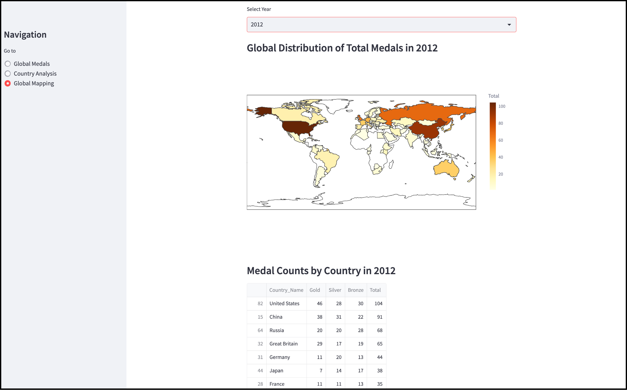
Terrific. The user can select an Olympiad by year from the dropdown menu and the total medal counts are displayed on the global choropleth map. To accompany this, we can also scroll down through the table of medal winners by country.
Putting It All Together in Streamlit
Now that we have all the pieces to our multi-page site, we need to put it all together by adding in the sidebar with menu. To keep it simple, we can use just a simple set of radio buttons to display each page.
def main():
    st.sidebar.title("Summer Olympic Medals")
    page = st.sidebar.radio("Go to", ["Global Medals", "Country Analysis", "Global Mapping"])

    if page == "Global Medals":
        page_overview()
    elif page == "Country Analysis":
        page_country_analysis()
    elif page == "Global Mapping":
        page_choropleth()

if __name__ == "__main__":
    main()
In our main() function we create a title for our sidebar and then a set of 3 radio buttons to handle each page. If a user selects a particular radio button, the associated function is called to load that particular page.
And then lastly, the main() function is called to load the application as required.
And that’s all there is to it!
If you had any issues, this project (including the CSV data file) is available on gitHub (HERE).
In Summary…
This project showcases a 3-page Streamlit multi-page application of summer olympic medal winners by country, year, and medal colour.
We have created 5 different data visualizations to give our users different stories and perspectives on this data.
By creating this application in a modular fashion, we can easily add, remove, or modify data visualizations as we see fit.
Streamlit is a terrific application for quickly and easily generating data visualizations using standard Python data visualization libraries like Plotly.
Thank you for reading.
GitHub repository: HERE.
If you want to learn more about data visualization and data storytelling, check out my free 5-Day Email Course on Data Storytelling Fundamentals:

https://stats-and-stories.ck.page/datastorytelling
No strings attached. Let me know what you think! Any feedback/comments are very much appreciated!